JBoss.orgCommunity Documentation
A reference guide to the components of the RichFaces 4 framework
Copyright ©
Abstract
This book details each component in the RichFaces 4 framework, including examples of their use in applications.
- 1. Introduction
- 2. Common Ajax attributes
- I. Ajax control components
- 3. Actions
- 3.1. <a4j:ajax>
- 3.2. <a4j:param>
- 3.3. <a4j:actionListener>
- 3.4. <a4j:commandButton>
- 3.5. <a4j:commandLink>
- 3.6. <a4j:jsFunction>
- 3.7. <a4j:poll>
- 3.8. <a4j:push>
- 3.8.1. Setting up Push
- 3.8.2. Server-side Push methods
- 3.8.3. Client-side Push methods
- 3.8.4. Push Topics
- 3.8.5. Handling a push message
- 3.8.6. Handling a push subscription
- 3.8.7. Using TopicsContext to publish message
- 3.8.8. Integrating Push with CDI events
- 3.8.9. Push and JMS integration
- 3.8.10. Reference data
- 4. Resources
- 5. Containers
- 6. Validation
- 7. Processing management
- II. User interface components
- 8. Rich inputs
- 9. Panels
- 10. Tables and grids
- 11. Trees
- 12. Menus and toolbars
- 13. Output and messages
- 14. Drag and drop
- 15. Layout and appearance
- 16. Functions
- 17. Functionality extension
- A. Revision History
This book is a guide to the various components available in the RichFaces 4.5.18-SNAPSHOT framework. It includes descriptions of the role of the components, details on how best to use them, coded examples of their use, and basic references of their properties and attributes.
For full references for all component classes and properties, refer to the following supplementary documentation:
-
VDL (View Definition Language) Documentation
- Available at http://docs.jboss.org/richfaces/latest_4_5_X/vdldoc/
-
Javadoc
For further examples for each component, refer to the RichFaces Showcase at http://showcase.richfaces.org/.
The RichFaces framework is made up of two tag libraries: the a4j library and the rich library.
a4jlibrary-
The
a4jtag library provides core Ajax and utility components. richlibrary-
The
richtag library provides ready-made, self-contained, rich user-interface components. These components have built-in Ajax support. By default, the components don’t require additional configuration in order to send requests or update, but can also be customized by plugging in utility behaviors.
The Ajax components in the a4j library share common attributes to perform similar functionality. Most RichFaces components in the rich library that feature built-in Ajax support share these common attributes as well.
Most attributes have default values, so they need not be explicitly set for the component to function in its default state. These attributes can be altered to customize the behavior of the component if necessary.
The RichFaces Ajax script is built on a base of the JSF 2 Ajax script. As such, each time a request is sent, the data from the requesting component’s parent JSF form is submitted along with the XMLHttpRequest object. The form data contains values from the input element and auxiliary information such as state-saving data.
The execute attribute allows JSF processing to be limited to defined components. The execute attribute can point to an id identifier of a specific component to process. Components can also be identified through the use of Expression Language ( EL).
Alternatively, the execute attribute accepts the following keywords:
@all- Every component is processed.
@none- No components are processed.
@this-
The requesting component with the
executeattribute is processed. This is the default behavior for components. @form- The form that contains the requesting component is processed.
@region-
The region that contains the requesting component is processed. Use the
<a4j:region>component as a wrapper element to specify regions.
Some components make use of additional keywords. These are detailed under the relevant component entry in this book.
If the bypassUpdates attribute is set to true, the Update Model phase of the request processing lifecycle is bypassed. This is useful if user input needs to be validated but the model does not need to be updated. This is the opposite functionality to the execute attribute in RichFaces.
The render attribute provides a reference to one or more components on the page that need updating after an Ajax interaction. It uses the UIComponent.findComponent() algorithm to find the components in the component tree using their id identifiers as a reference. Components can be referenced by their id identifier alone, or by their clientId identifier to make locating components more efficient. Example 2.1, “render example” shows both ways of referencing components. Each command button will correctly render the referenced panel grids, but the second button locates the references more efficiently with explicit clientId paths.
Example 2.1. render example
<h:form id="form1">

    <a4j:commandButton value="Basic reference" render="infoBlock, infoBlock2" />

    <a4j:commandButton value="Specific reference" render=":infoBlock,:sv:infoBlock2" />

</h:form>


<h:panelGrid id="infoBlock">

    ...

</h:panelGrid>


<h:form id="sv">

    <h:panelGrid id="infoBlock2">

        ...

    </h:panelGrid>

</h:form>
The value of the render attribute can also be an expression written using JavaServer Faces' Expression Language ( EL); this can either be a Set, Collection, Array, or String.
Differences between JSF Ajax and RichFaces Ajax
JSF evaluates all parameters during page rendering. As such, during a request from a page, all execute and render values are passed to the server from the client. In contrast, RichFaces evaluates these options at the server side during the current request.
This means that with JSF, making changes during a request to a render value defined with EL will not influence the request. RichFaces, however, will always use the newer values.
The RichFaces approach additionally increases data integrity. Parameters that are changed from the client side are re-evaluated on the server, where they cannot be changed.
Conditionally-rendered component updates
A common problem with using render occurs when the referenced component is conditionally rendered via the rendered attribute. If a component is not initially rendered, it does not have any HTML representation in the Document Object Model ( DOM). As such, when RichFaces renders the component via Ajax, the page does not update as the place for the update is not known.
To work around this issue, wrap the component to be rendered in an <a4j:outputPanel> component. The <a4j:outputPanel> component will receive the update and render the component as required.
A component with ajaxRendered="true" will be re-rendered with every Ajax request, even when not referenced by the requesting component’s render attribute. This can be useful for updating a status display or error message without explicitly requesting it.
The ajaxRendered attribute’s functionality is the basis for the <a4j:outputPanel> component. The <a4j:outputPanel> component is designed to mark parts of the page for automatic updating. Refer to Section 5.1, “<a4j:outputPanel>” for details.
Automatic rendering of such components can be repressed by adding limitRender="true" to the requesting component, as described in Section 2.2.3, “limitRender”.
RichFaces Ajax-enabled components and Ajax behaviors with limitRender="true" specified will not cause components with ajaxRendered="true" to re-render, and only those components listed in the render attribute will be updated. This essentially overrides the ajaxRendered attribute in other components.
Example 2.3, “Data reference example” describes two command buttons, a panel grid rendered by the buttons, and an output panel showing error messages. When the first button is clicked, the output panel is rendered even though it is not explicitly referenced with the render attribute. The second button, however, uses limitRender="true" to override the output panel’s rendering and only render the panel grid.
Example 2.2. Rendering example
<h:form id="form1">

    <a4j:commandButton value="Normal rendering" render="infoBlock" />

    <a4j:commandButton value="Limited rendering" render="infoBlock" limitRender="true" />

</h:form>


<h:panelGrid id="infoBlock">

    ...

</h:panelGrid>


<a4j:outputPanel ajaxRendered="true">

    <h:messages />

</a4j:outputPanel>
The requestDelay attribute specifies an amount of time in milliseconds for the request to wait in the queue before being sent to the server. If a similar request is added to the queue before the delay is over, the original request is replaced with the new one.
When set to true, the ignoreDupResponses attribute causes responses from the server for the request to be ignored if there is another similar request in the queue. This avoids unnecessary updates on the client when another update is expected. The request is still processed on the server, but if another similar request has been queued then no updates are made on the client.
JSF provides global jsf.ajax.onError and jsf.ajax.onEvent events to define handlers (the jsf.ajax.onEvent event is used for all begin, success, and complete events). RichFaces adds event-specific attributes at the component level.
The onbeforesubmit event attribute invokes the event listener before an Ajax request is sent. The request is canceled if the event listener defined for the onbeforesubmit event returns false.
The onbegin event attribute invokes the event listener after an Ajax request is sent.
The onbeforedomupdate event attribute invokes the event listener after an Ajax response has been returned but before the DOM tree of the browser is updated.
The oncomplete event attribute invokes the event listener after an Ajax response has been returned and the DOM tree of the browser has been updated.
The data attribute allows additional data to be handled with the oncomplete event. Use JSF Expression Language ( EL) to reference the property of the managed bean, and its value will be serialized in JavaScript Object Notation ( JSON) and returned to the client side. The property can then be referenced through the event.data variable in the event attribute definitions. Both primitive types and complex types such as arrays and collections can be serialized and used with data.
Example 2.3. Data reference example
<a4j:commandButton value="Update" oncomplete="showTheName(event.data.name)" data="#{userBean.name}" />
The onerror event attribute invokes the event listener when an error has occurred during Ajax communications.
RichFaces allows one to register callbacks for the events listed above using jQuery:
-
ajaxsubmit: triggered before an Ajax request is sent. -
ajaxbegin: triggered after an Ajax request is sent. -
ajaxbeforedomupdate: triggered after an Ajax response has been returned but before the DOM tree of the browser has been updated. -
ajaxcomplete: triggered after an Ajax response has been returned and the DOM tree of the browser has been updated.
The event callback can be registered either on a form or a whole page:
<h:outputScript>

jQuery(document).ready(function() {

    jQuery(#{rich:element('form_id')}).on("ajaxsubmit", function() {

        // the callback will be triggered before the form is submitted using JSF AJAX

        console.log("ajaxsubmit");

    });


    jQuery(document).on("ajaxcomplete", function() {

        // the callback will be triggered for each completed JSF AJAX for the current page

        console.log("ajaxcomplete");

    });

}

</h:outputScript>
Table of Contents
- 3. Actions
- 3.1. <a4j:ajax>
- 3.2. <a4j:param>
- 3.3. <a4j:actionListener>
- 3.4. <a4j:commandButton>
- 3.5. <a4j:commandLink>
- 3.6. <a4j:jsFunction>
- 3.7. <a4j:poll>
- 3.8. <a4j:push>
- 3.8.1. Setting up Push
- 3.8.2. Server-side Push methods
- 3.8.3. Client-side Push methods
- 3.8.4. Push Topics
- 3.8.5. Handling a push message
- 3.8.6. Handling a push subscription
- 3.8.7. Using TopicsContext to publish message
- 3.8.8. Integrating Push with CDI events
- 3.8.9. Push and JMS integration
- 3.8.10. Reference data
- 4. Resources
- 5. Containers
- 6. Validation
- 7. Processing management
- 3.1. <a4j:ajax>
- 3.2. <a4j:param>
- 3.3. <a4j:actionListener>
- 3.4. <a4j:commandButton>
- 3.5. <a4j:commandLink>
- 3.6. <a4j:jsFunction>
- 3.7. <a4j:poll>
- 3.8. <a4j:push>
- 3.8.1. Setting up Push
- 3.8.2. Server-side Push methods
- 3.8.3. Client-side Push methods
- 3.8.4. Push Topics
- 3.8.5. Handling a push message
- 3.8.6. Handling a push subscription
- 3.8.7. Using TopicsContext to publish message
- 3.8.8. Integrating Push with CDI events
- 3.8.9. Push and JMS integration
- 3.8.10. Reference data
This chapter details the basic components that respond to a user action and submit an Ajax request.
The <a4j:ajax> behavior allows Ajax capability to be added to a non-Ajax component. The non-Ajax component must implement the ClientBehaviorHolder interface for all the event attributes that support behavior rendering.
The <a4j:ajax> behavior is placed as a direct child to the component that requires Ajax support.
Point the event attribute to the standard JSF event that triggers the behavior. If the event attribute is not defined, the behavior is triggered on the event that normally provides interaction behavior for the parent component.
Example 3.1. <a4j:ajax> example
<h:panelGrid columns="2">

    <h:inputText id="myinput" value="#{userBean.name}">

        <a4j:ajax event="keyup" render="outtext" />

    </h:inputText>

    <h:outputText id="outtext" value="#{userBean.name}" />

</h:panelGrid>
-
client-behavior-renderer-type:org.ajax4jsf.behavior.Ajax -
behavior-id:org.ajax4jsf.behavior.Ajax -
handler-class:org.richfaces.view.facelets.html.AjaxHandler -
behavior-class:org.ajax4jsf.component.behavior.AjaxBehavior -
client-behavior-renderer-class:org.ajax4jsf.renderkit.AjaxBehaviorRenderer
The <a4j:param> behavior combines the functionality of the JavaServer Faces ( JSF) components <f:param> and <f:actionListener>.
Basic usage of the <a4j:param> requires three main attributes:
-
The
valueattribute is the initial value of the parameter. -
The
assignToattribute defines the bean property. The property is updated if the parent command component performs an action event during the Process Request phase.
Example 3.2, “<a4j:param> example” shows a simple implementation along with the accompanying managed bean.
Example 3.2. <a4j:param> example
<h:form id="form">

    <a4j:commandButton value="Set name to Alex" reRender="rep">

        <a4j:param name="username" value="Alex" assignTo="#{paramBean.name}"/>

    </a4j:commandButton>

    <h:outputText id="rep" value="Name: #{paramBean.name}"/>

</h:form>
public class ParamBean {

    private String name = "John";


    public String getName() {

        return name;

    }


    public void setName(String name) {

        this.name = name;

    }

}
When the button is pressed, the application sets the name parameter of the bean to Alex, and displays the name in the output field.
The <a4j:param> tag can be used with non-Ajax components in addition to Ajax components. This includes components which are working through the GET request, such as the <h:link> and <h:button> components. In this way, data model values can also be updated without any Java code on the server side.
The converter attribute can be used to specify how to convert the value before it is submitted to the data model. The property is assigned the new value during the Update Model phase.
Validation failure
If the validation of the form fails, the Update Model phase will be skipped and the property will not be updated.
Variables from JavaScript functions can be used for the value attribute. In such an implementation, the noEscape attribute should be set to true. Using noEscape="true", the value attribute can contain any JavaScript expression or JavaScript function invocation, and the result will be sent to the server as the value attribute.
Example 3.3. Passing client-side parameters
<h:form>

   <a4j:commandButton value="Show Screen Size" render="infoPanel">

      <a4j:param name="w" value="screen.width"

                 assignTo="#{paramBean.screenWidth}" noEscape="true" />

      <a4j:param name="h" value="screen.height"

                 assignTo="#{paramBean.screenHeight}" noEscape="true" />

   </a4j:commandButton>


   <h:panelGrid columns="2" id="infoPanel">

      <h:outputText value="Width:" />

      <h:outputText value="#{paramBean.screenWidth}" />

      <h:outputText value="Height:" />

      <h:outputText value="#{paramBean.screenHeight}" />

   </h:panelGrid>

</h:form>
The command button triggers the <a4j:param> behaviors and renders the output text. The <a4j:param> behaviors pass client-side parameters for the screen width and height through the backing bean. These parameters are then used to populate the output text values.
Use the <a4j:actionListener> tag to register an ActionListener class on a parent action component. The class provided as a listener must implement the javax.faces.event.ActionListener interface. Multiple listener methods can be registered on an action component in this way.
The <a4j:actionListener> tag differs from the standard JSF tag by allowing a listener method to be defined instead of just a class. Use the listener attribute to define the listener method.
The <a4j:commandButton> component is similar to the JavaServer Faces ( JSF) <h:commandButton> component, but additionally includes Ajax support.

The <a4j:commandButton> component executes the complete form
Button controls are typically used to perform complete form submissions for data storing. As a consequence, the <a4j:commandButton> component has the execute="@form" setting by default. To limit rendering to a different scope, redefine the execute attribute.
The <a4j:commandButton> requires only the value attribute to function. Use the value attribute to specify the text of the button.
By default, the <a4j:commandButton> uses the click event instead of the submit event.
The <a4j:commandLink> component is similar to the JavaServer Faces ( JSF) <h:commandLink> component, except that it includes plugged-in Ajax behavior.

The <a4j:commandLink> component executes the complete form
Link controls are typically used to perform complete form submissions for data storing. As a consequence, the <a4j:commandLink> component has the execute="@form" setting by default. To limit rendering to a different scope, redefine the execute attribute.
The <a4j:commandLink> requires only the value attribute to function. Use the value attribute to specify the text of the link.
The <a4j:commandLink> uses the click event instead of the submit event.
The <a4j:jsFunction> component performs Ajax requests directly from JavaScript code and retrieves server-side data. The server-side data is returned in JavaScript Object Notation ( JSON) format prior to the execution of any JavaScript code defined using the oncomplete attribute.
The <a4j:jsFunction> component requires the data attribute. Use the data attribute to define where the retrieved server-side data is stored.
Example 3.4, “<a4j:jsFunction> example” shows how an Ajax request can be initiated from the JavaScript and a partial page update performed. The JavaScript function can be invoked with the data returned by the Ajax response.
Example 3.4. <a4j:jsFunction> example
<table width="400">

   <tbody>

      <tr>

         <td>

            <span onmouseover="updateName('Kate')"

                  onmouseout="updateName('')">Kate</span>

         </td>

         <td>

            <span onmouseover="updateName('John')"

                  onmouseout="updateName('')">John</span>

         </td>

         <td>

            <span onmouseover="updateName('Alex')"

                  onmouseout="updateName('')">Alex</span>

         </td>

      </tr>

      <tr>

         <td colspan="3">

            Name: <b><h:outputText id="showname" value="#{functionBean.text}" /></b>

         </td>

      </tr>

   </tbody>

</table>

<h:form>

   <a4j:jsFunction name="updateName" render="showname">

      <a4j:param name="name" assignTo="#{functionBean.text}"/>

   </a4j:jsFunction>

</h:form>
The output text for the name is changed depending on which table cell the user hovers over with the mouse. The <a4j:jsFunction> component manages the updating and display of the name.
The <a4j:jsFunction> component allows the use of the <a4j:param> component or the JavaServer Faces <f:param> component to pass any number of parameters for the JavaScript function.
The <a4j:poll> component allows periodical sending of Ajax requests to the server. It is used for repeatedly updating a page at specific time intervals.
The interval attribute specifies the time in milliseconds between requests. The default for this value is 1000 ms (1 second).
The <a4j:poll> component can be enabled and disabled using the enabled attribute. Using Expression Language ( EL), the enabled attribute can point to a bean property to apply a particular attribute value.
The <a4j:push> component performs real-time updates on the client side from events triggered at the server side. The events are pushed out to the client through the RichFaces messaging queue. When the <a4j:push> component is triggered by a server event, it can in turn cause Ajax updates and changes.
The <a4j:push> component uses the Comet model for pushing data to the client.
Using the Push component requires configuration steps which depends on an environment in which the Push is used:
The <a4j:push> uses an Atmosphere framework for transporting messages. In order to use the Atmosphere on the server-side, it is necessary to add Atmosphere libraries into a project.
In a Maven-based project, you should add richfaces-push-depchain as a runtime dependency:
 <dependency>

    <groupId>org.richfaces</groupId>

    <artifactId>richfaces-push-depchain</artifactId>

    <type>pom</type>

    <version>4.5.18-SNAPSHOT</version>

    <scope>runtime</scope>

</dependency>
By declarating a dependency chain, all the required runtime dependencies such as atmosphere-runtime will be added transitively to your project.
For non-Maven-based projects, it is necessary to add dependencies manually - check "RichFaces Developer Guide", section "Project libraries and dependencies" for details.
The Push requires a PushServlet registered in web application and listening for Push client connections.
In the Servlets 3.0 and higher environments, the servlet will be registered automatically.
However in the Servlets 2.5 and lower environments, the servlet needs to be registered manually in web.xml:
<!-- Push Servlet - listens for user sessions -->

<servlet>

    <servlet-name>Push Servlet</servlet-name>

    <servlet-class>org.richfaces.webapp.PushServlet</servlet-class>

    <load-on-startup>1</load-on-startup>

</servlet>

<servlet-mapping>

    <servlet-name>Push Servlet</servlet-name>

    <url-pattern>/__richfaces_push</url-pattern>

</servlet-mapping>


<!-- setups servlet-mapping in RichFaces configuration -->

<context-param>

    <param-name>org.richfaces.push.handlerMapping</param-name>

    <param-value>/__richfaces_push</param-value>

</context-param>
Manual registration of servlet in Servlets 3.0
When you attempt to register the Push servlet manually in Servlet 3.0 environments, RichFaces will detect that the Push servlet is already registered and avoid initializing it again.
However, be sure to setup the Push servlet to support asynchronous requests - modify the servlet registration from the previous web.xml snippet as follows:
<servlet>

    <servlet-name>Push Servlet</servlet-name>

    <servlet-class>org.richfaces.webapp.PushServlet</servlet-class>

    <load-on-startup>1</load-on-startup>

    <async-supported>true</async-supported>

</servlet>
Switching to Blocking I/O instead of asynchronous servlets
Although a container you use supports Servlets 3.0, you may experience problems with using asynchronous servlets.
It is possible to force the Atmosphere to use a blocking I/O approach with the following web.xml configuration:
<context-param>

    <param-name>org.atmosphere.useBlocking</param-name>

    <param-value>true</param-value>

</context-param>
The Push events can be fired on the server-side in several ways:
- TopicsContext - accesses a RichFaces message queue directly
- Push CDI - uses the CDI Event mechanism to fire messages
- Push JMS - the RichFaces Push consumes messages from an enterprise messaging system and exposes them to the client (tightly coupled with the JMS runtime)
On the client side, push notifications may be processed in the following ways:
-
ondataavailableevent handler (serialized message is available) -
Client behaviors attached to
dataavailableevent
The Push messages are delivered to the client based on a TopicKey's name (e.g. someTopic).
The TopicKey can optionally include a subtopic name (e.g. subtopic@anotherTopic).
On the client side, the topic is represted by an <a4j:push>'s attribute address.
Push Topic relates to JMS topic
The format for the name of the push topic is very close to the JMS topic name and thus enables a seamless transport of JMS messages to the RichFaces message queue.
Topics with EL expressions
Since the topic key can contain EL expressions, it is possible to achieve dynamic end-points (e.g. addressing specific clients).
You need to push a message by using TopicContext.publish(TopicKey key, Object message) or using CDI events to publish message to dynamically evaluated topic key.
The <a4j:push>'s attribute address accepts EL expressions.
A push message sent from the server to the <a4j:push> component on the client will cause it to trigger any event handlers defined using the dataavailable event handler.
The <a4j:push> component should also include the onerror event handler to inform the user when an error has occurred with the push messages.
<a4j:push> can be used for either immediate processing of messages (like in the previous example) or it can trigger a partial page update. Check out following samples:
Example 3.5. Handling a push message
<a4j:push address="chat"

          onerror="alert(event.rf.data)"

          ondataavailable="chat.addMessage(event.rf.data)" />
This example uses the dataavailable event attribute with some JavaScript to update messages in a chat room. The event.rf.data parameter contains Push message data serialized to JavaScript.
Example 3.6. Updating DOM for each push message
<a4j:push address="chat"

          onerror="alert(event.rf.data)">

    <a4j:ajax event="datavailable" render="chat" />

</a4j:push>
This example uses the dataavailable event handler to trigger an AJAX request and a partial page update.
The <a4j:push> component establishes connection with server on complete page load (when document is ready).
It means that the application starts to handle push messages once the page is completely loaded.
However time-critical applications may require keeping client stricly synchronized with the server state.
For such applications you may use onsubscribed event handler, which is triggered every time the given component is successfully subscribed to the address/topic it listens to (on a page load and on each AJAX re-render).
Example 3.7. The time-critical updates in stock application
<a4j:push address="stockUpdates"

          onerror="alert(event.rf.data)">

    <a4j:ajax event="dataavailable" render="stocksTable" />

    <a4j:ajax event="subscribed" render="stocksTable" />

</a4j:push>
This example uses the subscribed event to update the table content once the push component is subscribed to the topic, ensuring that the table content is not stale.
Messages could be produced using the TopicsContext interface directly as in the following sample:
private TopicKey topicKey = new TopicKey("chat");


public void initializeTopic() {

    TopicsContext topicsContext = TopicsContext.lookup();

    topicsContext.getOrCreateTopic(topicKey);

}


public void sendMessage(String message) throws MessageException {

    TopicsContext topicsContext = TopicsContext.lookup();

    topicsContext.publish(topicKey, message);

}
A topic needs to first be created using TopicsContext#getOrCreate(TopicKey) where TopicKey is the name of the topic. A message to the topic can be sent using the method: TopicsContext#publish(topicKey, message).
An alternative way of producing messages is to use the CDI event mechanism.
Push notifications can be produced by annotating a CDI event injection point with the @Push annotation, which specifies an end-point (topic name).
The payload of the message is the serialized object sent using the CDI event interface ( Event.fire(T object)).
@Inject

@Push(topic = "chat")

Event<String> pushEvent;


public void sendMessage(String message) {

    pushEvent.fire(message);

}
An integration of the RichFaces Push and the Java Messaging Service ( JMS) allows to write robust interactive applications.
The JMS integration needs to be enabled in web.xml with a following configuration:
<context-param>

    <param-name>org.richfaces.push.jms.enabled</param-name>

    <param-value>true</param-value>

</context-param>
The JMS instance on the back-end must be configured to work with your <a4j:push> components.
Configuring JMS on JBoss EAP
Refer to the JBoss EAP Administration and Configuration Guide for details on configuring JMS in JBoss EAP.
Example 3.8. JMS server configuration
This simple example describes the JMS server configuration required for a pushing server date to the client.
The JMS server needs to be setup in order to propagate JMS messages to Push components. Create a new JMS topic using the following settings:
|
Name: |
datePush |
|
JNDI name: |
/topic/datePush |
|
Use the default settings for other options. |
Add a single role for the topic in the same form using the following settings:
|
Name: |
guest |
|
Send: |
true |
|
Consume: |
true |
|
Create subscriber: |
true |
|
Delete subscriber: |
true |
|
Create durable subscriber: |
true |
|
Delete durable subscriber: |
true |
Ensure the Create durable subscriber and the Delete durable subscriber options are set to true for proper push functionality.
Durable subscriptions
Durable subscriptions receive all events, including those events which were sent while the push component was not connected.
Refer to JMS Documentation for details on configuring the JMS Server.
JMS integration with custom configuration
RichFaces looks for the JMS Connection Factory on the JNDI context /ConnectionFactory by default.
The prefix /topic is used for deriving JMS topic names from Push topic names.
When integrating component into an enterprise system, this defaults can be changed.
Use following web.xml parameters to change default values: org.richfaces.push.jms.connectionFactory, org.richfaces.push.jms.topicsNamespace.
When RichFaces obtains a connection, an empty user name is used with an empty password.
Use following web.xml parameters or equivalent JVM parameters to change default values: org.richfaces.push.jms.connectionUsername, org.richfaces.push.jms.connectionPassword.
The JMS message which should be propagated to Push needs to be created with the method session.createObjectMessage(message);.
The message could be then published using publisher.publish(message); like in a following example:
Example 3.9. Sending messages using JMS
TopicConnection connection;

TopicSession session;

TopicPublisher publisher;


public void sendCurrentDate() throws JMSException {

    String currentDate = new Date().toString();

    ObjectMessage message = session.createObjectMessage(message);

    publisher.publish(message);

}


// messaging needs to be initialized before using method #sendCurrentDate()

private void initializeMessaging() throws JMSException, NamingException {

    if (connection == null) {

        TopicConnectionFactory tcf = (TopicConnectionFactory) InitialContext.doLookup("java:/ConnectionFactory");

        connection = tcf.createTopicConnection();

    }

    if (session == null) {

        session = connection.createTopicSession(false, Session.AUTO_ACKNOWLEDGE);

    }

    if (topic == null) {

        topic = InitialContext.doLookup("topic/datePush");

    }

    if (publisher == null) {

        publisher = session.createPublisher(topic);

    }

}
Receiving messages from a JMS queue doesn’t differ from receiving messages sent by the TopicsContext or using CDI events.
Example 3.10. Receiving messages using JMS
<a4j:push id="datePush" address="datePush"

            ondataavailable="jQuery(#{rich:element('serverDate')}).text(event.rf.data)" />


<a4j:outputPanel id="serverDate" layout="block">

    <i>waiting for event...</i>

</a4j:outputPanel>
The above example demonstrates a simple use of the <a4j:push> tag that causes an immediate update of the page content.
This chapter covers those components used to handle and manage resources and beans.
The <a4j:mediaOutput> component is used for generating images, video, sounds, and other resources defined on the fly.
The createContent attribute points to the method used for generating the displayed content.
If necessary, the value attribute can be used to pass input data to the content generation method specified with createContent. The cacheable attribute specifies whether the resulting content will be cached or not.
The mimeType attribute describes the type of output content, and corresponds to the type in the header of the HTTP request. The element attribute defines XHTML element used to display the content:
-
img -
object -
applet -
script -
link -
a
Example 4.1. <a4j:mediaOutput> example
This example uses the <a4j:mediaOutput> component to generate a JPEG image of verification digits. The code on the application page is a single element:
<a4j:mediaOutput element="img" cacheable="false" session="false"

                 createContent="#{mediaBean.paint}" value="#{mediaData}"

                 mimeType="image/jpeg" />
The <a4j:mediaOutput> component uses the MediaBean.paint method to create the image. The method generates a random number, which is then converted into an output stream and rendered to a JPEG image. The MediaBean class is as follows:
package demo;


import java.awt.Graphics2D;

import java.awt.image.BufferedImage;

import java.io.IOException;

import java.io.OutputStream;

import java.util.Random;

import javax.imageio.ImageIO;


public class MediaBean {


    public void paint(OutputStream out, Object data) throws IOException {


        Integer high = 9999;

        Integer low = 1000;

        Random generator = new Random();

        Integer digits = generator.nextInt(high - low + 1) + low;


        if (data instanceof MediaData) {

            MediaData paintData = (MediaData) data;

            BufferedImage img = new BufferedImage(paintData.getWidth(),paintData.getHeight(),BufferedImage.TYPE_INT_RGB);

            Graphics2D graphics2D = img.createGraphics();

            graphics2D.setBackground(paintData.getBackground());

            graphics2D.setColor(paintData.getDrawColor());

            graphics2D.clearRect(0,0,paintData.getWidth(),paintData.getHeight());

            graphics2D.setFont(paintData.getFont());

            graphics2D.drawString(digits.toString(), 20, 35);

            ImageIO.write(img,"png",out);

        }

    }

}
Another class, MediaData is required by the value attribute for keeping data to be used as input for the content creation method. The MediaData class is as follows:
package demo;


import java.awt.Color;

import java.awt.Font;

import java.io.Serializable;


public class MediaData implements Serializable {


    private static final long serialVersionUID = 1L;


    Integer Width=110;

    Integer Height=50;


    Color Background=new Color(190, 214, 248);

    Color DrawColor=new Color(0,0,0);


    Font font = new Font("Serif", Font.TRUETYPE_FONT, 30);


    /* Corresponding getters and setters */

    ...


}
The <a4j:mediaOutput> component uses the MediaBean and MediaData classes to generate a new image on each page refresh.
Serializable interface
A bean class passed using the value attribute of <a4j:mediaOutput> should implement the Serializable interface so that it will be encoded to the URL of the resource.
This chapter details those components in the r tag library which define an area used as a container or wrapper for other components.
The <a4j:outputPanel> component is used to group together components in to update them as a whole, rather than having to specify the components individually.
Use the <a4j:outputPanel> component to wrap behaviors when using complex Ajax rendering. Parent components may not render correctly when attached behaviors trigger updates. Point the behaviors to the wrapping <a4j:outputPanel> component instead of the parent components. The <a4j:outputPanel> component is properly encoded to ensure the wrapped components are correctly rendered.
The layout attribute can be used to determine how the component is rendered in HTML:
-
layout="inline"is the default behavior, which will render the component as a pair of<span>tags containing the child components. -
layout="block"will render the component as a pair of<div>tags containing the child components, which will use any defined<div>element styles.
Setting ajaxRendered="true" will cause the <a4j:outputPanel> to be updated with each Ajax response for the page, even when not listed explicitly by the requesting component. This can in turn be overridden by specific attributes on any requesting components.
The <a4j:region> component specifies a part of the JSF component tree to be processed on the server. The region causes all the r Ajax controls to execute: decoding, validating, and updating the model. The region causes these components to execute even if not explicitly declared. As such, processing areas can more easily be marked using a declarative approach.
Regions can be nested, in which case only the parent region of the component initiating the request will be processed.
JavaServer Faces 2 provides built-in support for bean validation as per the Java Specification Request JSR-303 standard. As such, containers must validate model objects. Validation is performed at different application tiers according to annotation-based constraints. Refer to http://jcp.org/en/jsr/detail?id=303 for further details on the JSR-303 specification.
Example 6.1, “JSR-303 validation annotations” shows an example JSF managed bean. The bean includes JSR-303 annotations for validation. Validation annotations defined in this way are registered on components bound to the bean properties, and validation is triggered in the Process Validation phase.
Example 6.1. JSR-303 validation annotations
import javax.validation.constraints.Max;

import javax.validation.constraints.Min;

import javax.validation.constraints.Pattern;

import javax.validation.constraints.Size;


@ManagedBean

@RequestScoped

public class UserBean {


   @Size(min=3, max=12)

   private String name = null;


   @Pattern(regexp = "^[\\w\\-]([\\.\\w])+[\\w]+@([\\w\\-]+\\.)+[a-zA-Z]{2,4}$" , message="Bad email")

   private String email = null;


   @Min(value = 18)

   @Max(value = 99)

   private Integer age;


//...

//Getters and Setters

}
Requirements
Bean validation in both JavaServer Faces and RichFaces requires the JSR-303 implementation. The implementation is bundled with JEE 6 Application Server™.
If using Tomcat™ or another simple servlet container, add the validation-api Java Archive and a validation provider (such as Hibernate Validator™) to your application libraries.
The validation built in to JavaServer Faces 2 occurs on the server side. The <rich:validator> behavior adds client-side validation to a control based on registered server-side validators. It provides this validation without the need to reproduce the server-side annotations. The <rich:validator> behavior triggers all client validator annotations listed in the relevant managed bean.
The <rich:validator> behavior is added as a child element to any input control. The value of the input control must reference a managed bean. The content of the input control validates on the client-side based on registered server-side validators included in the managed bean.
JSF validation tags
JSF validation tags, such as <f:validateLength> and <f:validateDoubleRange> tags, can be declared alongside <rich:validator> behaviors. However, because this duplicates the validation processes at both the view and model level, it is not recommended.
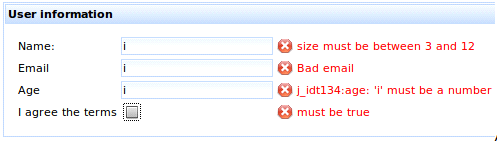
Use the <rich:message> and <rich:messages> components to display validation messages. The for attribute of the <rich:message> component references the id identifier of the input control being validated.
Example 6.3. Messages
<rich:panel header="User information">

   <h:panelGrid columns="3">


      <h:outputText value="Name:" />

      <h:inputText value="#{validationBean.name}" id="name">

         <rich:validator />

      </h:inputText>

      <rich:message for="name" />


      <h:outputText value="Email" />

      <h:inputText value="#{validationBean.email}" id="email">

         <rich:validator />

      </h:inputText>

      <rich:message for="email" />


      <h:outputText value="Age" />

      <h:inputText value="#{validationBean.age}" id="age">

         <rich:validator />

      </h:inputText>

      <rich:message for="age" />


      <h:outputText value="I agree the terms" />

      <h:selectBooleanCheckbox value="#{validationBean.agree}" id="agree">

         <rich:validator/>

      </h:selectBooleanCheckbox>

      <rich:message for="agree" />


   </h:panelGrid>

</rich:panel>
Failed validation checks are reported using <rich:message> components. The validation annotations in the managed bean are outlined in Example 6.1, “JSR-303 validation annotations”.
Use the event attribute to specify which event on the input control triggers the validation process. By default, the <rich:validator> behavior triggers validation when the input control is changed ( event="change").
Example 6.4. Validation triggers
<h:inputText value="#{userBean.name}">

   <rich:validator event="keyup"/>

</h:inputText>
The event attribute is changed to the keyup event, such that validation takes place after each key press.
If no client-side validation method exists for a registered server-side validator, Ajax fall-back is used. The <rich:validator> behavior invokes all available client-side validators. If all the client-side validators return valid, RichFaces performs an Ajax request to invoke the remaining validators on the server side.
-
client-behavior-renderer-type:org.richfaces.ClientValidatorRenderer -
behavior-id:org.richfaces.behavior.ClientValidator -
handler-class:org.richfaces.view.facelets.html.ClientValidatorHandler -
behavior-class:org.ajax4jsf.component.behavior.ClientValidatorImpl -
client-behavior-renderer-class:org.richfaces.renderkit.html.ClientValidatorRenderer
The <rich:graphValidator> component is used to wrap a set of input components related to one object. The object defined by the <rich:graphValidator> component can then be completely validated. The validation includes all object properties, even those which are not bound to the individual form components. Validation performed in this way allows for cross-field validation in complex forms.
Validation without model updates
The <rich:graphValidator> component performs a clone() method on the referenced bean instance during the validation phase. The cloned object is validated and triggers any required validation messages. As such, the model object remains clean, and the lifecycle is interrupted properly after the Process Validations phase.
Ensure the referenced object implements the Cloneable interface, and allows a deep clone if required.
The <rich:graphValidator> element must wrap all the input controls that are required to validate the object. The value attribute names the bean for the validating object.
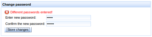
Example 6.5. Basic usage
The example demonstrates a simple form for changing a password. The two entered passwords must match, so a <rich:graphValidator> component is used for cross-field validation.
<h:form>

   <rich:graphValidator value="#{userBean}">

      <rich:panel header="Change password">

         <rich:messages/>

         <h:panelGrid columns="3">

            <h:outputText value="Enter new password:" />

            <h:inputSecret value="#{userBean.password}" id="pass"/>

            <rich:message for="pass"/>

            <h:outputText value="Confirm the new password:" />

            <h:inputSecret value="#{userBean.confirm}" id="conf"/>

            <rich:message for="conf"/>

         </h:panelGrid>

         <a4j:commandButton value="Store changes"

                            action="#{userBean.storeNewPassword}" />

      </rich:panel>

   </rich:graphValidator>

</h:form>
The input controls validate against the following bean:
@ManagedBean

@RequestScoped

public class UserBean implements Cloneable {


   @Size(min = 5, max = 15, message="Wrong size for password")

   private String password;

   @Size(min = 5, max = 15, message="Wrong size for confirmation")

   private String confirm;

   private String status = "";


   @AssertTrue(message = "Different passwords entered!")

   public boolean isPasswordsEquals() {

      return password.equals(confirm);

   }


   public void storeNewPassword() {

      FacesContext.getCurrentInstance().addMessage("", new FacesMessage(FacesMessage.SEVERITY_INFO, "Succesfully changed!", "Succesfully changed!"));

   }


   ...

}
When validation occurs, the whole object is validated against the annotation contstraints. The @AssertTrue annotation relies on the isPasswordsEqual() function to check whether the two entered passwords are equal.
If the entered passwords do not match, an error message is displayed:
This chapter covers those components that manage the processing of information, requests, and updates.
The <a4j:queue> component manages the JSF queue of Ajax requests. It provides additional options for a finer control of request processing.
The <a4j:queue> component works in the same basic way as the standard JSF queue. It can be enabled and disabled through the enabled attribute.
Requests from other libraries
The <a4j:queue> component does not handle standard JSF requests or requests from component libraries other than RichFaces.
Use the requestDelay attribute to add a delay between each request in the queue. Set the requestDelay attribute to the number of milliseconds to wait in between each request. Delaying requests avoids unnecessary processing for actions that would otherwise cause multiple requests, such as typing. Similar requests in the queue are combined while waiting for the request delay.
Example 7.1. Delaying requests
<a4j:queue requestDelay="1500"/>
The queue delays each request by 1500 milliseconds.
The client side can update unnecessarily if duplicate responses require similar updates. Set ignoreDupResponses="true" to ignore duplicate responses. With this setting, the client will not update from a request if a similar request is in the queue.
Define the queue scope to make it the default queue for all requests in that scope. The scope depends on the placement of the queue and any naming identifiers.
-
An unnamed
<a4j:queue>component placed outside any forms becomes the default queue for all requests on the page. -
An unnamed
<a4j:queue>component placed inside a form becomes the default queue for all requests within that form. -
Use the
nameidentifier attribute to name an<a4j:queue>component. Named queues can be accessed with the<a4j:attachQueue>behavior to act as a queue for specific components and behaviors. Refer to Section 7.1.7, “<a4j:attachQueue>” for details.
Example 7.2. Queue scopes
<a4j:queue name="viewQueue" requestDelay="2000"/>

<h:form>

    <a4j:queue name="formQueue" requestDelay="1500"/>

   ...

</h:form>
The queue outside the form is scoped to the view. The queue inside the form is scoped only to that form.
The <a4j:queue> component features several events relating to queuing actions in addition to the common JSF events:
-
The
completeevent is fired after a request is completed. The request object is passed as a parameter to the event handler, so the queue is accessible usingrequest.queueand the element which was the source of the request is accessible usingthis. -
The
requestqueueevent is fired after a new request has been added to the queue. -
The
requestdequeueevent is fired after a request has been removed from the queue.
-
component-type:org.richfaces.Queue -
component-class:org.richfaces.component.UIQueue -
component-family:org.richfaces.Queue -
renderer-type:org.richfaces.QueueRenderer
The <a4j:attachQueue> behavior is used together with a <a4j:queue> component to further customize queuing for particular components and behaviors. The <a4j:attachQueue> behavior can override the scope-wide queue settings for an individual component, or attach specific requests to a queue.
Queues can be scoped to various levels as described in Section 7.1.4, “Queue scopes”. Use an <a4j:attachQueue> behavior in the same scope as a queue to override the queue settings for a particular control.
Example 7.3. Overriding scope settings
<a4j:queue requestDelay="2000"/>

<h:form>

   <rich:panel>

      <h:inputText>

         <a4j:ajax event="keyup" />

      </h:inputText>

      <a4j:commandButton value="submit">

         <a4j:attachQueue requestDelay="0" />

      </a4j:commandButton>

   </rich:panel>

</h:form>
The request delay is overridden by the <a4j:attachQueue> behavior on the submit button.
Name an <a4j:queue> component using the name attribute. It can then be used by specific components through the <a4j:attachQueue> behavior. Use the name attribute of the <a4j:attachQueue> behavior to identify the name of the destination queue.
Example 7.4. Using a named queue
<a4j:queue name="viewQueue"/>

<h:form>

    <a4j:queue name="formQueue"/>

   <rich:panel>

      <a4j:commandButton value="submit">

         <a4j:attachQueue name="viewQueue" />

      </a4j:commandButton>

   </rich:panel>

</h:form>
The requests from the button are attached to the viewQueue queue, rather than the formQueue queue.
Use grouping to process multiple requests together. Specify a grouping identifier with the requestGroupingId attribute. Requests from multiple <a4j:attachQueue> behaviors can use the same identifier to group requests together.
Example 7.5. Grouping requests
<h:form>

   <a4j:queue requestDelay="2000"/>

   <h:inputText id="input1" value="#{queueBean.text1}">

      <a4j:attachQueue requestGroupingId="registrationForm"/>

   </h:inputText>

   <h:inputText id="input2" value="#{queueBean.text2}">

      <a4j:attachQueue requestGroupingId="registrationForm"/>

   </h:inputText>

</h:form>
Requests from both the text input boxes are grouped together with the registrationForm identifier.
The <a4j:log> component generates JavaScript that opens a debug window, logging application information such as requests, responses, and DOM changes.
The <a4j:log> component doesn’t require any additional attributes for basic functionality.
The mode attribute determines how the log appears on the page.
-
Set
mode="inline"to place the logging data in-line on the current page. This is the default setting. -
Set
mode="popup"to present the logging data in a new pop-up window. The window is set to be opened by pressing the key combination Ctrl+Shift+L; this can be partially reconfigured with thehotkeyattribute, which specifies the letter key to use in combination with Ctrl+Shift instead of L. -
Set
mode="console"to present the logging data in the JavaScript console of the browser.
The amount of data logged can be determined with the level attribute:
-
Set
level="ERROR"to log all errors. -
Set
level="FATAL"to log only fatal messages. -
Set
level="INFO"to log only informational messages. -
Set
level="WARN"to log only warning messages. -
Set
level="ALL"to log all data. This is the default setting.
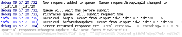
Log renewal
The log is automatically renewed after each Ajax request. It does not need to be explicitly re-rendered. To clear previous requests, implement a Clear button or similar functionality.
-
component-type:org.richfaces.AjaxLog -
component-class:org.richfaces.component.UIAjaxLog -
component-family:org.richfaces.AjaxLog -
renderer-type:org.richfaces.AjaxLogRenderer
The <a4j:log> component is intended primarily for debugging during development. However it is still possible to style the component if desired.
Table 7.1. Style classes (selectors) and corresponding skin parameters
| Class (selector) | Skin Parameters | Mapped CSS properties |
|---|---|---|
|
|
|
| No skin parameters. | |
| No skin parameters. | |
| No skin parameters. | |
| No skin parameters. | |
| No skin parameters. | |
| No skin parameters. | |
| No skin parameters. | |
| No skin parameters. | |
| No skin parameters. | |
| No skin parameters. | |
| No skin parameters. | |
| No skin parameters. | |
| No skin parameters. | |
| No skin parameters. | |
| No skin parameters. | |
The <a4j:status> component displays the status of current Ajax requests. The status can be either in progress, complete, or an error is shown after a failed request.
The text display can be customized depending on the current status.
-
The
startTextattribute defines the text shown after the request has been started and is currently in progress. Set the styles for the text with thestartStyleandstartStyleClassattributes. Alternatively, use thestartfacet to customize the text appearance. -
The
stopTextattribute defines the text shown once the request is complete. Set the styles for the text with thestopStyleandstopStyleClassattributes. Alternatively, use thestopfacet to customize the text appearance.If the
stopTextattribute is not defined, and no facet exists for the stopped state, the complete status is simply not shown. In this way, only the progress of the request is displayed to the user, along with any errors. -
The
errorTextattribute defines the text shown when an error has occurred. Set the styles for the text with theerrorStyleanderrorStyleClassattributes. Alternatively, use theerrorfacet to customize the text appearance.
The <a4j:status> component monitors the status of the region relevant to where it is placed.
- If unnamed and placed outside any forms, it monitors the status at the view level.
- If unnamed and placed inside a form, it monitors the status at the form level.
However, if identified with the name attribute, the <a4j:status> component can monitor any Ajax component or behavior. Use the status attribute on the Ajax component or behavior to reference the name identifier of the <a4j:status> component.
Example 7.8. Updating a referenced <a4j:status> component
<rich:panel>

   <f:facet name="header">

      <h:outputText value="User Details Panel" />

   </f:facet>

   <h:panelGrid columns="3">

      <h:outputText value="User name:" />

      <h:inputText value="#{userBean.name}">

         <a4j:ajax status="nameStatus" event="keyup" />

      </h:inputText>

      <a4j:status name="nameStatus">

         <f:facet name="start">

            <h:graphicImage value="/images/ai.gif" />

         </f:facet>

      </a4j:status>

      <h:outputText value="Address:" />

      <h:inputText value="#{userBean.address}">

         <a4j:ajax status="addressStatus" event="keyup" />

      </h:inputText>

      <a4j:status name="addressStatus">

         <f:facet name="start">

            <h:graphicImage value="/images/ai.gif" />

         </f:facet>

      </a4j:status>

   </h:panelGrid>

</rich:panel>
The <a4j:status> component can be controlled through the JavaScript API. The JavaScript API provides the following functions:
start()-
Switches status to the
startstate. stop()-
Switches status to the
stopstate. error()-
Switches status to the
errorstate.
Table of Contents
- 8. Rich inputs
- 9. Panels
- 10. Tables and grids
- 11. Trees
- 12. Menus and toolbars
- 13. Output and messages
- 14. Drag and drop
- 15. Layout and appearance
- 16. Functions
- 17. Functionality extension
This chapter details components for user input and interaction.
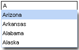
The <rich:autocomplete> component is an auto-completing input-box with built-in Ajax capabilities. It supports client-side suggestions, browser-like selection, and customization of the look and feel.
The auto-complete box is a standard JSF UIInput control with added validation.
The value attribute stores the text entered by the user for the auto-complete box. Suggestions shown in the auto-complete list can be specified using one of two different methods:
-
The
autocompleteMethodattribute points to a method which returns a list of suggestions according to a supplied prefix.
client and lazyClient modes
The prefix is normally ignored in client and lazyClient modes. In these modes, the component requests the suggestion list once only, and performs filtering on the client.
-
The
autocompleteListattribute points to a collection of suggestions.
Example 8.1. Defining suggestion values
- Using the
autocompleteMethodattribute -
<rich:autocomplete value="#{bean.state}" autocompleteMethod="#{bean.autocomplete}" />
The
<rich:autocomplete>component uses thebean.autocompletemethod to provide suggestions, based on the entered prefix. - Using the
autocompleteListattribute -
<rich:autocomplete value="#{bean.state}" autocompleteList="#{bean.suggestions}" />
The
<rich:autocomplete>component retrieve the suggestion list frombean.suggestions.
Use the mode attribute to determine how the suggestion list is requested:
-
The
clientsetting pre-loads data to the client and uses the input to filter the possible suggestions. -
The
ajaxsetting fetches suggestions with every input change using Ajax requests. -
The
lazyClientsetting pre-loads data to the client and uses the input to filter the possible suggestions. The filtering does not start until the input length matches a minimum value. Set the minimum value with theminCharsattribute. -
The
cachedAjaxsetting pre-loads data via Ajax requests when the input length matches a minimum value. Set the minimum value with theminCharsattribute. All suggestions are handled on the client until the input prefix is changed, at which point a new request is made based on the new input prefix.
Users can type into the text field to enter a value, which also searches through the suggestion items in the drop-down box. By default, the first suggestion item is selected as the user types. This behavior can be deactivated by setting selectFirst="false".
Setting autofill="true" causes the <rich:autocomplete> to fill the text field box with a matching suggestion as the user types.
To allow users to enter multiple values separated by specific characters, use the tokens attribute. As the user types, a suggestion will present as normal. When they enter a character specified as a token, this begins a new suggestion process, and the component only uses text entered after the token character for suggestions. For example, if tokens=", " is set, the <rich:autocomplete> component uses both the comma and space characters as tokens to separate entries. When the user enters a comma or a space, a new suggestion process begins.
Using tokens
When declaring tokens, avoid using any characters that are present in the list of suggestions. This may cause unexpected behavior as the user expects the character to match suggestions instead of separating suggested entries.
The <rich:autocomplete> component uses the JavaScript startsWith() method to create the list of suggestions. The filtering is performed on the client side. Alternatively, use the clientFilterFunction attribute to specify a custom filtering function. The custom function must accept two parameters: the subString parameter is the filtering value as typed into the text box by the user, and the value parameter is an item in the list of suggestions against which the subString must be checked. Each item is iterated through and passed to the function as the value parameter. The custom function must return a boolean value indicating whether the passed item meets the conditions of the filter, and the suggestion list is constructed from successful items.
Example 8.2. Customizing the filter
This example demonstrates how to use a custom filter with the clientFilterFunction attribute. The custom filter determines if the sub-string is contained anywhere in the suggestion item, instead of just at the start.
<script>

   function customFilter(subString, value){

      if(subString.length>=1) {

         if(value.indexOf(subString)!=-1)

            return true;

      }else return false;

   };

</script>

<h:form>

   <rich:autocomplete mode="client" minChars="0" autofill="false"

                      clientFilterFunction="customFilter"

                      autocompleteMethod="#{autocompleteBean.autocomplete}" />

</h:form>
The <rich:autocomplete> component can be controlled through the JavaScript API. The JavaScript API provides the following functions:
getValue()- Get the current value of the text field.
setValue(newValue)-
Set the value of the text field to the
newValuestring passed as a parameter. showPopup()- Show the pop-up list of completion values.
hidePopup()- Hide the pop-up list.
focus()- Focus the input element.
-
component-type:org.richfaces.Autocomplete -
component-class:org.richfaces.component.UIAutocomplete -
component-family:javax.faces.Input -
renderer-type:org.richfaces.AutocompleteRenderer -
handler-class:org.richfaces.view.facelets.AutocompleteHandler
Table 8.1. Style classes (selectors) and corresponding skin parameters
| Class (selector) | Skin Parameters | Mapped CSS properties |
|---|---|---|
|
|
|
|
| |
|
| |
|
|
|
|
|
|
|
| |
| No skin parameters. | |
|
|
|
|
| |
| No skin parameters. | |
| No skin parameters. | |
| No skin parameters. | |
| No skin parameters. | |
|
|
|
|
| |
| No skin parameters. | |
| No skin parameters. | |
| No skin parameters. | |
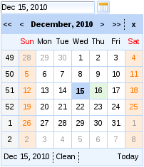
The <rich:calendar> component allows the user to enter a date and time through an in-line or pop-up calendar. The pop-up calendar can navigate through months and years, and its look and feel can be highly customized.
Basic usage of the <rich:calendar> component requires only the value attribute, which holds the currently selected date. Example 8.3, “Basic usage” shows a basic declaration, with the value pointing to a bean property. The bean property holds the selected date.
The <rich:calendar> component is presented as a pop-up by default, appearing as a text field with a button to expand the full pop-up calendar. To render the calendar in-line on the page instead, set popup="false. This displays the full calendar without the text field and display button.
To add keyboard support for manual input, set enableManualInput="true". To disable the calendar from any user input, set disabled="true".
To change the appearance of the display button from the standard calendar icon, use the buttonIcon and buttonDisabledIcon attributes to replace the icon with a specified file. Alternatively, use the buttonLabel attribute to display text on the button without an icon. If buttonLabel is specified then both the buttonIcon and buttonDisabledIcon attributes are ignored. To hide the text field box, set showInput="false".
The calendar features a button for locating today’s date on the calendar. This can be set to three different values using the todayControlMode attribute:
-
hidden, which does not display the button; -
select, the default setting, which scrolls the calendar to the current month and selects the date; and -
scroll, which scrolls the calendar to the month but does not select the date. -
inactive, which displays the date but performs no action when clicked.
To make the entire calendar read-only, set readonly="true". This allows months and years to be browsed through with the arrow controls, but dates and times cannot be selected.
Calendar also supports keyboard navigation, with the pop-up appearing when calendar gains focus, if enableManualInput="true" is set the pop-up can be brought up by the up arrow key.
- arrows keys - changing days/weeks
- pageDown, pageUp - changing months
- shift + pageDown, pageUp - changing years
- Enter - applying the selected date
- Esc - closing the popup
- T - selecting today
- C - clearing the selection
-
H - opening the Time editor
- up/down arrows - increasing/decreasing value
- TAB - switching between hours, minutes, seconds, am/pm
- Esc - closing the editor
- Enter - saving the value and closing the editor
The <rich:calendar> component can additionally allow a time of day to be specified with the date. After selecting a date the option to set a time becomes available. The default time can be set with the defaultTime attribute. If the time is altered and a new date is selected, it will not reset unless resetTimeOnDateSelect="true" is specified.
The date selection feature is activated if the time is present in the datePattern attribute for the calendar.
Support for seconds
In RichFaces 4, the <rich:calendar> component supports times that include seconds. Previous versions of RichFaces only supported hours and minutes.
Date and time strings can be formatted in a set pattern. Use standard locale formatting strings specified by ISO 8601 (for example, d/M/yy HH:mm a) with the datePattern attribute to format date and time strings.
To set the locale of the calendar, use the locale attribute. The calendar will render month and day names in the relevant language. For example, to set the calendar to the US locale, specify locale="en/US".
Use an application resource bundle to localize the calendar control labels. Define the following strings in the resource bundle:
-
The
RICH_CALENDAR_APPLY_LABELstring is the label for the button. -
The
RICH_CALENDAR_TODAY_LABELstring is the label for the button. -
The
RICH_CALENDAR_CLOSE_LABELstring is the label for the button. -
The
RICH_CALENDAR_OK_LABELstring is the label for the button. -
The
RICH_CALENDAR_CLEAN_LABELstring is the label for the button. -
The
RICH_CALENDAR_CANCEL_LABELstring is the label for the button.
Alternatively, use the org.richfaces.calendar resource bundle with Java Archive files ( JAR s) defining the same properties.
The look and feel of the <rich:calendar> component can be customized through the use of a data model on the server side. The component supports two different ways of loading data from the server side through defining the mode attribute.
When the mode attribute is not specified, the component uses the client mode. The client mode loads an initial portion of data within a set date range. The range can be defined by using the preloadDateRangeBegin and preloadDateRangeEnd attributes. Additional data requests for months outside the range are not sent.
Alternatively, with mode="ajax" the <rich:calendar> requests portions of data from the data model every time the month is switched. The data model can be defined through the dataModel attribute, which points to an object that implements the CalendarDataModel interface. If the dataModel attribute is not defined or has a value of null, the ajax mode functions the same as the client mode.
Instead of using a data model, the <rich:calendar> component can be customized on the client-side using JavaScript. Use the dayClassFunction attribute to reference the function that determines the CSS style class for each day cell. Use the dayDisableFunction to reference the function that enables or disables a day cell. Example 8.4, “Client-side customization” demonstrates how client-side customization can be used to style different days in a calendar.
Example 8.4. Client-side customization
<style>
.everyThirdDay {
background-color: gray;
}
.weekendBold {
font-weight: bold;
font-style: italic;
}
</style>
<script type="text/javascript">
var curDt = new Date();
function disablementFunction(day){
if (day.isWeekend) return false;
if (curDt==undefined){
curDt = day.date.getDate();
}
if (curDt.getTime() - day.date.getTime() < 0) return true;
else return false;
}
function disabledClassesProv(day){
if (curDt.getTime() - day.date.getTime() >= 0) return 'rf-ca-boundary-dates';
var res = '';
if (day.isWeekend) res+='weekendBold ';
if (day.day%3==0) res+='everyThirdDay';
return res;
}
</script>
<rich:calendar dayDisableFunction="disablementFunction"
dayClassFunction="disabledClassesProv"
boundaryDatesMode="scroll" />
The <rich:calendar> component can be controlled through the JavaScript API. The JavaScript API provides the following functions:
showPopup()- Expand the pop-up calendar element.
hidePopup()- Collapse the pop-up calendar element.
switchPopup()- Invert the state of the pop-up calendar element.
getValue()- Return the selected date value of the calendar.
getValueAsString()- Return the selected date value of the calendar as a formatted string.
setValue(newValue)-
Set the selected date value to the
newValuedate passed as a parameter. If the new date is not in the currently displayed month, a request is performed to display the correct month. resetValue()- Clear the selected date value.
today()- Select today’s date.
getCurrentMonth()- Return the number of the month currently being displayed.
getCurrentYear()- Return the number of the year currently being displayed.
showSelectedDate()- Show the calendar month that contains the currently selected date.
showDateEditor()- Show the date editor pop-up.
hideDateEditor()- Hide the date editor pop-up.
showTimeEditor()- Show the time editor pop-up.
hideTimeEditor()- Hide the time editor pop-up.
focus()- Focus the input element.
-
component-type:org.richfaces.Calendar -
component-class:org.richfaces.component.UICalendar -
component-family:org.richfaces.Calendar -
renderer-type:org.richfaces.CalendarRenderer -
handler-class:org.richfaces.view.facelets.CalendarHandler
Table 8.2. Style classes (selectors) and corresponding skin parameters
| Class (selector) | Skin Parameters | Mapped CSS properties |
|---|---|---|
|
|
|
| No skin parameters. | |
|
|
|
|
| |
|
| |
|
| |
|
|
|
|
| |
|
| |
|
| |
|
|
|
|
| |
|
| |
|
| |
|
| |
|
|
|
|
| |
|
| |
|
| |
|
|
|
|
| |
|
| |
|
| |
|
|
|
|
| |
|
| |
|
| |
|
| |
|
|
|
|
| |
|
| |
| No skin parameters. | |
| No skin parameters. | |
|
|
|
|
| |
|
| |
|
| |
|
|
|
|
| |
| No skin parameters. | |
|
|
|
|
| |
|
| |
|
| |
| No skin parameters. | |
|
|
|
|
| |
|
|
|
|
| |
|
|
|
|
| |
| No skin parameters. | |
|
|
|
|
| |
|
| |
|
| |
|
|
|
|
| |
| No skin parameters. | |
|
|
|
|
| |
|
|
|
|
| |
|
| |
|
|
|
| No skin parameters. | |
| No skin parameters. | |
| No skin parameters. | |
|
|
|
|
|
|
| No skin parameters. | |
|
|
|
|
| |
|
|
|
|
| |
|
|
|
|
| |
|
| |
|
|
|
|
| |
|
| |
| No skin parameters. | |
|
|
|
|
| |
|
|
|
|
| |
|
| |
|
|
|
|
| |
|
| |
|
| |
|
|
|
|
| |
| No skin parameters. | |
| No skin parameters. | |
|
|
|
|
| |
|
| |
|
| |
|
|
|
|
| |
|
|
|
|
| |
|
|
|
The <rich:editor> component is used for creating a WYSIWYG editor on a page.
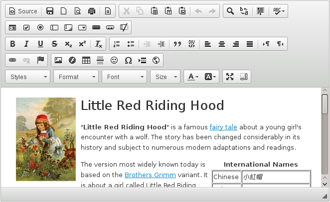
<rich:editor> component is based on the CKEditor implementation.
When rendering a <rich:editor>, a textarea is rendered to the page and once the page is completely loaded (ready state), the textarea is enhanced using a CKEditor script and replaced with a full-featured WYSIWYG editor.
Basic usage requires the value attribute to point to the expression for the current value of the component.
Example 8.5. Basic usage of <rich:editor>
<rich:editor value="#{backingBean.editedValue}" />


<h:outputText escape="false" value="#{backingBean.editedValue}" />
Note that the editor produces HTML markup and to be able to render it’s output, the markup needs to be unescaped (as with <h:outputText> component in example above).
The dimensions of the editor can be managed using width and height attributes.
The readonly attribute can be used to switch the editor into a read-only mode.
The tabindex attribute specifies the position of the current element in the tabbing order for the current document.
Note
The ResourceServlet has to be registered for the url-pattern /org.richfaces.resources/\* in order to serve the editor resources (JavaScript, CSS, images) correctly. Check the RichFaces Developer’s Guide for further details.
Note
The <rich:editor> requires the <h:body> component to be present in the view and must be an ancestor of the editor in order for the resource dependencies to render correctly.
Note
The <rich:editor> inside a <rich:popupPanel> requires the domElementAttachment attribute of the popup panel to be set to "parent".
There are several options to customize the style of the editor:
-
style, styleClass: customizes the style of the editor and underlying textarea -
editorStyle, editorClass: customizes the style of the CKEditor instance -
textareaStyle, textareaClass: customizes the style of the underlying textarea
The <rich:editor> is skinnable using the JavaScript API of the CKeditor. Refer to the CKeditor documentation on installing skins for details on how to customize the look and feel of the editor component.
The basic set of <rich:editor> attributes allows you to support common use-cases for a WYSIWYG editor. However the underlying CKEditor implementation supports many more configuration options.
Use the config attribute to define any of these advanced configuration options supported by the CKEditor. This configuration is written in JavaScript object format and its value is interpolated for EL expressions (making configuration dynamic).
There are two ways to define the configuration: the config attribute or a facet named config. The facet takes precedence over attribute when both are defined.
<rich:editor config="startupFocus: #{userPreferences.startupFocus}" />


<rich:editor>

    <f:facet name="config">

        startupFocus: #{userPreferences.startupFocus}

    </f:facet>

</rich:editor>
In the above samples, the <rich:editor> is configured to take focus after loading the page as defined by the userPreference bean. Definitions using either attribute or facet are equivalent.
Note
For further configuration options, refer to CKEditor 4 Developer Guide and CKEditor 4 configuration reference.
The <rich:editor> supports a toolbar attribute, which is able to change the configuration of the toolbar’s button set. There are two configurations available: basic (default), full (enables all of the features).
It is also possible to define a custom toolbar using the CKEditor toolbar configuration in a config facet:
<rich:editor toolbar="CustomToolbar">

    <f:facet name="config">

        toolbar_CustomToolbar:

        [

        { name: 'document', items : [ 'NewPage','Preview' ] },

        { name: 'clipboard', items : [ 'Cut','Copy','Paste','-','Undo','Redo' ] },

        { name: 'editing', items : [ 'Find','Replace','-','SelectAll','-','Scayt' ] },

        { name: 'insert', items : [ 'Image', 'Flash', 'Table', 'HorizontalRule',

                 'Smiley', 'SpecialChar', 'PageBreak', 'Iframe' ] },

                '/',

        { name: 'styles', items : [ 'Styles','Format' ] },

        { name: 'basicstyles', items : [ 'Bold','Italic','Strike','-','RemoveFormat' ] },

        { name: 'paragraph', items : [ 'NumberedList','BulletedList','-','Outdent','Indent','-','Blockquote' ] },

        { name: 'links', items : [ 'Link','Unlink','Anchor' ] },

        { name: 'tools', items : [ 'Maximize' ] }

        ]

        </f:facet>

</rich:editor>
Note that toolbar name ( CustomToolbar) needs to match the toolbar_<name> configuration option.
The <rich:editor> comes with a lang attribute which allows you to change the localization of the editor. For language configuration options, refer to http://www.w3.org/TR/html4/struct/dirlang.html.
The lang attribute influences following settings:
- underlying textarea - specifies the i18n settings for received and submitted content
- editor value - specifies the i18n settings for value edited in WYSIWYG mode
- default settings of localization of editor controls and interface
However the interface first localized using the browser configuration (usually determined by client system settings). To force the editor to use a specific localization for the interface, you use the advanced CKEditor configuration option language, as in following sample:
<rich:editor lang="fr" config="language: 'fr'" />
The above sample forces the editor to use a french interface, suppressing the browser preferred settings.
The <rich:editor> component produces set of events for handling component specific interaction.
-
init- once the editor is initialized and ready to be handle user interaction -
focus- once the editor is focused -
blur- once the editor is blurred -
change- fired on blur event when editor content has been changed after previous focus -
dirty- fired immediately after editor content has been changed
Events can be handled either by registering a JavaScript event handler or by attaching JSF behavior:
<rich:editor value="#{backingBean.editorValue}">

    <a4j:ajax event="change" render="editorOutput" />

    <a4j:ajax event="dirty" render="editorOutput">

        <a4j:attachQueue requestDelay="1000" />

    </a4j:ajax>

</rich:editor>


<a4j:outputPanel id="editorOutput">

    <h:outputText escape="false" value="#{backingBean.editorValue}" />

</a4j:outputPanel>
The example above shows the editor and its output, which is updated every second after each instant change or immediately after user focus leaves the editor area.
The <rich:editor> component can be controlled through the JavaScript API. The JavaScript API provides the following functions:
getValue()- Get the current value of the input control.
setValue(newValue)-
Set the value of the input control to the
newValuestring passed as a parameter. getEditor()-
Returns the CKEditor object instance associated to given
<rich:editor>component. getInput()- Returns the associated textarea.
focus()- Gives focus to this component
blur()- Removes focus from this component
isFocused()-
Returns
trueif this component is focused isDirty()-
Returns
trueif editor is focused and it was edited from last focus event (reset by blur event, by usingsetValue(newValue)call and when component is re-rendered) isValueChanged()-
Returns
trueif the control’s value has been changed from the default (reset bysetValue(newValue)call and when component is re-rendered) isRead0nly()-
Returns
trueif editor content is editable. setRead0nly(readonly)-
When
readonlyistrue, editor will be switched to editable state. Otherwise, it will be switched to readonly state.
-
component-type:org.richfaces.Editor -
component-class:org.richfaces.component.UIEditor -
component-family:org.richfaces.Editor -
renderer-type:org.richfaces.EditorRenderer
Table 8.3. Style classes (selectors) and corresponding skin parameters
| Class (selector) | Skin Parameters | Mapped CSS properties |
|---|---|---|
|
|
|
|
|
|
|
|
|
|
| |
|
|
|
|
| |
|
| |
|
| |
|
| |
|
|
|
|
|
|
|
| |
|
|
|
|
| |
|
|
|
|
| |
|
| |
|
| |
|
| |
|
|
|
|
|
The <rich:fileUpload> component allows the user to upload files to a server. It features multiple uploads, progress bars, restrictions on file types, and restrictions on sizes of the files to be uploaded.
Basic usage requires the fileUploadListener attribute. Use the attribute to reference a listener function on the server side after each file is uploaded. The listener should process files as required, such as storing them in the session/db/filesystem/ directory. The component itself does not store uploaded files, so if the listener is not implemented they are not stored anywhere.
Files are uploaded to either the temporary folder (different for each operating system) or to RAM (random-access memory), depending on the value of the org.richfaces.fileUpload.createTempFiles context parameter of the web.xml settings file for the project. If the parameter is set to true, the files are uploaded to the temporary folder.
To limit the maximum size of the uploaded files, define the byte size with the maxfileSize parameter on the component or with org.richfaces.fileUpload.maxRequestSize context parameter of the web.xml settings file for the project.
Locally set maxFileSize (if not set to 0) will override the global maxRequestSize.
Note
Your server might require additional configuration, e.g. WildFly allows requests only up to 10 MB by default.
Any file is accepted by rich:fileUpload component by default. There are several parameters available for limiting what can user upload to the server:
maxFilesQuantity-
The
maxFilesQuantityparameter defines maximum number of files allowed to be uploaded. After a number of files in the list equals to the value of this attribute, "Add" button disappears and nothing could be uploaded even if you clear the whole list. In order to upload files again you should rerender the component. acceptedTypes-
The
acceptedTypesparameter defines comma separated list of file extensions accepted by component. The component does not provide any feedback when rejecting file. For introducing feedback for rejection, useontyperejectedparameter. ontyperejected-
The
ontyperejectedparameter defines event handler when file does not meet conditions stated byacceptedTypesparameter. maxFileSize-
The
maxFileSizeparameter defines the maximum allowed size for a file. onsizerejected-
The
onsizerejectedparameter defines event handler when file exceeds the size defined bymaxFileSizeparameter.
Set the immediateUpload attribute to true to upload files as soon as they are added to the list, rather than waiting for the user to press the button.
The text labels used in the component can be completely customized. Labels for the various controls of the component can be set using the following parameters:
addLabel-
The
addLabelparameter sets the label for the button. clearAllLabel-
The
clearAllLabelparameter sets the label for the button. clearLabel-
The
clearLabelparameter sets the label for the button. uploadLabel-
The
uploadLabelparameter sets the label for the button.
The <rich:fileUpload> component provides a built-in progress bar to indicate the progress of each file that is uploaded. This progress bar can be replaced with a <rich:progressBar> component added to the progress facet. Refer to Section 13.8, “<rich:progressBar>” for details on the <rich:progressBar> component.
To disable the <rich:fileUpload> component, use the disabled attribute.
There are a number of event handlers specific to the <rich:fileUpload> component:
-
filesubmitis triggered before a file is uploaded. -
uploadcompleteis triggered after all files in the list have finished uploading.
-
component-type:org.richfaces.FileUpload -
component-class:org.richfaces.component.UIFileUpload -
component-family:org.richfaces.FileUpload -
renderer-type:org.richfaces.FileUploadRenderer -
handler-class:org.richfaces.view.facelets.FileUploadHandler
Table 8.4. Style classes (selectors) and corresponding skin parameters
| Class (selector) | Skin Parameters | Mapped CSS properties |
|---|---|---|
|
|
|
|
| |
|
|
|
| No skin parameters. | |
| No skin parameters. | |
| No skin parameters. | |
|
|
|
|
| |
|
|
|
|
| |
|
| |
|
|
|
|
| |
|
|
|
|
| |
|
| |
|
|
|
|
| |
|
|
|
|
| |
|
| |
|
|
|
|
| |
|
|
|
|
| |
|
| |
|
|
|
| No skin parameters. | |
|
|
|
|
| |
|
| |
|
|
|
|
| |
|
| |
|
|
|
|
| |
|
| |
| No skin parameters. | |
| No skin parameters. | |
The <rich:inplaceInput> component allows information to be entered in-line in blocks of text, improving readability of the text. Multiple input regions can be navigated with keyboard navigation. The component has three functional states: the view state, where the component displays its initial setting, such as "click to edit"; the edit state, where the user can input text; and the "changed" state, where the new value for the component has been confirmed but can be edited again if required.
Basic usage requires the value attribute to point to the expression for the current value of the component. Validation and conversion rules for the JSF UIInput control apply as usual.
When in the initial view state, the starting label can be set using the defaultLabel attribute. Alternatively, if the initial value is already set through the value attribute, this is displayed instead.
Once the user has entered text, the label is stored in the model specified by the value attribute. The use of the default label and value is shown in Example 8.7, “Default label and value”.
Example 8.7. Default label and value
<rich:inplaceInput value="#{bean.value}" defaultLabel="click to edit"/>
By default, the event to switch the component to the edit state is a single mouse click. This can be changed using the editEvent attribute to specify a different event.
The user can confirm and save their input in multiple ways:
- By default, pressing the Enter key will confirm and save the input.
-
If
showControls="true"is set, buttons for confirming or canceling are added to the component. -
If
saveOnBlur="true"is set, the input is saved on the component’s blur event.
Pressing the Esc key cancels editing in all cases.
The <rich:inplaceInput> component can be controlled through the JavaScript API. The JavaScript API provides the following functions:
getValue()- Get the current value of the input control.
setValue(newValue)-
Set the value of the input control to the
newValuestring passed as a parameter. isEditState()-
Returns
trueif the control is currently in the edit state, orfalseif the control is currently in the view state. isValueChanged()-
Returns
trueif the control’s value has been changed from the default. save()- Saves the current item as the control’s value.
cancel()- Cancel editing the value.
getInput()- Return the DOM element for the input.
open()- Turn on the editable state and focus the input.
-
component-type:org.richfaces.InplaceInput -
component-class:org.richfaces.component.UIInplaceInput -
component-family:org.richfaces.InplaceInput -
renderer-type:org.richfaces.InplaceInputRenderer
Table 8.5. Style classes (selectors) and corresponding skin parameters
| Class (selector) | Skin Parameters | Mapped CSS properties |
|---|---|---|
|
|
|
|
| |
| No skin parameters. | |
| No skin parameters. | |
| No skin parameters. | |
|
|
|
|
| |
|
| |
|
| |
|
|
|
|
| |
| No skin parameters. | |
|
|
|
|
| |
|
|
|
|
| |
| No skin parameters. | |
| No skin parameters. | |
| No skin parameters. | |
| No skin parameters. | |
The <rich:inplaceSelect> component is similar to the <rich:inplaceInput> component, except that the <rich:inplaceSelect> component uses a drop-down selection box to enter text instead of a regular text field. Changes can be rendered either in-line or for the whole block, and inputs can be focused with keyboard navigation. The component is based on the JSF UISelectOne component, so all the standard rules for value definition, processing, conversion, and validation apply.
The component has three functional states:
- When in the view state, the component displays its initial setting, such as "click to edit".
- When in the edit state, the user can select a value from a drop-down list.
- When in the changed state, the new value for the component has been confirmed, but it can be edited again if required.
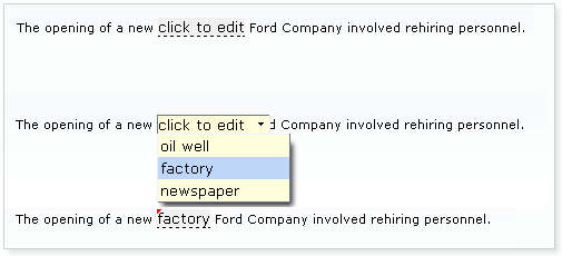
Basic usage requires the value attribute to point to the expression for the current value of the component and a list of items. The list of items can be defined using the JSF components <f:selectItem/> and <f:selectItems/>.
Example 8.8. Defining list items for <rich:inplaceSelect>
<rich:inplaceSelect value="#{bean.inputValue}" defaultLabel="click to edit" >

    <f:selectItems value="#{bean.selectItems}" />

    <f.selectItem itemValue="1" itemLabel="Item 1" />

    <f.selectItem itemValue="2" itemLabel="Item 2" />

    <f.selectItem itemValue="3" itemLabel="Item 3" />

    <f.selectItem itemValue="4" itemLabel="Item 4" />

</rich:inplaceSelect>
When in the initial view state, the starting label can be set using the defaultLabel attribute, such as defaultLabel="click to edit". Alternatively, if the initial value is already set through the value attribute, this is displayed instead.
By default, the event to switch the component to the edit state is a single mouse click. This can be changed using the editEvent attribute to specify a different event. When switching to edit mode, the drop-down list of possible values will automatically be displayed; this can be deactivated by setting openOnEdit="false".
Once a new value for the control is saved, the state switches to the "changed" state. Saving a new value for the control can be performed in a number of ways:
-
Once the user selects an item from the drop-down list, the item is saved as the new control value. This is the default setting. If
saveOnSelect="false"is set, the component applies the selected item but remains in the edit state so a different selection could be chosen. The value is then applied when the Enter key is pressed. -
If
saveOnBlur="true"is set, the selected item is saved as the new control value when the control loses focus. -
If
showControls="true"is set, buttons are added to the control to confirm or cancel the selection. The new control value is only saved once the user confirms the selection using the button.
Pressing the Esc key cancels editing in all cases.
The <rich:inplaceSelect> component can be controlled through the JavaScript API. The JavaScript API provides the following functions:
getValue()- Get the current value of the select control.
setValue(newValue)-
Set the value of the select control to the
newValuestring passed as a parameter. isEditState()-
Returns
trueif the control is currently in the edit state, orfalseif the control is currently in the view state. isValueChanged()-
Returns
trueif the control’s value has been changed from the default. save()- Saves the current item as the control’s value.
cancel()- Cancel editing the value.
getInput()- Return the input entered into the control by the user.
getLabel()- Return the default label of the control.
setLabel(newLabel)-
Set the default label of the control to the
newLabelstring passed as a parameter. showPopup()- Show the pop-up list of possible values.
hidePopup()- Hide the pop-up list.
open()- Turn on the editable state and focus the input.
-
component-type:org.richfaces.InplaceSelect -
component-class:org.richfaces.component.UIInplaceSelect -
component-family:org.richfaces.Select -
renderer-type:org.richfaces.InplaceSelectRenderer
Table 8.6. Style classes (selectors) and corresponding skin parameters
| Class (selector) | Skin Parameters | Mapped CSS properties |
|---|---|---|
|
|
|
|
| |
| No skin parameters. | |
| No skin parameters. | |
| No skin parameters. | |
|
|
|
|
| |
|
| |
|
| |
|
|
|
|
|
|
| No skin parameters. | |
| No skin parameters. | |
| No skin parameters. | |
|
|
|
|
| |
|
|
|
|
| |
| No skin parameters. | |
| No skin parameters. | |
|
|
|
|
| |
| No skin parameters. | |
| No skin parameters. | |
| No skin parameters. | |
| No skin parameters. | |
| No skin parameters. | |
The <rich:inputNumberSlider> component provides a slider for changing numerical values. Optional features include control arrows to step through the values, a tool-tip to display the value while sliding, and a text field for typing the numerical value which can then be validated against the slider’s range.
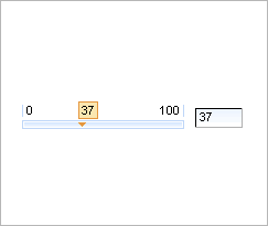
Basic use of the component with no attributes specified will render a slider with a minimum value of 0, a maximum of 100, and a gradient step of 1, together with a text field for typing the desired numerical value. The slider is labeled with the minimum and maximum boundary values, and a tool-tip showing the current value is shown while sliding the slider. The value attribute is used for storing the currently selected value of the slider. Standard conversion and validation for the JSF UIInput component is applied.
The text field can be removed by setting showInput="false".
The properties of the slider can be set with the attributes minValue, maxValue, and step.
The minimum and maximum labels on the slider can be hidden by setting showBoundaryValues="false". The tool-tip showing the current value can be hidden by setting showToolTip="false".
Arrow controls can be added to either side of the slider to adjust the value incrementally by setting showArrows="true". Clicking the arrows move the slider indicator in that direction by the gradient step, and clicking and holding the arrows moves the indicator continuously. The time delay for each step when updating continuously can be defined using the delay attribute.
The <rich:inputNumberSlider> component can be controlled through the JavaScript API. The JavaScript API provides the following functions:
getValue()- Get the current value of the slider control.
setValue(newValue)-
Set the value of the slider control to the
newValueinteger passed as a parameter. increase()- Increase the value of the slider control by the gradient step amount.
decrease()- Decrease the value of the slider control by the gradient step amount.
focus()- Focus the input element.
-
component-type:org.richfaces.InputNumberSlider -
component-class:org.richfaces.component.html.HtmlInputNumberSlider -
component-family:org.richfaces.Input -
renderer-type:org.richfaces.InputNumberSliderRenderer
Table 8.7. Style classes (selectors) and corresponding skin parameters
| Class (selector) | Skin Parameters | Mapped CSS properties |
|---|---|---|
| No skin parameters. | |
|
|
|
|
| |
| No skin parameters. | |
|
|
|
|
| |
|
| |
|
| |
|
|
|
|
| |
|
| |
|
| |
|
|
|
|
| |
|
| |
| No skin parameters. | |
| No skin parameters. | |
| No skin parameters. | |
| No skin parameters. | |
| No skin parameters. | |
| No skin parameters. | |
| No skin parameters. | |
| No skin parameters. | |
|
|
|
|
| |
|
| |
|
| |
|
| |
The <rich:inputNumberSpinner> component is a single-line input field with buttons to increase and decrease a numerical value. The value can be changed using the corresponding directional keys on a keyboard, or by typing into the field.
Basic use of the component with no attributes specified will render a number spinner with a minimum value of 1, a maximum value of 100, and a gradient step of 1.
These default properties can be re-defined with the attributes minValue, maxValue, and step respectively. The starting value of the spinner is the minimum value unless otherwise specified with the value attribute.
When changing the value using the buttons, raising the value above the maximum or cause the spinner to restart at the minimum value. Likewise, when lowering below the minimum value the spinner will reset to the maximum value. This behavior can be deactivated by setting cycled="false", which will cause the buttons to stop responding when the reach the maximum or minimum value.
The ability to change the value by typing into the text field can be disabled by setting enableManualInput="false".
The <rich:inputNumberSpinner> component can be controlled through the JavaScript API. The JavaScript API provides the following functions:
getValue()- Get the current value of the spinner control.
setValue(newValue)-
Set the value of the spinner control to the
newValueinteger passed as a parameter. increase()- Increase the value of the spinner control by the gradient step amount.
decrease()- Decrease the value of the spinner control by the gradient step amount.
focus()- Focus the input element.
-
component-type:org.richfaces.InputNumberSpinner -
component-class:org.richfaces.component.html.HtmlInputNumberSpinner -
component-family:org.richfaces.Input -
renderer-type:org.richfaces.InputNumberSpinnerRenderer
Table 8.8. Style classes (selectors) and corresponding skin parameters
| Class (selector) | Skin Parameters | Mapped CSS properties |
|---|---|---|
|
|
|
|
|
|
|
| |
|
| |
|
| |
|
|
|
|
| |
| No skin parameters. | |
| No skin parameters. | |
The <rich:select> component provides a drop-down list box for selecting a single value from multiple options. The <rich:select> component can be configured as a <rich:autocomplete>, where it will accept typed input. The component also supports keyboard navigation. The <rich:select> component functions similarly to the JSF UISelectOne component.
The <rich:select> can optionally be used in an auto-completing mode, where the values in the drop-down list are provided dynamically using either the autocompleteMethod or autocompleteList attributes.
If these attributes are omitted, the component operates in the traditional non-auto-completing mode.
Refer to the individual attribute documentation to see which attributes are applicable only with an auto-completing select list.
Additionally refer to the <rich:autocomplete> section for details on configuring the ajax behaviour of the <rich:select> component.
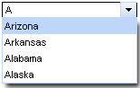
Simple usage of the <rich:select> component requires the value attribute to store the selected value. Additionally, child tags to manage the list of selections are required. The child tags can either be a number of <f:selectItem> tags or a <f:selectItems> tag which points to a data model containing a list of selection items. The value attribute is used to store the current selection.
In auto-completing mode var attribute is required, <f:selectItems> tag is not used.
Example 8.9. Selection items
- Using multiple
<f:selectItem>tags
<rich:select>

   <f:selectItem itemValue="0" itemLabel="Option 1" />

   <f:selectItem itemValue="1" itemLabel="Option 2" />

   <f:selectItem itemValue="2" itemLabel="Option 3" />

   <f:selectItem itemValue="3" itemLabel="Option 4" />

   <f:selectItem itemValue="4" itemLabel="Option 5" />

</rich:select>
- Using a single
<f:selectItems>tag
<rich:select>

   <f:selectItems value="#{bean.options}" />

</rich:select>
- Auto-completing functionality
<rich:select autocompleteList="#{bean.suggestions}" var="s" />
The arrow keys on a keyboard can be used to highlight different items in the list. If the control loses focus or the Enter key is pressed, the highlighted option is chosen as the value and the list is closed. Pressing the Esc key will close the list but not change the value.
The <rich:select> component allows the user to type into a text field to scroll through or filter the list. By default, the <rich:select> component functions as a drop-down list with no manual input. To add keyboard support for manual input, set enableManualInput="true".
Once the user begins typing, the first available matching option is highlighted. If the typed text does not match any values in the list, no value is chosen and the drop-down list displays as empty. Other keyboard interaction remains the same as the basic drop-down list.
The standard JSF <h:selectOne> component does not offer this extended keyboard support. However, since the <rich:select> component is still based on the JSF UISelectOne component, it will not accept a value that does not match any items in the drop-down list. If an invalid value is entered, it is highlighted as erroneous and validation messages appear with the submission.
Use the defaultLabel attribute to set a place-holder label, such as defaultLabel="select an option".
Server-side processing occurs in the same manner as for an <h:selectOneMenu> component. As such, custom objects used for selection items should use the same converters as for an <h:selectOneMenu> component.
The <rich:select> component can be controlled through the JavaScript API. The JavaScript API provides the following functions:
getValue()- Get the current value of the text field.
setValue(newValue)-
Set the value of the text field to the
newValuestring passed as a parameter. getLabel()- Return the default label of the control.
showPopup()- Show the pop-up list of completion values.
hidePopup()- Hide the pop-up list.
focus()- Focus the input element.
-
component-type:org.richfaces.Select -
component-class:org.richfaces.component.UISelect -
component-family:org.richfaces.Select -
renderer-type:org.richfaces.SelectRenderer -
handler-class:org.richfaces.view.facelets.AutocompleteHandler
Table 8.9. Style classes (selectors) and corresponding skin parameters
| Class (selector) | Skin Parameters | Mapped CSS properties |
|---|---|---|
| No skin parameters. | |
|
|
|
|
|
|
| No skin parameters. | |
|
|
|
|
| |
|
| |
|
|
|
| No skin parameters. | |
|
|
|
|
| |
| No skin parameters. | |
| No skin parameters. | |
| No skin parameters. | |
| No skin parameters. | |
| No skin parameters. | |
The <rich:orderingList> is a component for ordering items in a list (client-side).
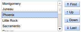
To use the <rich:orderingList> bind the value attribute to the list to be ordered. The var attribute specifies a variable to use when iterating through the list values. The var attribute is used within the itemLabel to assign the object value to be displayed. Similarly, the var attribute is used within the itemValue attribute to specify the object value mapped by the display value. If the itemValue is not of type String, a converter must be specified for this itemValue using either the converter attribute, or a nested <f:converter> tag.
Example 8.10. ItemLabel/ItemValue use
- Using the
itemLabelanditemValueattributes
<rich:orderingList value="#{listSelectBean.capitals}" var="capital" itemValue="#{capital}" itemLabel="#{capital.name}">

    <f:converter converterId="CapitalsConverter" />

</rich:orderingList>
The arrow keys on a keyboard can be used to highlight different items in the list. Pressing the ctrlmodifier with the arrow keys will move the selected item up or down within the list.
In addition to the above simple itemLabel display, the <rich:orderingList> supports a columnar layout of the itemValues to be sorted. This is achieved by nesting <rich:column> tags within the orderingList, and referencing the var attribute from within the <rich:column> EL.
Example 8.11. Nested <rich:column> tags
- Using
<rich:column>tags nested within the<rich:orderingList>
<rich:orderingList value="#{listSelectBean.capitals}" var="capital"  listWidth="300px">

    <f:converter converterId="CapitalsConverter" />

    <rich:column>

        <f:facet name="header">Flag</f:facet>

        <h:graphicImage value="#{capital.stateFlag}" alt="flag"  width="33"/>

    </rich:column>

    <rich:column>

        <f:facet name="header">Name</f:facet>

        #{capital.name}

    </rich:column>

    <rich:column>

        <f:facet name="header">State</f:facet>

        #{capital.state}

    </rich:column>

</rich:orderingList>
When using <rich:column> tags to layout the <rich:orderingList> items, the itemLabel attribute is irrelevant, and may be left out.
The <rich:orderingList> component can be controlled through the JavaScript API. The JavaScript API provides the following functions:
getList()-
Returns the javascript list object backing the
<rich:orderingList>. This list can be used to select/unselect item(s). up()- Move the currently selected item(s) up one step.
down()- Move the currently selected item(s) down one step.
upTop()- Move the currently selected item(s) to the top of the list.
downBottom()- Move the currently selected item(s) to the bottom of the list.
toggleButtons()- Activate/de-activate the orderingList buttons based on the current component item state.
focus()- Focus the list (to use keyboard navigation).
-
component-type:org.richfaces.OrderingList -
component-class:org.richfaces.component.UIOrderingList -
component-family:org.richfaces.SelectMany -
renderer-type:org.richfaces.OrderingListRenderer
Table 8.10. Style classes (selectors) and corresponding skin parameters
| Class (selector) | Skin Parameters | Mapped CSS properties |
|---|---|---|
| No skin parameters. | |
| No skin parameters. | |
|
|
|
|
| |
|
| |
|
| |
| No skin parameters. | |
|
|
|
|
| |
|
| |
|
| |
|
| |
|
|
|
|
| |
|
| |
|
|
|
| No skin parameters. | |
|
|
|
|
| |
| No skin parameters. | |
| No skin parameters. | |
The <rich:pickList> is a component for selecting items from a list. Additionally, it allows for the selected items to be ordered (client-side). From the client side perspective, items are added/removed from the source list, and removed/added to the target list. However it is important to note that the server-side source of items is never modified, and always represents the list of all items available for selection. If the list of unselected items is required, it can be determined by subtracting the collection of all selected items from the collection of all available items.
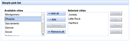
To use the <rich:pickList> bind the value attribute to the target list, where the selected items will be stored. The list of source items is provided by nesting a SelectItem source, such as a <f:selectItems> tag, or a list of <f:selectItem> tags. If the itemValue of the SelectItem is not of type String, a converter must be specified for this itemValue using either the converter attribute, or a nested <f:converter> tag.
Example 8.12. Simple pickList use
- Using the default
SelectItemitemLabel to generate the pickList source and target items.
<rich:pickList value="#{listSelectBean.selectedCapitals}"

               sourceCaption="Available cities" targetCaption="Selected cities"

               listWidth="170px" listHeight="100px"

               orderable="true">

    <f:selectItems value="#{listSelectBean.capitals}" var="capital" itemValue="#{capital}" itemLabel="#{capital.name}" />

    <f:converter converterId="CapitalsConverter" />

</rich:pickList>
The items in the target list can be ordered client-side by setting the orderable attribute of the <rich:pickList> tag to true. The arrow keys on a keyboard can then be used to highlight different items in the target list, and pressing the ctrlmodifier with the arrow keys will move the selected item up or down within the target list.
In addition to the above simple SelectItem itemLabel display, the <rich:pickList> supports a columnar layout of the items to be selected. This is achieved by adding a var attribute used to represent the collection of nested SelectItems, and nesting <rich:column> tags within the pickList. The var attribute of the <f:selectItem> is then referenced from within the <rich:column> EL.
Example 8.13. Nested <rich:column> tags
- Using
<rich:column>tags nested within the<rich:pickList>
<rich:pickList value="#{listSelectBean.selectedCapitals}" var="capital" listHeight="200px">

    <f:selectItems value="#{listSelectBean.capitals}" />

    <f:converter converterId="CapitalsConverter" />

    <rich:column>

        <f:facet name="header">Flag</f:facet>

        <h:graphicImage value="#{capital.stateFlag}" alt="flag" width="33"/>

    </rich:column>

    <rich:column>

        <f:facet name="header">Name</f:facet>

        #{capital.name}

    </rich:column>

    <rich:column>

        <f:facet name="header">State</f:facet>

        #{capital.state}

    </rich:column>

</rich:pickList>
The <rich:pickList> component can be controlled through the JavaScript API. The JavaScript API provides the following functions:
getSourceList()-
Returns the javascript list object backing the
<rich:pickList>source list. This list can be used to select/unselect item(s). getTargetList()-
Returns the javascript list object backing the
<rich:pickList>target list. This list can be used to select/unselect item(s). add()- Add the currently selected items to the target list, removing them from the source list.
addAll()- Add all the source items to the target list, removing them from the source list.
remove()- Remove the currently selected items from the target list, adding them to the source list.
removeAll()- Remove all the source items from the target list, adding them to the source list.
toggleButtons()- Activate/de-activate the pickList buttons based on the current component item state.
focus()- Focus the source list (to use keyboard navigation).
-
component-type:org.richfaces.PickList -
component-class:org.richfaces.component.UIPickList -
component-family:org.richfaces.SelectMany -
renderer-type:org.richfaces.PickListRenderer
Table 8.11. Style classes (selectors) and corresponding skin parameters
| Class (selector) | Skin Parameters | Mapped CSS properties |
|---|---|---|
| No skin parameters. | |
|
|
|
|
| |
|
| |
|
| |
| No skin parameters. | |
|
|
|
|
| |
|
| |
|
| |
|
| |
|
|
|
|
| |
|
| |
|
|
|
| No skin parameters. | |
|
|
|
|
| |
| No skin parameters. | |
| No skin parameters. | |
This chapter details those components which act as panels and containers to hold groups of other components.
The <rich:panel> component is a bordered panel with an optional header.
No attributes need to be listed for basic usage. a <rich:panel> without any attributes defined renders a bordered region with no header.
To add a header to the panel, use the header attribute to specify the text to appear in the header. Alternatively the header can be constructed using a header facet. Example 9.1, “Adding a header” demonstrates the two different approaches.
Example 9.1. Adding a header
<rich:panel header="This is the panel header">

    <h:outputText value="This is the panel content" />

</rich:panel>
<rich:panel>

    <f:facet name="header">

        <h:outputText value="This is the panel header">

    </f:facet>

    <h:outputText value="This is the panel content" />

</rich:panel>
Both the examples render an identical panel.
-
component-type:org.richfaces.Panel -
component-class:org.richfaces.component.UIPanel -
component-family:org.richfaces.Panel -
renderer-type:org.richfaces.PanelRenderer
Table 9.1. Style classes (selectors) and corresponding skin parameters
| Class (selector) | Skin Parameters | Mapped CSS properties |
|---|---|---|
|
|
|
|
| |
|
|
|
|
| |
|
| |
|
| |
|
| |
|
|
|
|
| |
|
|
The <rich:accordion> is a series of panels stacked on top of each other, each collapsed such that only the header of the panel is showing. When the header of a panel is clicked, it is expanded to show the content of the panel. Clicking on a different header will collapse the previous panel and epand the selected one. Each panel contained in a <rich:accordion> component is a <rich:accordionItem> component.

The <rich:accordion> component requires no attributes for basic usage. The component can contain any number of <rich:accordionItem> components as children. The headers of the <rich:accordionItem> components control the expanding and collapsing when clicked. Only a single <rich:accordionItem> can be displayed at a time. Refer to Section 9.2.9, “<rich:accordionItem>” for details on the <rich:accordionItem> component.
Form elements required
All <rich:tabPanel> components should be wrapped in a form element when using either ajax or server mode, as usual for submitting components.
The activeItem attribute holds the active panel name. This name is a reference to the name identifier of the active child <rich:accordionItem> component.
The switching mode for performing submissions is determined by the switchType attribute, which can have one of the following three values:
server-
The default setting. Activation of a
<rich:accordionItem>component causes the parent<rich:accordion>component to perform a common submission, completely refreshing the page. Only one panel at a time is rendered to the client side. ajax-
Activation of a
<rich:accordionItem>component causes the parent<rich:accordion>component to perform an Ajax form submission, and the content of the panel is rendered. Only one panel at a time is rendered to the client side. client-
Activation of a
<rich:accordionItem>component causes the parent<rich:accordion>component to perform updates on the client side. All the panels are rendered on the client side during the initial page render. JavaScript changes the styles such that one panel component becomes hidden while the other is shown.
Icons for the accordion can be chosen from a set of standard icons. They can be set for the left and right side of the panel and for active, inactive state.
itemActiveLeftIcon,itemActiveRightIcon- These attributes determine the icons for the active item.
itemInactiveLeftIcon,itemInactiveRightIcon- These attributes determine the icons for the inactive item.
itemDisabledLeftIcon,itemDisabledRightIcon- These attributes determine the icons for the disabled item.
The standard icons are shown in Figure 9.4, “<Standard icons>”. Alternatively, point the icon attributes to the paths of image files. The image files are then used as icons.
Any icons specified by child <rich:accordionItem> component overwrite the relevant icons declared with the parent <rich:accordion> component.
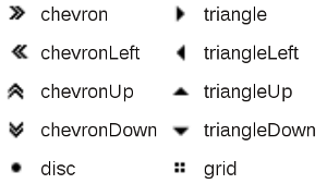
In addition to the standard Ajax events and HTML events, the <rich:accordion> component uses the client-side events common to all switchable panels:
-
The
itemchangeevent points to the function to perform when the switchable item is changed. -
The
beforeitemchangeevent points to the function to perform when before the switchable item is changed.
The <rich:accordion> component uses the server-side events common to all switchable panels:
-
The
ItemChangeEventevent occurs on the server side when an item is changed through Ajax using theservermode. It can be processed using theItemChangeListenerattribute. Refer to Section 9.6.6, “<rich:itemChangeListener>” for details on the<rich:itemChangeListener>tag.
The <rich:accordion> component can be controlled through the JavaScript API. The JavaScript API provides the following functions, which are common to all switchable panels:
getItems()- Return an array of the items contained in the accordion control.
getItemsNames()- Return an array of the names of the items contained in the accordion control.
switchToItem(itemName)-
Switch to and display the item identified by the
itemNamestring passed as a parameter. firstItem(),prevItem(),nextItem(),lastItem()- Get the name of the first item, the previous item, the next item, or the last item.
-
component-type:org.richfaces.Accordion -
component-class:org.richfaces.component.UIAccordion -
component-family:org.richfaces.Accordion -
renderer-type:org.richfaces.AccordionRenderer -
handler-class:org.richfaces.view.facelets.html.TogglePanelTagHandler
Table 9.2. Style classes (selectors) and corresponding skin parameters
| Class (selector) | Skin Parameters | Mapped CSS properties |
|---|---|---|
|
|
|
|
| |
|
|
|
|
| |
|
| |
|
| |
|
| |
|
| |
| No skin parameters. | |
|
|
|
| No skin parameters. | |
|
|
|
|
| |
|
| |
|
| |
| No skin parameters. | |
| No skin parameters. | |
| No skin parameters. | |
| No skin parameters. | |
| No skin parameters. | |
The <rich:accordionItem> component is a panel for use with the <rich:accordion> component. <rich:accordionItem> components can be added dynamically using iteration models with the <c:forEach> tag.
Basic usage of the <rich:accordionItem> component requires the header attribute, which provides the text on the panel header. The panel header is all that is visible when the accordion item is collapsed.
Alternatively the header facet could be used in place of the header attribute. This would allow for additional styles and custom content to be applied to the tab.
Icons for the accordion item are inherited from the parent <rich:accordion> component. Refer to Section 9.2.3, “Appearance” for details on icon attributes. Alternatively, the item’s icons can be re-defined at the <rich:accordionItem> component level, and these settings will be used instead of the parent component’s settings.
In addition to the standard HTML events, the <rich:accordionItem> component uses the client-side events common to all switchable panel items:
-
The
enterevent points to the function to perform when the mouse enters the panel. -
The
leaveevent points to the function to perform when the mouse leaves the panel.
The <rich:collapsiblePanel> component is a collapsible panel that shows or hides content when the header bar is activated. It is a simplified version of <rich:togglePanel> component.
Basic usage requires the header content is specified either by the header attribute, or by the headerExpanded / headerCollapsed facets. Additionally the panel requires content to display when it is expanded. Content is added as child elements like a standard panel.
The switching mode for performing submissions is determined by the switchType attribute, which can have one of the following three values:
server-
This is the default setting. The
<rich:collapsiblePanel>component performs a common submission, completely refreshing the page. Only one panel at a time is rendered to the client side. ajax-
The
<rich:collapsiblePanel>component performs an Ajax form submission, and only the content of the panel is refreshed. Only one panel at a time is rendered to the client side. client-
The
<rich:collapsiblePanel>component changes the state on the client side without any additional requests being sent.
The appearance of the <rich:collapsiblePanel> component can be customized using facets. The headerExpanded and headerCollapsed CSS classes are used to style the appearance of the panel when it is expanded and collapsed respectively.
Icons for the collapsible panel can be chosen from a set of standard icons. They can be set for the left and right side of the panel and for expanded and collapsed state.
leftCollapsedIcon,rightCollapsedIcon- These attributes determine the icons for the collapsed state.
leftExpandedIcon,rightExpandedIcon- These attributes determine the icons for the expanded state.
The standard icons are shown in Figure 9.4, “<Standard icons>”. Alternatively, point the icon attributes to the paths of image files. The image files are then used as icons. Use "none" to hide the default icons.
The <rich:collapsiblePanel> component uses the following unique server-side events:
-
The
PanelToggleEventevent occurs on the server side when the<rich:collapsiblePanel>component is expanded or collapsed in either theajaxorservermodes. It can be processed using thepanelTogglerListenerattribute.
The <rich:collapsiblePanel> component can be controlled through the JavaScript API. The JavaScript API provides the following functions:
switchPanel()- Switch the state of the collapsible panel (expanded or collapsed).
expand()- Expand this collapsible panel.
collapse()- Collapse this collapsible panel.
isExpanded()-
Returns
trueif this collapsible panel is expanded.
-
component-type:org.richfaces.CollapsiblePanel -
component-class:org.richfaces.component.UICollapsiblePanel -
component-family:org.richfaces.CollapsiblePanel -
renderer-type:org.richfaces.CollapsiblePanelRenderer -
handler-class:org.richfaces.view.facelets.html.CollapsiblePanelTagHandler
Table 9.3. Style classes (selectors) and corresponding skin parameters
| Class (selector) | Skin Parameters | Mapped CSS properties |
|---|---|---|
|
|
|
|
| |
|
|
|
|
| |
|
| |
|
| |
|
| |
| No skin parameters. | |
| No skin parameters. | |
|
|
|
|
| |
|
| |
| No skin parameters. | |
| No skin parameters. | |
| No skin parameters. | |
| No skin parameters. | |
| No skin parameters. | |
Use the <rich:panelToggleListener> tag to register a PanelToggleListener class on a parent <rich:collapsiblePanel> component. The class provided as a listener must implement the org.richfaces.event.PanelToggleListener interface. The processPanelToggle method accepts an org.richface.event.PanelToggleEvent event as a parameter.
The <rich:popupPanel> component provides a pop-up panel or window that appears in front of the rest of the application. The <rich:popupPanel> component functions either as a modal window which blocks interaction with the rest of the application while active, or as a non-modal window. It can be positioned on the screen, dragged to a new position by the user, and re-sized.
The <rich:popupPanel> does not require any compulsory attributes, though certain use cases require different attributes.
If show="true" then the pop-up panel will display when the page is first loaded.
The <rich:popupPanel> component can be shown and hidden manually using the show() and hide() methods from the JavaScript API. These can be implemented using two different approaches:
-
Using the
<rich:componentControl>component. For details on the component, refer to Section 17.1, “<rich:componentControl>”. -
Using the
rich:componentfunction. For details on the function, refer to Section 16.2, “rich:component”.
For explicit referencing when using the functions, the component can be given an id identifier.
Example 9.2, “<rich:popupPanel> example” demonstrates basic use of both the <rich:componentControl> component and the rich:component function to show and hide the <rich:popupPanel> component.
Example 9.2. <rich:popupPanel> example
<h:commandButton value="Show the panel">

    <rich:componentControl target="popup" operation="show" />

</h:commandButton>

...

<rich:popupPanel id="popup">

    <p><a href="#" onclick="#{rich:component('popup')}.hide()">Hide the panel</a></p>

</rich:popupPanel>
Placement
The <rich:popupPanel> component is usually rendered in front of any other objects on the page. This is achieved by attaching the component to the <body> element of the page, and setting a very high "z-index" (the stack order of the object). This approach is taken because relatively-positioned elements could still overlap the pop-up panel if they exist at higher levels of the DOM hierarchy, even if their z-index is less than the <rich:popupPanel> component.
If the <rich:popupPanel> is to participate in submitting child components/behaviors, then a form element must be nested within the <rich:popupPanel>. Alternatively, if no overlapping elements exist, the <rich:popupPanel> component can be reattached to its original DOM element by setting domElementAttachment to either parent or form.
By default, the <rich:popupPanel> appears as a modal window that blocks interaction with the other objects on the page. To implement a non-modal window instead, set modal="false". This will allow interaction with other objects outside the pop-up panel.
The pop-up panel can be both re-sized and re-positioned by the user. The minimum possible size for the panel can be set with the minWith and minHeight attributes. These abilities can be deactivated by setting resizable or movable to false as necessary.
The pop-up panel can be automatically sized when it is shown if the autosized attribute is set to true.
Embedded objects in the panel
Embedded objects inserted into the HTML with the <embed> tag could be rendered in front of a <rich:popupPanel> component in some browsers. The <rich:popupPanel> component can be forcibly rendered in front of these objects by setting overlapEmbedObjects="true".
However, due to the additional script processing required when using the overlapEmbedObjects attribute, applications can suffer from decreased performance. As such, overlapEmbedObjects should only be set to true when <embed> or <object> tags are being used in the parent view. Do not set it to true for applications that do not require it.
A panel header and associated controls can be added to the <rich:popupPanel> component through the use of facets. The header facet displays a title for the panel, and the controls facet can be customized to allow window controls such as a button for closing the pop-up. Example 9.3, “Header and controls” demonstrates the use of the facets.
Example 9.3. Header and controls
<h:commandLink value="Show pop-up">

    <rich:componentControl target="popup" operation="show" />

</h:commandLink>

...

<rich:popupPanel id="popup" modal="false" autosized="true" resizeable="false">

    <f:facet name="header">

        <h:outputText value="The title of the panel" />

    </f:facet>

    <f:facet name="controls">

        <h:graphicImage value="/pages/close.png" style="cursor:pointer" onclick="#{rich:component('popup')}.hide()" />

    </f:facet>

    <p>

        This is the content of the panel.

    </p>

</rich:popupPanel>
The <rich:popupPanel> component can contain any other component just like a normal panel.
Contents of the <rich:popupPanel> component which are positioned relatively may be trimmed if they extend beyond the borders of the pop-up panel. For certain in-line controls this behavior may be preferable, but for other dynamic controls it could be undesirable. If the trimOverlayedElements attribute is set to false then child components will not be trimmed if they extend beyond the borders of the pop-up panel. For example, if using a calendar, select, or other pop-up component, set trimOverlayedElements="false".
The <rich:popupPanel> component can be controlled through the JavaScript API. The JavaScript API provides the following functions:
getTop()- Return the top co-ordinate for the position of the pop-up panel.
getLeft()- Return the left co-ordinate for the position of the pop-up panel.
moveTo(top,left)-
Move the pop-up panel to the co-ordinates specified with the
topandleftparameters. resize(width,height)-
Resize the pop-up panel to the size specified with the
widthandheightparameters. show()- Show the pop-up panel.
hide()- Hide the pop-up panel.
-
component-type:org.richfaces.PopupPanel -
component-class:org.richfaces.component.UIPopupPanel -
component-family:org.richfaces.PopupPanel -
renderer-type:org.richfaces.PopupPanelRenderer
Table 9.4. Style classes (selectors) and corresponding skin parameters
| Class (selector) | Skin Parameters | Mapped CSS properties |
|---|---|---|
| No skin parameters. | |
| No skin parameters. | |
|
|
|
|
| |
|
|
|
|
|
|
|
| |
|
| |
|
| |
|
|
|
|
| |
|
| |
|
|
|
| No skin parameters. | |
| No skin parameters. | |
The <rich:tabPanel> component provides a set of tabbed panels for displaying one panel of content at a time. The tabs can be highly customized and themed. Each tab within a <rich:tabPanel> container is a <rich:tab> component. Refer to Section 9.5.7, “<rich:tab>” for further details on the <rich:tab> component.
Form elements required
All <rich:tabPanel> components should be wrapped in a form element when using either ajax or server mode, as usual for submitting components.
The activeItem attribute holds the active tab name. This name is a reference to the name identifier of the active child <rich:tab> component.
The switching mode for performing submissions is determined by the switchType attribute, which can have one of the following three values:
server-
The default setting. Activation of a
<rich:tab>component causes the parent<rich:tabPanel>component to perform a common submission, completely refreshing the page. Only one tab at a time is rendered to the client side. ajax-
Activation of a
<rich:tab>component causes the parent<rich:tabPanel>component to perform an Ajax form submission, and the content of the tab panel is refreshed. Only one tab at a time is rendered to the client side. client-
Activation of a
<rich:tab>component causes the parent<rich:tabPanel>component to update on the client side. All the tabs are rendered to the client during the initial page render. JavaScript changes the styles such that one tab becomes hidden while the other is shown.
In addition to the standard Ajax events and HTML events, the <rich:tabPanel> component uses the client-side events common to all switchable panels:
-
The
itemchangeevent points to the function to perform when the switchable item is changed. -
The
beforeitemchangeevent points to the function to perform when before the switchable item is changed.
The <rich:tabPanel> component uses the server-side events common to all switchable panels:
-
The
ItemChangeEventevent occurs on the server side when an item is changed through Ajax using theservermode. It can be processed using theItemChangeListenerattribute. Refer to Section 9.6.6, “<rich:itemChangeListener>” for details on the<rich:itemChangeListener>tag.
The <rich:tabPanel> component can be controlled through the JavaScript API. The JavaScript API provides the following functions, which are common to all switchable panels:
getItems()- Return an array of the tabs contained in the tab panel.
getItemsNames()- Return an array of the names of the tabs contained in the tab panel.
switchToItem(itemName)-
Switch to and display the item identified by the
itemNamestring passed as a parameter. firstItem(),prevItem(),nextItem(),lastItem()- Get the name of the first item, the previous item, the next item, or the last item.
-
component-type:org.richfaces.TabPanel -
component-class:org.richfaces.component.UITabPanel -
component-family:org.richfaces.TabPanel -
renderer-type:org.richfaces.TabPanelRenderer -
handler-class:org.richfaces.view.facelets.html.TogglePanelTagHandler
Table 9.5. Style classes (selectors) and corresponding skin parameters
| Class (selector) | Skin Parameters | Mapped CSS properties |
|---|---|---|
|
|
|
|
| |
|
| |
|
|
|
| No skin parameters. | |
|
|
|
|
|
|
|
| |
| No skin parameters. | |
|
|
|
|
|
|
|
| |
| No skin parameters. | |
|
|
|
|
| |
|
| |
|
| |
|
|
|
|
| |
|
| |
|
|
|
|
| |
|
|
|
|
| |
|
| |
|
| |
The <rich:tab> component represents an individual tab inside a <rich:tabPanel> component, including the tab’s content. Clicking on the tab header will bring its corresponding content to the front of other tabs.
Basic usage of the <rich:tab> component requires only the tab header and tab content. No additional attributes are required.
The header attribute provides the text on the tab header. The content of the tab is then detailed inside the <rich:tab> tags.
Alternatively, the header facet could be used in place of the header attribute. This would allow custom components to be applied to the tab header. The component also supports three facets to customize the appearance depending on the current state of the tab:
headerActivefacet- This facet is used when the tab is the currently active tab.
headerInactivefacet- This facet is used when the tab is not currently active.
headerDisabledfacet-
This facet is used when the tab is disabled.
The
headerfacet is used in place of any state-based facet that has not been defined.
The switching mode for performing submissions can be inherited from the switchType attribute of the parent <rich:tabPanel> component, or set individually for each <rich:tab> component. Refer to Section 9.5, “<rich:tabPanel>” for details on the switchType attribute.
An individual tab can be disabled by setting disabled="true". Disabled tabs cannot be activated or switched to.
In addition to the standard HTML events, the <rich:tab> component uses the client-side events common to all switchable panel items:
-
The
enterevent points to the function to perform when the mouse enters the tab. -
The
leaveattribute points to the function to perform when the mouse leaves the tab.
-
component-type:org.richfaces.Tab -
component-class:org.richfaces.component.UITab -
component-family:org.richfaces.Tab -
renderer-type:org.richfaces.TabRenderer
The <rich:tab> component uses the same styles as those applied to the parent <rich:tabPanel> component. Refer to Section 9.5.6, “Style classes and skin parameters” for details.
The <rich:togglePanel> component is used as a base for the other switchable components, the <rich:accordion> component and the <rich:tabPanel> component. It provides an abstract switchable component without any associated markup. As such, the <rich:togglePanel> component could be customized to provide a switchable component when neither an accordion component or a tab panel component is appropriate.
The <rich:togglePanel> component acts as a wrapper for multiple <rich:togglePanelItem> components. Each child component is displayed after being activated with the <rich:toggleControl> behavior.
Refer to Section 9.6.7, “<rich:toggleControl>” and Section 9.6, “<rich:togglePanel>” for details on how to use the components together.
The initial state of the component can be configured using the activeItem attribute, which points to a child component to display. Alternatively, if no activeItem attribute is defined, the initial state will be blank until the user activates a panel component with a connected <rich:toggleControl> behavior.
The child components are shown in the order in which they are defined in the view, as shown in Example 9.4, “Basic usage”.
Form elements required
All <rich:tabPanel> components should be wrapped in a form element when using either ajax or server mode, as usual for submitting components.
Example 9.4. Basic usage
<rich:togglePanel id="layout" activeItem="item1">

   <rich:togglePanelItem id="item1">

      <!--content-->

   </rich:togglePanelItem>

   <rich:togglePanelItem id="item2">

      <!--content-->

   </rich:togglePanelItem>

</rich:togglePanel>

<h:commandButton>

   <rich:toggleControl targetPanel="layout"/> <!--cycles through the states-->

</h:commandButton>
All the switchable components ( <rich:togglePanel>, <rich:accordion> component and the <rich:tabPanel>) can leverage the <a4j:repeat> tag to dynamically create child components. This can be useful when the definition of the panel items is determined at run-time from a backing bean list.
The switching mode for performing submissions is determined by the switchType attribute, which can have one of the following three values:
server-
The default setting. Activation of a child component causes the parent
<rich:togglePanel>component to perform a common submission, completely refreshing the page. Only one child at a time is rendered to the client side. ajax-
Activation of a child component causes the parent
<rich:togglePanel>component to perform an Ajax form submission, and the content of the panel is refreshed. Only one child at a time is rendered to the client side. client-
Activation of a child component causes the parent
<rich:togglePanel>component to update on the client side. All the items are rendered to the client side during the initial page render. JavaScript changes the styles such that one child component becomes hidden while the other is shown.
The <rich:togglePanel> component can be controlled through the JavaScript API. The JavaScript API provides the following functions, which are common to all switchable panels:
getItems()- Return an array of the items contained in the toggle panel.
getItemsNames()- Return an array of the names of the items contained in the toggle panel.
switchToItem(itemName)-
Switch to and display the item identified by the
itemNamestring passed as a parameter. firstItem(),prevItem(),nextItem(),lastItem()- Get the name of the first item, the previous item, the next item, or the last item.
-
component-type:org.richfaces.TogglePanel -
component-class:org.richfaces.component.UITogglePanel -
component-family:org.richfaces.TogglePanel -
renderer-type:org.richfaces.TogglePanelRenderer -
handler-class:org.richfaces.view.facelets.html.TogglePanelTagHandler
Use the <rich:itemChangeListener> tag to register an ItemChangeListener class on a parent panel component. The class provided as a listener must implement the org.richfaces.event.ItemChangeListener interface. The processItemChange method accepts an org.richface.event.ItemChangeEvent event as a parameter.
The <rich:itemChangeListener> tag can be used with any of the switchable panel components:
-
<rich:togglePanel>(refer to Section 9.6, “<rich:togglePanel>”) -
<rich:accordion>(refer to Section 9.2, “<rich:accordion>”) -
<rich:tabPanel>(refer to Section 9.5, “<rich:tabPanel>”) -
<rich:panelMenu>(refer to Section 12.4, “<rich:panelMenu>”)
The <rich:toggleControl> behavior can be attached to any interface component, whether inside or outside the controlled panel itself. It works with a <rich:togglePanel> component to switch between different <rich:togglePanelItem> components. Refer to Section 9.6, “<rich:togglePanel>” and Section 9.6.8, “<rich:togglePanelItem>” for details on how to use the components together.
The <rich:toggleControl> implements the JSF BehaviorHolder component, which provides events to attached components and behaviors.
If the <rich:toggleControl> component is positioned inside a <rich:togglePanel> component, no panel attachment attributes need to be defined, as the control is assumed to switch through the <rich:togglePanelItem> components of its parent <rich:togglePanel> component.
A <rich:toggleControl> component can be located outside the <rich:togglePanel> component it needs to switch. Where this is the case, the <rich:togglePanel> is identified using the targetPanel attribute.
The <rich:toggleControl> component can switch the attached <rich:togglePanel> component in multiple ways:
-
By default, the
<rich:toggleControl>component will cycle through<rich:togglePanelItem>components in the order they are defined within the view.
Example 9.5. Default switching
<rich:togglePanel id="layout">

   <rich:togglePanelItem>

      <!--content-->

   </rich:togglePanelItem>

   <rich:togglePanelItem>

      <!--content-->

   <rich:togglePanelItem>

</rich:togglePanel>

<h:commandButton>

   <rich:toggleControl targetPanel="layout"/> <!--cycles through the states-->

</h:commandButton>
-
The next item to switch to can be explicitly defined by including a
<rich:toggleControl>component within a<rich:togglePanelItem>component. Point thetargetItemto the<rich:togglePanelItem>to switch to when the state is next changed.
Example 9.6. Explicit switching
<rich:togglePanel activeItem="item1">

   <rich:togglePanelItem id="item1">

      <!--content-->

      <h:commandButton>

         <rich:toggleControl targetItem="item2"> <!--switches to item2 -->

      </h:commandButton>

   </rich:togglePanelItem>

   <rich:togglePanelItem id="item2">

      <!--content-->

      <h:commandButton>

         <rich:toggleControl targetItem="item1"> <!--switches to item1 -->

      </h:commandButton>

   <rich:togglePanelItem>

</rich:togglePanel>
-
Alternatively, use the
targetItemattribute with keywords to switch items. The@first,@prev,@next, and@lastkeywords switch to the first item, the previous item, the next item, and the last item respectively.
Example 9.7. Keyword-based switching
<rich:togglePanel activeItem="item1">

   <rich:togglePanelItem id="item1">

      <!--content-->

      <h:commandButton>

         <rich:toggleControl targetItem="@next"> <!--switches to next item (item2)-->

      </h:commandButton>

   </rich:togglePanelItem>

   <rich:togglePanelItem id="item2">

      <!--content-->

      <h:commandButton>

         <rich:toggleControl targetItem="@prev"> <!--switches to previous item (item1)-->

      </h:commandButton>

   <rich:togglePanelItem>

</rich:togglePanel>
-
client-behavior-renderer-type:org.richfaces.component.behavior.ToggleControl -
behavior-id:org.richfaces.component.behavior.ToggleControl -
handler-class:org.richfaces.view.facelets.html.CustomBehaviorHandler -
behavior-class:org.richfaces.component.behavior.ToggleControl -
client-behavior-renderer-class:org.richfaces.renderkit.html.ToggleControlRenderer
The <rich:togglePanelItem> component is a switchable panel for use with the <rich:togglePanel> component. Use the <rich:togglePanelItem> component to define the content for a panel using nested components. Switching between <rich:togglePanelItem> components is handled by the <rich:toggleControl> behavior.
This chapter covers all components related to the display of tables and grids.
The non-visual <a4j:repeat> component is used to iterate through a data model. The component renders child content for every iteration according to the current object data.
The <a4j:repeat> component extends the standard UIRepeat component to allow partial updates within iterations while sending Ajax requests. The component acts as a base for all the data iteration components detailed in this chapter.
The contents of the collection are determined using Expression Language ( EL). The data model for the contents is specified with the value attribute. The var attribute names the object to use when iterating through the collection. This object is then referenced in the relevant child components. Example 10.1, “<a4j:repeat> example” shows how to use <a4j:repeat> to maintain a simple table.
Example 10.1. <a4j:repeat> example
<table>

    <tbody>

        <a4j:repeat value="#{repeatBean.items}" var="item">

            <tr>

                <td><h:outputText value="#{item.code}" id="item1" /></td>

                <td><h:outputText value="#{item.price}" id="item2" /></td>

            </tr>

        </a4j:repeat>

    </tbody>

</table>
Each row of a table contains two cells: one showing the item code, and the other showing the item price. The table is generated by iterating through items in the repeatBeans.items data model.
The <a4j:repeat> component uses other attributes common to iteration components, such as the first attribute for specifying the first item for iteration, and the rows attribute for specifying the number of rows of items to display.
Specific cells, rows, and columns can be updated without sending Ajax requests for the entire collection. Components that cause the change can specify which part of the table to update through the render attribute. The render attribute specifies which part of a table to update. The updated parts relate to where the action component is placed relative to the table:
- Action components inside the table
-
Use
render=componentIDwhere the component identified bycomponentIDis in the same row as the action component. The action component updates the single specified component, as demonstrated in Example 10.2, “Update a single component”.
Example 10.2. Update a single component
<rich:column>

   <a4j:commandButton render="col"></a4j:commandButton>

</rich:column>

<rich:column>

   <h:outputText value="#{car.model}" id="col"/>

</rich:column>
- Action components outside the table
-
Use
render=tableId:@rows([rowId]):componentIdto specify the component to update. The action component updates the component with an identifier ofcomponentId, which is within the row with an identifier ofrowId, which is within the table with an identifier oftableId.
Instead of a specific identifier, any of the references could be variables, as demonstrated in Example 10.3, “Use variables to specify references”.
Example 10.3. Use variables to specify references
render=tableId:@rows(bean.rowToUpdate):cellId
The @rows function accepts a collection of row keys to be updated. Similarly the table@body shorthand can be used to specify that the entire table body should be updated.
The <rich:dataTable> component is used to render a table, including the table’s caption. It works in conjunction with the <rich:column> and <rich:columnGroup> components to list the contents of a data model.
<rich:extendedDataTable>
The <rich:dataTable> component does not include extended table features, such as data scrolling (including lazy Ajax loading), row selection, and column reordering. These features are available as part of the <rich:extendedDataTable> component; refer to Section 10.6, “<rich:extendedDataTable>” for further details.
The value attribute points to the data model, and the var attribute specifies a variable to use when iterating through the data model.
In addition, the table requires a set of <rich:column> components to define the content of the table.
The first attribute specifies which item in the data model to start from, and the rows attribute specifies the number of items to list. The header, footer, and caption facets can be used to display text, and to customize the appearance of the table through skinning. demonstrates a simple table implementation.
The keepSaved attribute defines whether this iteration component will reset saved children’s state before rendering. By default, the state is reset if there are no faces messages with severity error or higher.
Example 10.4. <rich:dataTable> example
<rich:dataTable value="#{capitalsBean.capitals}" var="cap" rows="5">

    <f:facet name="caption">

        <h:outputText value="United States Capitals" />

    </f:facet>

    <f:facet name="header">

        <h:outputText value="Capitals and States Table" />

    </f:facet>

    <rich:column>

        <f:facet name="header">State Flag</f:facet>

            <h:graphicImage value="#{cap.stateFlag}"/>

        <f:facet name="footer">State Flag</f:facet>

    </rich:column>

    <rich:column>

        <f:facet name="header">State Name</f:facet>

            <h:outputText value="#{cap.state}"/>

        <f:facet name="footer">State Name</f:facet>

    </rich:column>

    <rich:column >

        <f:facet name="header">State Capital</f:facet>

            <h:outputText value="#{cap.name}"/>

        <f:facet name="footer">State Capital</f:facet>

    </rich:column>

    <rich:column>

        <f:facet name="header">Time Zone</f:facet>

            <h:outputText value="#{cap.timeZone}"/>

        <f:facet name="footer">Time Zone</f:facet>

    </rich:column>

    <f:facet name="footer">

        <h:outputText value="Capitals and States Table" />

    </f:facet>

</rich:dataTable>
For details on filtering and sorting data tables, refer to Section 10.10, “Table filtering” and Section 10.11, “Table sorting”.
As <rich:dataTable> the component is based on the <a4j:repeat> component, it can be partially updated with Ajax. Refer to Section 10.1.2, “Limited views and partial updates” for details on partially updating the <rich:dataTable> component.
The <rich:dataTable> component supports master-detail markup with collapsible sub-table sections. Refer to Section 10.5, “<rich:collapsibleSubTable>” for full details on using the <rich:collapsibleSubTable> component.
Use the rows attribute to specify the number of rows to show at a time. The table is then presented in pages of rows. Pages can be navigated by using a control such as the <rich:dataScroller> component. Refer to Section 10.9, “<rich:dataScroller>” for full details on using the <rich:dataScroller> component.
The DataTable supports a number of meta-component ids that can be used as a shorthand for specifying execute and render targets. The following meta-components IDs are supported with the DataTable:
@scroll- The scrollable part of the table
@header- The table header
@footer- The table footer
@body- The table body
The <rich:dataTable> component can be controlled through the JavaScript API. The JavaScript API provides the following functions:
expandAllSubTables()- Expand any sub-tables contained in the data table.
collapseAllSubTables()- Collapse any sub-tables contained in the data table.
switchSubTable(subtableId)- Switch the expanded or collapsed state of any sub-tables contained in the data table.
filter(columnId, newFilterValue, [isClearPreviousFilters])-
Filter the table based on the column specified with the
columnIdparameter. Use thenewFilterValueparameter as the filter value. The optionalisClearPreviousFiltersparameter is a boolean value which, if set totrue, will clear any previous filters applied to the table. sort(columnId, [direction], [isClearPreviousSorting])-
Sort the table based on the column specified with the
columnIdparameter. The optiondirectionparameter specifies whether to sort in ascending or descending order. The optionalisClearPreviousSortingparameter is a boolean value which, if set totrue, will clear any previous sorting applied to the table. clearSorting()- Clear any sorting that is currently applied to the table.
clearFiltering()- Clear any filtering that is currently applied to the table.
-
component-type:org.richfaces.DataTable -
component-class:org.richfaces.component.UIDataTable -
component-family:org.richfaces.Data -
renderer-type:org.richfaces.DataTableRenderer -
handler-class:org.richfaces.taglib.DataTableHandler
Table 10.1. Style classes (selectors) and corresponding skin parameters
| Class (selector) | Skin Parameters | Mapped CSS properties |
|---|---|---|
|
|
|
|
| |
|
| |
| No skin parameters. | |
| No skin parameters. | |
| No skin parameters. | |
|
|
|
|
| |
|
| |
|
| |
|
| |
|
| |
|
|
|
|
| |
|
| |
|
| |
|
| |
| No skin parameters. | |
| No skin parameters. | |
|
|
|
|
| |
|
| |
|
| |
|
| |
|
| |
| No skin parameters. | |
| No skin parameters. | |
|
|
|
|
| |
|
| |
|
| |
|
| |
|
| |
| No skin parameters. | |
| No skin parameters. | |
|
|
|
|
| |
|
| |
|
| |
|
| |
|
| |
| No skin parameters. | |
| No skin parameters. | |
|
|
|
|
| |
|
| |
|
| |
|
| |
|
| |
The <rich:column> component facilitates columns in a table. It supports merging columns and rows, sorting, filtering, and customized skinning.
In general usage, the <rich:column> component is used in the same was as the JavaServer Faces ( JSF) <h:column> component. It requires no extra attributes for basic usage, as shown in Example 10.5, “Basic column example”.
Example 10.5. Basic column example
<rich:dataTable value="#{capitalsBean.capitals}" var="cap" rows="5">

    <rich:column>

        <f:facet name="header">State Flag</f:facet>

        <h:graphicImage value="#{cap.stateFlag}"/>

    </rich:column>

    <rich:column>

        <f:facet name="header">State Name</f:facet>

        <h:outputText value="#{cap.state}"/>

    </rich:column>

    <rich:column >

        <f:facet name="header">State Capital</f:facet>

        <h:outputText value="#{cap.name}"/>

    </rich:column>

    <rich:column>

        <f:facet name="header">Time Zone</f:facet>

        <h:outputText value="#{cap.timeZone}"/>

    </rich:column>

</rich:dataTable>
Columns can be merged by using the colspan attribute to specify how many normal columns to span. The colspan attribute is used in conjunction with the breakRowBefore attribute on the next column to determine how the merged columns are laid out. Example 10.6, “Column spanning example”.
Example 10.6. Column spanning example
<rich:dataTable value="#{capitalsBean.capitals}" var="cap" rows="5">

    <rich:column colspan="3">

        <h:graphicImage value="#{cap.stateFlag}"/>

    </rich:column>

    <rich:column breakBefore="true">

        <h:outputText value="#{cap.state}"/>

    </rich:column>

    <rich:column >

        <h:outputText value="#{cap.name}"/>

    </rich:column>

    <rich:column>

        <h:outputText value="#{cap.timeZone}"/>

    </rich:column>

</rich:dataTable>
Similarly, the rowspan attribute can be used to merge and span rows. Again the breakRowBefore attribute needs to be used on related <rich:column> components to define the layout. Example 10.7, “Row spanning example” and the resulting Figure 10.5, “Complex headers using column groups” show the first column of the table spanning three rows.
Example 10.7. Row spanning example
<rich:dataTable value="#{capitalsBean.capitals}" var="cap" rows="5">

    <rich:column rowspan="3">

        <f:facet name="header">State Flag</f:facet>

        <h:graphicImage value="#{cap.stateFlag}"/>

    </rich:column>

    <rich:column>

        <f:facet name="header">State Info</f:facet>

        <h:outputText value="#{cap.state}"/>

    </rich:column>

    <rich:column breakBefore="true">

        <h:outputText value="#{cap.name}"/>

    </rich:column>

    <rich:column breakBefore="true">

        <h:outputText value="#{cap.timeZone}"/>

    </rich:column>

</rich:dataTable>
For details on filtering and sorting columns, refer to Section 10.10, “Table filtering” and Section 10.11, “Table sorting”.
The <rich:columnGroup> component combines multiple columns in a single row to organize complex parts of a table. The resulting effect is similar to using the breakRowBefore attribute of the <rich:column> component, but is clearer and easier to follow in the source code.
The <rich:columnGroup> can also be used to create complex headers in a table. Example 10.8, “Complex headers using column groups” and the resulting Figure 10.5, “Complex headers using column groups” demonstrate how complex headers can be achieved.
Example 10.8. Complex headers using column groups
<rich:dataTable value="#{capitalsBean.capitals}" var="cap" rows="5" id="sublist">

    <f:facet name="header">

        <rich:columnGroup>

            <rich:column rowspan="2">

                <h:outputText value="State Flag"/>

            </rich:column>

            <rich:column colspan="3">

                <h:outputText value="State Info"/>

            </rich:column>

            <rich:column breakBefore="true">

                <h:outputText value="State Name"/>

            </rich:column>

            <rich:column>

                <h:outputText value="State Capital"/>

            </rich:column>

            <rich:column>

                <h:outputText value="Time Zone"/>

            </rich:column>

        </rich:columnGroup>

    </f:facet>

    <rich:column>

        <h:graphicImage value="#{cap.stateFlag}"/>

    </rich:column>

    <rich:column>

        <h:outputText value="#{cap.state}"/>

    </rich:column>

    <rich:column>

        <h:outputText value="#{cap.name}"/>

    </rich:column>

    <rich:column>

        <h:outputText value="#{cap.timeZone}"/>

    </rich:column>

</rich:dataTable>
The <rich:collapsibleSubTable> component acts as a child element to a <rich:dataTable> component. The <rich:collapsibleSubTable> component iterates through the child collections in the currently iterated object to create master-detail tables.
Additionally, the detail part of the table can be collapsed or expanded through different modes. The <rich:collapsibleSubTable> component works with the <rich:collapsibleSubTableToggler> component, which expands and collapses the sub-tables.
The <rich:collapsibleSubTable> component requires the same basic attributes as the <rich:dataTable> component. The value attribute points to the collection, and the var attribute specifies a variable to use when iterating through the collection.
In addition, the <rich:collapsibleSubTable> component typically needs a corresponding <rich:collapsibleSubTableToggler> component to allow expanding and collapsing. Declare the id identifier on the <rich:collapsibleSubTable> element so that the <rich:collapsibleSubTableToggler> component can reference it. Refer to Section 10.5.5, “<rich:collapsibleSubTableToggler>” for details on the <rich:collapsibleSubTableToggler> component.
Example 10.9. Basic usage
<rich:dataTable value="#{carsBean.inventoryVendorLists}" var="list">

   <f:facet name="header">

      <rich:columnGroup>

         <rich:column colspan="6">

            <h:outputText value="Cars marketplace" />

         </rich:column>

         <rich:column breakRowBefore="true">

            <h:outputText value="Model" />

         </rich:column>

         <rich:column>

            <h:outputText value="Price" />

         </rich:column>

         <rich:column>

            <h:outputText value="Mileage" />

         </rich:column>

         <rich:column>

            <h:outputText value="VIN Code" />

         </rich:column>

         <rich:column>

            <h:outputText value="Items stock" />

         </rich:column>

         <rich:column>

            <h:outputText value="Days Live" />

         </rich:column>

      </rich:columnGroup>

   </f:facet>

   <rich:column colspan="6">

      <rich:collapsibleSubTableToggler for="sbtbl" />

      <h:outputText value="#{list.vendor}" />

   </rich:column>

   <rich:collapsibleSubTable value="#{list.vendorItems}" var="item" id="sbtbl"

      expandMode="client">

      <rich:column>

         <h:outputText value="#{item.model}" />

      </rich:column>

      <rich:column>

         <h:outputText value="#{item.price}" />

      </rich:column>

      <rich:column>

         <h:outputText value="#{item.mileage}" />

      </rich:column>

      <rich:column>

         <h:outputText value="#{item.vin}" />

      </rich:column>

      <rich:column>

         <h:outputText value="#{item.stock}" />

      </rich:column>

      <rich:column>

         <h:outputText value="#{item.daysLive}" />

      </rich:column>

      <f:facet name="footer">

         <h:outputText value="Total of #{list.vendor} Cars: #{list.count}" />

      </f:facet>

   </rich:collapsibleSubTable>

</rich:dataTable>
The resulting tables contains multiple sub-tables, grouping the list of cars by vendor. Each sub-table can be expanded or collapsed using the toggle with the vendor’s name. The screenshot shows all sub-tables collapsed except for the sub-table for Ford cars.
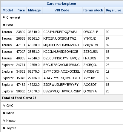
Use the boolean expanded attribute to control the current state of the sub-table.
The switching mode for performing submissions is determined by the expandMode attribute, which can have one of the following three values:
server-
The default setting. Expansion of the
<rich:collapsibleSubTable>component performs a common submission, completely re-rendering the page. ajax-
Expansion of the
<rich:collapsibleSubTable>component performs an Ajax form submission, and the content of the data table is rendered. client-
Expansion of the
<rich:collapsibleSubTable>component updates the data table on the client side.
-
component-type:org.richfaces.CollapsibleSubTable -
component-class:org.richfaces.component.UICollapsibleSubTable -
component-family:org.richfaces.Data -
renderer-type:org.richfaces.CollapsibleSubTableRenderer -
handler-class:org.richfaces.taglib.CollapsibleSubTableHandler
Table 10.2. Style classes (selectors) and corresponding skin parameters
| Class (selector) | Skin Parameters | Mapped CSS properties |
|---|---|---|
| No skin parameters. | |
| No skin parameters. | |
| No skin parameters. | |
|
|
|
|
| |
|
| |
|
| |
|
| |
|
| |
| No skin parameters. | |
| No skin parameters. | |
| No skin parameters. | |
|
|
|
|
| |
|
| |
|
| |
|
| |
|
| |
| No skin parameters. | |
| No skin parameters. | |
|
|
|
|
| |
|
| |
|
| |
|
| |
|
| |
| No skin parameters. | |
| No skin parameters. | |
|
|
|
|
| |
|
| |
|
| |
|
| |
|
| |
| No skin parameters. | |
| No skin parameters. | |
|
|
|
|
| |
|
| |
|
| |
|
| |
|
| |
The <rich:collapsibleSubTableToggler> component provides a toggle control for the user to expand and collapse sub-tables.
The <rich:collapsibleSubTableToggler> component requires the for attribute. The for attribute references the id identifier of the <rich:collapsibleSubTable> component to control.
Refer to Example 10.9, “Basic usage” for an example using the <rich:collapsibleSubTable> component. In the example, the toggle control is placed in a column that spans the width of the table. Output text next to the toggle control displays the car vendor’s name for that sub-table.
The icons and labels of the <rich:collapsibleSubTableToggler> component can be customized. Use the collapsedIcon and expandedIcon attributes to specify icons for the toggler when it is collapsed and expanded respectively. Use the collapsedLabel and expandedLabel attributes to specify labels for the toggler when it is collapsed and expanded respectively.
-
component-type:org.richfaces.CollapsibleSubTableToggler -
component-class:org.richfaces.component.UICollapsibleSubTableToggleControl -
component-family:org.richfaces.CollapsibleSubTableToggler -
renderer-type:org.richfaces.CollapsibleSubTableTogglerRenderer
The <rich:extendedDataTable> component builds on the functionality of the <rich:dataTable> component, adding features such as scrolling for the table body (both horizontal and vertical), Ajax loading for vertical scrolling, frozen columns, row selection, and rearranging of columns. It also supports all the basic table features such as sorting, filtering, and paging using the <rich:dataScroller> component.
The <rich:extendedDataTable> component includes the following main attributes not included in the <rich:dataTable> component:
-
clientRows -
frozenColumns -
height -
onselectionchange -
selectedClass -
selection -
selectionMode -
showColumnControl
Complex sub-tables
Due to the complex mark-up involved in the <rich:extendedDataTable> component, it does not support the use of the <rich:collapsibleSubTable> component. The <rich:collapsibleSubTable> component is only available with the <rich:dataTable> component.
Similarly, complex row and column spanning using the breakRowBefore, colSpan, and rowSpan attributes is also not available with the <rich:extendedDataTable> component.
Basic use of the <rich:extendedDataTable> component requires the value and var attributes, the same as with the <rich:dataTable> component. In addition, a set of columns must be included to define the table content. Refer to Section 10.2, “<rich:dataTable>” for details.
As with the <rich:dataTable> component, the look of the <rich:extendedDataTable> component can be customized using the header and footer facets.
Example 10.10. <rich:extendedDataTable> example
This example <rich:extendedDataTable> component demonstrates horizontal and vertical scrolling and frozen columns. Each feature is detailed in this section.
<rich:extendedDataTable value="#{carsBean.allInventoryItems}"

                        var="car" id="table" frozenColumns="2"

                        style="height:300px; width:500px;" selectionMode="none">

   <f:facet name="header">

      <h:outputText value="Cars marketplace" />

   </f:facet>

   <rich:column>

      <f:facet name="header">

         <h:outputText value="vendor" />

      </f:facet>

      <h:outputText value="#{car.vendor}" />

   </rich:column>

   <rich:column>

      <f:facet name="header">

         <h:outputText value="Model" />

      </f:facet>

      <h:outputText value="#{car.model}" />

   </rich:column>

   <rich:column>

      <f:facet name="header">

         <h:outputText value="Price" />

      </f:facet>

      <h:outputText value="#{car.price}" />

   </rich:column>

   <rich:column>

      <f:facet name="header">

         <h:outputText value="Mileage" />

      </f:facet>

      <h:outputText value="#{car.mileage}" />

   </rich:column>

   <rich:column>

      <f:facet name="header">

         <h:outputText value="VIN Code" />

      </f:facet>

      <h:outputText value="#{car.vin}" />

   </rich:column>

   <rich:column>

      <f:facet name="header">

         <h:outputText value="Items stock" />

      </f:facet>

      <h:outputText value="#{car.stock}" />

   </rich:column>

   <rich:column>

      <f:facet name="header">

         <h:outputText value="Days Live" />

      </f:facet>

      <h:outputText value="#{car.daysLive}" />

   </rich:column>

</rich:extendedDataTable>
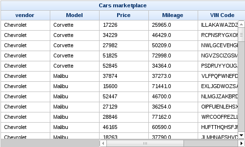
The example table shown in Example 10.10, “<rich:extendedDataTable> example” features both horizontal and vertical scrolling. Scrolling occurs automatically when the contents of the table exceed the dimensions specified with the height and width attributes. Headers and footers remain in place and visible when the table is scrolled.
Large tables can use Ajax "lazy" loading to cache data on the client during scrolling. Use the clientRows attribute to specify the number of rows to load. The specified number of rows are loaded on the initial rendering and with every vertical scroll. If the clientRows attribute is not specified, all the rows are loaded on the client without the use of Ajax.
In addition to Ajax scrolling, the <rich:extendedDataTable> component can also be used with the <rich:dataScroller> component in the same way as a regular <rich:dataTable> component. If both the clientRows and rows attributes are included, Ajax loading occurs as defined by the clientRows attribute, but the loading is limited to the current table page as determined by the rows attribute. Refer to Section 10.9, “<rich:dataScroller>” for full details on using the <rich:dataScroller> component.
The example table shown in Example 10.10, “<rich:extendedDataTable> example” has the first two columns frozen so that they remain visible if the user scrolls horizontally through the table. Note that the horizontal scrollbar does not encompass these frozen columns. To freeze columns, use the frozenColumns attribute to specify the number of columns on the left-hand side of the table to freeze.
Row selection is determined by the selectionMode attribute. Setting the attribute to none allows for no row selection capability. The example table shown in Example 10.10, “<rich:extendedDataTable> example” does not allow row selection.
Setting the selectionMode attribute to single allows the user to select a single row at a time using the mouse. With the selectionMode attribute set to multiple, the user can select multiple rows. Holding down the Ctrl key while clicking selects additional rows with each click. Holding down the Shift key while clicking selects all the rows in a range. Using Ctrl+A will result in selecting all the rows throughout the table.
The selection attribute points to a collection of objects. It holds the rowKey identifiers to track which rows are selected. Example 10.11, “Selecting multiple rows” shows how to implement multiple row selection in the same table from Example 10.10, “<rich:extendedDataTable> example”.
Example 10.11. Selecting multiple rows
<rich:extendedDataTable value="#{extTableSelectionBean.inventoryItems}"

                        var="car" selection="#{extTableSelectionBean.selection}"

                        id="table" frozenColumns="2"

                        style="height:300px; width:500px;" selectionMode="multiple">

   ...
The accompanying ExtSelectionBean bean handles which rows are selected. The rows are identified by their rowKey identifiers.
package org.richfaces.demo.tables;


import java.io.Serializable;

import java.util.ArrayList;

import java.util.Collection;

import java.util.List;


import javax.faces.bean.ManagedBean;

import javax.faces.bean.ManagedProperty;

import javax.faces.bean.SessionScoped;

import javax.faces.event.AjaxBehaviorEvent;


import org.richfaces.component.AbstractExtendedDataTable;

import org.richfaces.demo.tables.model.cars.InventoryItem;


@ManagedBean

@SessionScoped


public class ExtTableSelectionBean implements Serializable{


   private Collection<Object> selection;

   @ManagedProperty(value = "#{carsBean.allInventoryItems}")

   private List<InventoryItem> inventoryItems;

   private List<InventoryItem> selectionItems = new ArrayList<InventoryItem>();


   public void selectionListener(AjaxBehaviorEvent event){

      AbstractExtendedDataTable dataTable = (AbstractExtendedDataTable)event.getComponent();

      Object originalKey = dataTable.getRowKey();

      selectionItems.clear();

      for (Object selectionKey: selection) {

         dataTable.setRowKey(selectionKey);

         if (dataTable.isRowAvailable()){

            selectionItems.add((InventoryItem)dataTable.getRowData());

         }

      }

      dataTable.setRowKey(originalKey);

   }


   public Collection<Object> getSelection() {

      return selection;

   }


   public void setSelection(Collection<Object> selection) {

      this.selection = selection;

   }


   public List<InventoryItem> getInventoryItems() {

      return inventoryItems;

   }


   public void setInventoryItems(List<InventoryItem> inventoryItems) {

      this.inventoryItems = inventoryItems;

   }


   public List<InventoryItem> getSelectionItems() {

      return selectionItems;

   }


   public void setSelectionItems(List<InventoryItem> selectionItems) {

      this.selectionItems = selectionItems;

   }

}
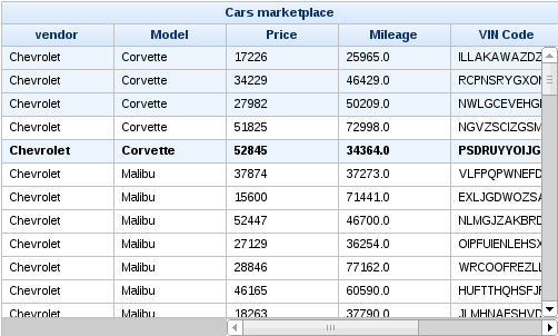
Columns in a <rich:extendedDataTable> component can be rearranged by the user by dragging each column to a different position. A graphical representation of the column is displayed during dragging. Figure 10.9, “Dragging columns” illustrates the Price column being dragged to a new location. The small blue arrow indicates where the column will be moved to if it is dropped in the current position. Figure 10.10, “Rearranged columns” shows the result of dragging the Price column.
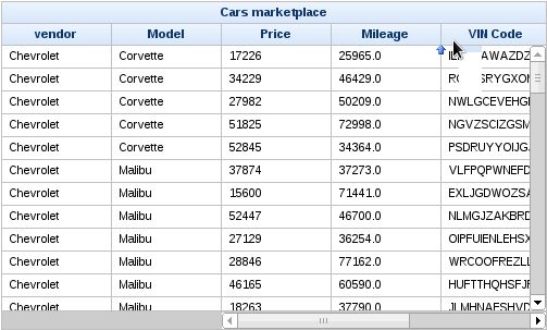
Column visibility can be changed through a popup menu, enabled by setting showColumnControl attribute to true:
The column control menu requires the table to have a header to put the button in. The labels in the menu can be customized by adding name attribute on rich:column, otherwise the labels are taken from the column header or footer. Component id is used in case the column doesn’t have name, header or footer.
The tableState attribute of the <rich:extendedDataTable> component can be used to bind state of the table (column width, sequence, sorting, filtering) to a backing-bean string property, for a later use. This state can be for example saved to a database, and it is different from standard JSF state saving mechanism.
The ExtendedDataTable supports a number of meta-component ids that can be used as a shorthand for specifying execute and render targets. The following meta-components IDs are supported with the ExtendedDataTable:
@scroll- The scrollable part of the table
@header- The table header
@footer- The table footer
@body- The table body
The <rich:extendedDataTable> component can include filtering and sorting in the same way as a regular <rich:dataTable> component. For full details on filtering tables, refer to Section 10.10, “Table filtering”. For full details on sorting tables, refer to Section 10.11, “Table sorting”.
The <rich:extendedDataTable> component can be controlled through the JavaScript API. The JavaScript API provides the following functions:
filter(columnId, newFilterValue, [isClearPreviousFilters])-
Filter the table based on the column specified with the
columnIdparameter. Use thenewFilterValueparameter as the filter value. The optionalisClearPreviousFiltersparameter is a boolean value which, if set totrue, will clear any previous filters applied to the table. sort(columnId, [direction], [isClearPreviousSorting])-
Sort the table based on the column specified with the
columnIdparameter. The optiondirectionparameter specifies whether to sort in ascending or descending order. The optionalisClearPreviousSortingparameter is a boolean value which, if set totrue, will clear any previous sorting applied to the table. clearSorting()- Clear any sorting that is currently applied to the table.
clearFiltering()- Clear any filtering that is currently applied to the table.
selectRows(index|range)- Select one or multiple rows, accepts a number (rowIndex) or an array ([firstRowIndex, lastRowIndex]). Indices are relative to the current view.
deselectRow(index)- Deselect the row that is currently selected, relative to the current view.
-
component-type:org.richfaces.ExtendedDataTable -
component-class:org.richfaces.component.UIExtendedDataTable -
component-family:org.richfaces.Data -
renderer-type:org.richfaces.ExtendedDataTableRenderer -
handler-class:org.richfaces.taglib.ExtendedDataTableHandler
Table 10.3. Style classes (selectors) and corresponding skin parameters
| Class (selector) | Skin Parameters | Mapped CSS properties |
|---|---|---|
|
|
|
|
| |
| No skin parameters. | |
|
|
|
|
| |
|
|
|
|
| |
|
|
|
|
| |
|
| |
|
| |
|
| |
| No skin parameters. | |
|
|
|
|
| |
|
|
|
|
| |
|
| |
|
|
|
|
| |
|
|
|
|
| |
| No skin parameters. | |
|
|
|
|
| |
|
|
|
|
| |
|
| |
|
|
|
| No skin parameters. | |
| No skin parameters. | |
|
|
|
| No skin parameters. | |
| No skin parameters. | |
| No skin parameters. | |
|
|
|
|
|
|
|
| |
| No skin parameters. | |
| No skin parameters. | |
|
|
|
|
|
|
|
| |
|
| |
|
| |
The <rich:dataGrid> component is used to arrange data objects in a grid. Values in the grid can be updated dynamically from the data model, and Ajax updates can be limited to specific rows. The component supports header, footer, and caption facets.
The <rich:dataGrid> component is similar in function to the JavaServer Faces <h:panelGrid> component. However, the <rich:dataGrid> component additionally allows iteration through the data model rather than just aligning child components in a grid layout.
The <rich:dataGrid> component requires the value attribute, which points to the data model, and the var attribute, which holds the current variable for the collection of data.
The number of columns for the grid is specifed with the columns attribute, and the number of elements to layout among the columns is determined with the elements attribute. The first attribute references the zero-based element in the data model from which the grid starts.
Example 10.12. <rich:dataGrid> example
<rich:panel style="width:150px;height:200px;">

  <h:form>

    <rich:dataGrid value="#{dataTableScrollerBean.allCars}" var="car" columns="2" elements="4" first="1">

        <f:facet name="header">

          <h:outputText value="Car Store"></h:outputText>

      </f:facet>

      <rich:panel>

          <f:facet name="header">

            <h:outputText value="#{car.make} #{car.model}"></h:outputText>

          </f:facet>

          <h:panelGrid columns="2">

            <h:outputText value="Price:" styleClass="label"></h:outputText>

            <h:outputText value="#{car.price}"/>

            <h:outputText value="Mileage:" styleClass="label"></h:outputText>

            <h:outputText value="#{car.mileage}"/>

          </h:panelGrid>

      </rich:panel>

      <f:facet name="footer">

          <rich:dataScroller></rich:dataScroller>

      </f:facet>

    </rich:dataGrid>

  </h:form>

</rich:panel>
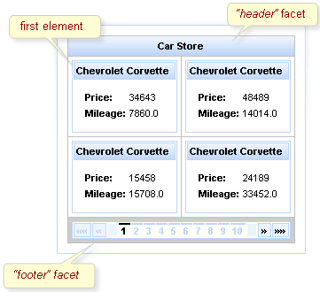
As <rich:dataGrid> the component is based on the <a4j:repeat> component, it can be partially updated with Ajax. Refer to Section 10.1.2, “Limited views and partial updates” for details on partially updating the <rich:dataGrid> component.
-
component-type:org.richfaces.DataGrid -
component-class:org.richfaces.component.UIDataGrid -
component-family:org.richfaces.Data -
renderer-type:org.richfaces.DataGridRenderer -
handler-class:org.richfaces.taglib.DataGridHandler
Table 10.4. Style classes (selectors) and corresponding skin parameters
| Class (selector) | Skin Parameters | Mapped CSS properties |
|---|---|---|
|
|
|
|
| |
|
| |
| No skin parameters. | |
| No skin parameters. | |
|
|
|
|
| |
|
| |
|
| |
|
| |
|
|
|
|
| |
|
| |
|
| |
|
| |
|
|
|
|
| |
| No skin parameters. | |
| No skin parameters. | |
| No skin parameters. | |
|
|
|
|
| |
|
| |
|
| |
|
| |
|
| |
| No skin parameters. | |
| No skin parameters. | |
|
|
|
|
| |
|
| |
|
| |
|
| |
|
| |
The <rich:list> component renders a list of items. The list can be an numerically ordered list, an un-ordered bullet-point list, or a data definition list. The component uses a data model for managing the list items, which can be updated dynamically.
The var attribute names a variable for iterating through the items in the data model. The items to iterate through are determined with the value attribute by using EL (Expression Language).
By default, the list is displayed as an un-ordered bullet-point list. The type attribute is used to specify different list types:
unordered-
The default presentation. The list is presented as a series of bullet-points, similar to the
<ul>HTML element.
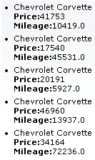
ordered-
The list is presented as a numbered series of items, similar to the
<ol>HTML element.
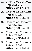
definitions- The list is presented as a series of data definitions. Part of the data model, specified as the term, is listed prominently. The other associated data is listed after each term.
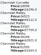
The term is marked using the term facet. The facet is required for all definition lists. Use of the facet is shown in Example 10.13, “Data definition list”.
Example 10.13. Data definition list
<h:form>

    <rich:list var="car" value="#{dataTableScrollerBean.allCars}" type="definitions" rows="5" title="Cars">

        <f:facet name="term">

            <h:outputText value="#{car.make} #{car.model}"></h:outputText>

        </f:facet>

        <h:outputText value="Price:" styleClass="label"></h:outputText>

        <h:outputText value="#{car.price}" /><br/>

        <h:outputText value="Mileage:" styleClass="label"></h:outputText>

        <h:outputText value="#{car.mileage}" /><br/>

    </rich:list>

</h:form>
The appearance of bullet points for unordered lists or numeration for ordered lists can be customized through CSS, using the list-style-type property.
The first attribute specifies which item in the data model to start from, and the rows attribute specifies the number of items to list. The title attribute is used for a floating tool-tip. Example 10.14, “<rich:list> example” shows a simple example using the <rich:list> component.
Example 10.14. <rich:list> example
<h:form>

    <rich:list var="car" value="#{dataTableScrollerBean.allCars}" rows="5" type="unordered" title="Car Store">

        <h:outputText value="#{car.make} #{car.model}"/><br/>

        <h:outputText value="Price:" styleClass="label"></h:outputText>

        <h:outputText value="#{car.price} "/><br/>

        <h:outputText value="Mileage:" styleClass="label"></h:outputText>

        <h:outputText value="#{car.mileage} "/><br/>

    </rich:list>

</h:form>
-
component-type:org.richfaces.List -
component-class:org.richfaces.component.UIList -
component-family:org.richfaces.List -
renderer-type:org.richfaces.ListRenderer -
handler-class:org.richfaces.taglib.ListHandler
Table 10.5. Style classes (selectors) and corresponding skin parameters
| Class (selector) | Skin Parameters | Mapped CSS properties |
|---|---|---|
|
|
|
|
| |
|
| |
|
|
|
|
| |
|
| |
|
|
|
|
| |
|
| |
|
|
|
|
| |
|
|
The <rich:dataScroller> component is used for navigating through multiple pages of tables or grids.
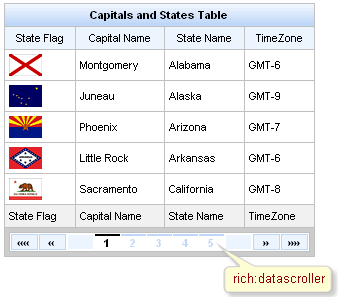
The <rich:dataScroller> must be placed in a facet of the table or grid it needs to control. Alternatively, use the for attribute to bind the parent table or grid to the scroller.
The bound table or grid should also have the rows attribute defined to limit the number of rows per page.
The <rich:dataScroller> component must be re-rendered whenever a filter changes on the bound table, so that the scroller matches the current model for the table.
Example 10.15. Basic usage
<rich:dataTable id="table" value="#{capitalsBean.capitals}" var="cap" rows="5">

   <!-- table content -->

   ...

</rich:dataTable>

<rich:dataScroller for="table" maxPages="5">

   <f:facet name="first">

      <h:outputText value="First" />

   </f:facet>

   <f:facet name="last">

      <h:outputText value="Last" />

   </f:facet>

</rich:dataScroller>
The page attribute is a value-binding attribute used to define and save the current page number.
The <rich:dataScroller> component provides a range of controllers for scrolling through tables and grids:
- Controls for scrolling by a specific amount
-
The component includes controls for switching to the first page, the last page, the next page, and the previous page, as well as controls for fast-forwarding or rewinding by a set amount. Use the
fastStepattribute to set the number of pages to skip when fast-forwarding or rewinding. The appearance of these controls can be customized using the following facets:first,last,next,previous,fastForward, andfastRewind. Additionally, there are facets for the controls' disabled states:first_disabled,last_disabled,next_disabled,previous_disabled,fastForward_disabled, andfastRewind_disabled. - Page controls
-
The component also features a series of numbered controls to jump to a specific page. Use the
maxPagesattribute to limit the number of page controls that appear. The current page control is highlighted. To add optional separators between controls, define the separators with thecontrolsSeparatorfacet.
The <rich:dataScroller> component can be controlled through the JavaScript API. The JavaScript API provides the following functions:
switchToPage(pageIndex)-
Switch to the page specified with the
pageIndexparameter. next()- Switch to the next page.
previous()- Switch to the previous page.
first()- Switch to the first page.
last()- Switch to the last page.
fastForward()-
Step forward through the pages by the
fastStepamount. fastRewind()-
Step backward through the pages by the
fastStepamount.
-
component-type:org.richfaces.DataScroller -
component-class:org.richfaces.component.UIDataScroller -
component-family:org.richfaces.DataScroller -
renderer-type:org.richfaces.DataScrollerRenderer -
handler-class:org.richfaces.taglib.DataScrollerHandler
Table 10.6. Style classes (selectors) and corresponding skin parameters
| Class (selector) | Skin Parameters | Mapped CSS properties |
|---|---|---|
|
|
|
|
| |
|
| |
|
|
|
|
| |
|
| |
|
| |
|
| |
| No skin parameters. | |
| No skin parameters. | |
| No skin parameters. | |
| No skin parameters. | |
| No skin parameters. | |
| No skin parameters. | |
|
|
|
|
| |
|
| |
|
| |
|
| |
|
|
|
|
| |
|
|
|
|
|
|
Tables entries can be filtered by the user through either the basic built-in filter inputs, or by defining external filter controls. Refer to Section 10.3, “<rich:column>” for details on using the <rich:column> component in tables.
To define a filter for a column use either the filter or filterExpression attributes, then use the filterValue attribute to point to an object which holds the current filtering value for the column. The attribute can be used to store filtering conditions in a session.
Use the filterExpression attribute to define an expression that can be evaluated as a boolean value. The expression checks if each table entry satisfies the filtering condition when the table is rendered. For example, the expression might be a JSTL (JavaServer Pages Standard Tag Library) function such as contains or equals.
Use the filter attribute to define a filter interface. The attribute must use EL (Expression Language) to point to an object which implements the org.richfaces.model.Filter<T> interface. The object must provide a single accept(T t) method. The method takes each iteration object as a parameter and returns a boolean value, which determines whether the object satisfies the filter. By defining a custom filter, you can implement complex business logic to filter a table.
The built-in filter controls of the <rich:column> component allow the user to enter text to use as the filtering value. The value of the built-in filter control is bound to the filterValue attribute, which can either be an initial filtering value on the page, or a value binding on the server. The filterValue is then applied to the filter defined either by the filterExpression or filter column attributes.
The filterValue is of type String. Conversion is either done implicitly via EL in the filterExpression, or explicitly within the filter function. The filter is processed and the table is rendered when the onblur event occurs for the column.
Example 10.16. Basic filtering
<rich:extendedDataTable value="#{carsBean.allInventoryItems}" var="car" filterVar="filterValue">

    <f:facet name="header">

        <h:outputText value="Cars marketplace"/>

    </f:facet>

    <rich:column filterExpression="#{empty filterValue or fn:startsWith(car.model, filterValue)}"

                 filterValue="#{carsFilteringBean.modelFilter}">

        <f:facet name="header">Model</f:facet>

        <h:outputText value="#{car.model}"/>

    </rich:column>

    <rich:column filterExpression="#{empty filterValue or car.price ge filterValue}"

                 filterValue="#{carsFilteringBean.priceFilter}"

                 filterConverterMessage="Error converting the 'Price' filter value">

        <f:facet name="header">Price</f:facet>

        <h:outputText value="#{car.price}"/>

    </rich:column>

</rich:extendedDataTable>
The example uses the basic filtering method on both columns in the table.
If you require more advanced filter controls use the external filtering properties of the <rich:column> component. With custom filter controls you can tailor the filter control, allowing for advanced use cases like select menus, checkboxes, etc. To use a custom filter control with the extendedDataTable component, one must first disable the built-in filter control.
Disabling built-in filter controls
The built-in filter controls can be disabled on a column-by-column basis by setting the column attribute filterType="custom". Alternatively one can disable filter controls for the whole application via the following context-param in the web.xml:
<context-param>

    <param-name>org.richfaces.builtin.filter.enabled</param-name>

    <param-value>false</param-value>

</context-param>
Example 10.17. Filtering example
<rich:dataTable value="#{capitalsBean.capitals}" var="cap" id="table">


    <f:facet name="header">

        <rich:columnGroup>

            <rich:column>

                <h:outputText value="State Name" />

            </rich:column>

            <rich:column>

                <h:outputText value="State Time Zone" />

            </rich:column>

        </rich:columnGroup>

    </f:facet>

    <rich:column filter="#{filteringBean.stateFilter}">

        <f:facet name="header">

            <h:inputText value="#{filteringBean.stateFilterValue}" id="input">

                <a4j:ajax event="keyup" render="table@body">

                    <a4j:attachQueue  requestDelay="700"

                        ignoreDupResponses="true" />

                </a4j:ajax>

            </h:inputText>

        </f:facet>

        <h:outputText value="#{cap.state}" />

    </rich:column>

    <rich:column filterExpression="#{fn:containsIgnoreCase(cap.timeZone, filteringBean.zoneFilterValue)}">

        <f:facet name="header">

            <h:selectOneMenu value="#{filteringBean.zoneFilterValue}">

                <f:selectItems value="#{filteringBean.zoneList}" />

                <a4j:ajax event="change" render="table@body" />

            </h:selectOneMenu>

        </f:facet>

        <h:outputText value="#{cap.timeZone}" />

    </rich:column>

</rich:dataTable>
The example uses a filter expression on the first column and a filter method on the second column.
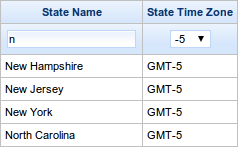
Tables entries can be sorted by defining external sorting algorithms. Refer to Section 10.3, “<rich:column>” for details on using the <rich:column> component in tables.
Sorting non-English tables
To sort a table whose contents are not in English, add the org.richfaces.datatableUsesViewLocale context parameter to the project’s web.xml settings file. Set the value of the context parameter to true.
Use the comparator attribute of the <rich:column> to specify the comparator to use when sorting. If no comparator is specified, the sorting algorithm will invoke the entries compareTo method of the sortBy values if they implement the java.lang.Comparable interface. As a final fall back, the algorithm implements a null sort, sorting elements based on whether or not they are null.
The built-in sorting controls of the <rich:column> component allow a user to click the sort icons of a column to sort it in ascending or descending order.
Set the sortBy attribute to indicate which value to use when sorting the column. Expressions in the sortBy attribute must refer to the variable declared in the table’s var attribute, which is used to fill the contents of the table.
Example 10.18. Basic sorting
<rich:dataTable value="#{capitalsBean.capitals}" var="cap" width="300px">

   <rich:column sortBy="#{cap.state}">

      <f:facet name="header">

         <h:outputText value="State Name"/>

      </f:facet>

      <h:outputText value="#{cap.state}"/>

   </rich:column>

   <rich:column sortBy="#{cap.name}">

      <f:facet name="header">

         <h:outputText value="State Capital"/>

      </f:facet>

      <h:outputText value="#{cap.name}"/>

   </rich:column>

</rich:dataTable>
The example uses the basic sorting method on both columns in the table.
Use the sortOrder attribute to set how the table’s contents are sorted when it is first loaded. By default, the value of the sortOrder attribute is unsorted, so that table entries appear in the order the are contained in the data model. Use sortOrder="ascending" to sort the entries in ascending alphabetical or numerical order. Use sortOrder="descending" to sort the entries in descending alphabetical or numerical order. The sortOrder attribute can also be used to externally set the sort order of a table when using the external sorting method; refer to Section 10.11.3, “External sort controls” for details.
Set the sortBy attribute to indicate which iteration object property to use when sorting the column. If using custom-defined rules for sorting, use the comparator attribute instead. Set the comparator attribute to point to your comparator method, which will be used when sorting the data model.
Disabling built-in sort controls
The built-in sort controls can be disabled on a column-by-column basis by setting the column attribute sortType="custom". Alternatively one can disable sort controls for the whole application via the following context-param in the web.xml:
<context-param>

    <param-name>org.richfaces.builtin.sort.enabled</param-name>

    <param-value>false</param-value>

</context-param>
Bind the sortOrder attribute to bean properties to manage the sorting order. The bean must handle all the sorting algorithms. Example 10.19, “Sorting” demonstrates table sorting using an external control.
Example 10.19. Sorting
<rich:dataTable value="#{capitalsBean.capitals}" var="cap" id="table">

    <rich:column>

        <f:facet name="header">

            State Flag

        </f:facet>

        <h:graphicImage value="#{cap.stateFlag}" alt="flag" />

    </rich:column>

    <rich:column sortBy="#{cap.name}" id="name" sortOrder="#{capitalsSortingBean.capitalsOrder}">

        <f:facet name="header">

            <a4j:commandLink value="Sort by Capital Name" render="table" action="#{capitalsSortingBean.sortByCapitals}" />

        </f:facet>

        <h:outputText value="#{cap.name}" />

    </rich:column>

    <rich:column sortBy="#{cap.state}" id="state" sortOrder="#{capitalsSortingBean.statesOrder}">

        <f:facet name="header">

            <a4j:commandLink value="Sort by State Name" render="table" action="#{capitalsSortingBean.sortByStates}" />

        </f:facet>

        <h:outputText value="#{cap.state}" />

    </rich:column>

    <rich:column sortBy="#{cap.timeZone}" id="timeZone" comparator="#{capitalsSortingBean.timeZoneComparator}"

        sortOrder="#{capitalsSortingBean.timeZonesOrder}">

        <f:facet name="header">

            <a4j:commandLink value="Sort by Time Zone" render="table" action="#{capitalsSortingBean.sortByTimeZones}" />

        </f:facet>

        <h:outputText value="#{cap.timeZone}" />

    </rich:column>

</rich:dataTable>
The example uses an external control to manage the table’s sorting.
When multiple columns are capable of being sorted at the same time, set the priority by which the columns are sorted with the sortPriorities attribute. The attribute must contain a list of column identifiers in the order of the sorting sequence.
Read this chapter for details on components that use tree structures.
The <rich:tree> component provides a hierarchical tree control. Each <rich:tree> component typically consists of <rich:treeNode> child components. The appearance and behavior of the tree and its nodes can be fully customized.
The <rich:tree> component requires the value attribute to point to the data model for populating the tree. The data model must be either an org.richfaces.model.TreeNode interface, an org.richfaces.model.TreeDataModel interface, or a javax.swing.tree.TreeNode interface. The var attribute declares the variable used for iterating through the data model, so that child <rich:treeNode> components can reference each iteration.
Ideally, the <rich:tree> component needs one or more <rich:treeNode> components to work with the data model. However if no <rich:treeNode> components are provided the tree creates default nodes instead.
Example 11.1. Basic usage
This example demonstrates basic usage of the <rich:tree> component using an org.richfaces.model.TreeNode data model.
First extend the org.richfaces.model.TreeNodeImpl and add the data fields you require, with appropriate accessor methods, as in:
import org.richfaces.model.TreeNodeImpl;


public class DataHolderTreeNodeImpl extends TreeNodeImpl {

    private Object data;


    public DataHolderTreeNodeImpl() {

        super();

    }


    public DataHolderTreeNodeImpl(boolean leaf, Object data) {

        super(leaf);

        this.data = data;

    }


    public Object getData() {

        return data;

    }


    @Override

    public String toString() {

        return super.toString() + " >> " + data;

    }

}
Then, the data model is constructed as follows:
private DataHolderTreeNodeImpl stationRoot;

private DataHolderTreeNodeImpl rootNodes;


public DataHolderTreeNodeImpl getRootNodes() {

    if (rootNodes == null) {

        String[] kickRadioFeed = {"Hall & Oates - Kiss On My List",

                "David Bowie - Let's Dance",

                "Lyn Collins - Think (About It)",

                "Kim Carnes - Bette Davis Eyes",

                "KC & the Sunshine Band - Give It Up"};

        stationRoot = new DataHolderTreeNodeImpl(false, "KickRadio");

        for (int i = 0; i<kickRadioFeed.length; i++) {

            DataHolderTreeNodeImpl child = new DataHolderTreeNodeImpl(true, kickRadioFeed[i]);

            stationRoot.addChild(i, child);

        }

        rootNodes = new DataHolderTreeNodeImpl();

        rootNodes.addChild(0, stationRoot);

    }

    return rootNodes;

}
The tree then accesses the nodes of the model using the station variable:
<rich:tree value="#{stations.stationNodes}" var="station">

   <rich:treeNode>

      <h:outputText value="#{station}" />

   </rich:treeNode>

</rich:tree>
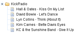
Different nodes in the tree can have different appearances, such as node icons, depending on the type of data the node contains. Use the nodeType attribute to differentiate the types of nodes; the node is then rendered according to the <rich:treeNode> component with the corresponding type attribute. Example 11.2, “nodeType attribute” shows a <rich:tree> component with three different child <rich:treeNode> components defined to represent three different node appearances. Refer to Section 11.1.10.2, “Appearance” for details on customizing the appearance of <rich:treeNode> components.
Example 11.2. nodeType attribute
<rich:tree nodeType="#{node.type}" var="node" value="#{treeBean.rootNodes}">

    <rich:treeNode type="country">

        #{node.name}

    </rich:treeNode>

    <rich:treeNode type="company" iconExpanded="/images/tree/disc.gif"

                   iconCollapsed="/images/tree/disc.gif">

        #{node.name}

    </rich:treeNode>

    <rich:treeNode type="cd" iconLeaf="/images/tree/song.gif">

        #{node.artist} - #{node.name} - #{node.year}

    </rich:treeNode>

</rich:tree>
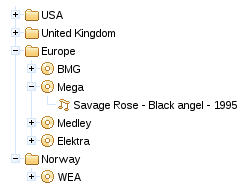
If the nodeType attribute returns null the nodes are rendered as "typeless" (or default) nodes.
Setting useDefaultNode="true" the default nodes can be used to render nodes that do not match with the provided treeNodes.
Example 11.3. Default treeNode
<rich:tree nodeType="#{node.type}" var="node" value="#{treeBean.rootNodes}" useDefaultNode="true">

    <rich:treeNode type="country">

        #{node.name}

    </rich:treeNode>

</rich:tree>
Only type="country" is set up, other nodes ("company" and "cd") will be created using the default treeNode.
<rich:tree nodeType="#{node.type}" var="node" value="#{treeBean.rootNodes}" useDefaultNode="true">

    <rich:treeNode type="country">

        #{node.name}

    </rich:treeNode>

    <f:facet name="defaultNode">

        <rich:treeNode iconExpanded="/images/tree/disc.gif" iconCollapsed="/images/tree/disc.gif"

                       iconLeaf="/images/tree/song.gif">

            #{node.name}

        </rich:treeNode>

    </f:facet>

</rich:tree>
The appearance of the default treeNode can be changed by using a facet named defaultNode.
Icons for different nodes and node states can be defined for the whole tree using the following attributes:
iconLeaf-
The
iconLeafattribute points to the icon to use for any node that does not contain any child nodes. iconExpandedandiconCollapsed-
The
iconExpandedandiconCollapsedattributes point to the icons to use for expanded and collapsed nodes respectively. If these attributes are defined, theiconattribute is not used.
The mode for performing submissions when nodes are expanded or collapsed is determined by the toggleType attribute, which can have one of the following three values:
ajax-
This is the default setting. The
<rich:tree>component performs an Ajax form submission, and only the content of the tree is rendered. server-
The
<rich:tree>component performs a common submission, completely refreshing the page. client-
The
<rich:tree>component updates on the client side through JavaScript, without any additional requests or updates. All nodes are rendered to the client during the initial page rendering.
By default, tree nodes are expanded and collapsed through the and controls. To expand or collapse a tree node using an action event such as a mouse click, specify the event with the toggleNodeEvent attribute.
The mode for performing submissions when nodes are selected is determined by the selectionType attribute, which can have one of the following three values:
ajax-
This is the default setting. The
<rich:tree>component performs an Ajax form submission, and only the content of the tree is rendered. client-
The
<rich:tree>component updates on the client side using JavaScript, without any additional requests or updates.
If the <rich:tree> component uses a custom data model, the data model provides unique keys for tree nodes so they can be identified during a client request. The <rich:tree> component can use strings as key values. These strings may contain special characters that are not allowed by browsers, such as the left angle bracket (<) and ampersand (&). To allow these characters in the keys, a row key converter must be provided.
To apply a converter to the <rich:tree> component, define it with the rowKeyConverter attribute.
In addition to the standard Ajax events and HMTL events, the <rich:tree> component uses the following client-side events:
-
The
nodetoggleevent is triggered when a node is expanded or collapsed. -
The
beforenodetoggleevent is triggered before a node is expanded or collapsed. -
The
selectionchangeevent is triggered when a node is selected. -
The
beforeselectionchangeevent is triggered before a node is selected.
The <rich:tree> component uses the following server-side listeners:
-
The
toggleListenerlistener processes expand and collapse events. -
The
selectionChangeListenerlistener processes the request when a node is selected.
-
component-type:org.richfaces.Tree -
component-class:org.richfaces.component.UItree -
component-family:org.richfaces.Tree -
renderer-type:org.richfaces.TreeRenderer -
handler-class:org.richfaces.view.facelets.TreeHandler
Styling for the <rich:tree> component is mostly applied to the tree nodes. Refer to Section 11.1.10.5, “Style classes and skin parameters” for details on styling tree nodes. In addition, the <rich:tree> component can make use of the style classes outlined in Style classes (selectors).
Use the <rich:treeSelectionChangeListener> tag to register a TreeSelectionChangeListener class on a parent <rich:tree> component. The class provided as a listener must implement the org.richfaces.event.TreeSelectionChangeListener interface. The processTreeSelectionChange method accepts an org.richface.event.TreeSelectionChangeEvent event as a parameter.
The <rich:treeNode> component is a child component of the <rich:tree> component. It represents nodes in the parent tree. The appearance and functionality of each tree node can be customized.
The <rich:treeNode> component must be a child of a <rich:tree> component or a tree adaptor component. It does not need any attributes declared for basic usage, but can provide markup templates for tree nodes of particular types. Default markup is used if the tree node type is not specified. Refer to Example 11.1, “Basic usage” for an example of basic <rich:treeNode> component usage.
Example 11.4. Basic usage
<rich:tree nodeType="#{node.type}" var="node"

           value="#{treeBean.rootNodes}">

   <rich:treeNode type="country">

      #{node.name}

   </rich:treeNode>

   <rich:treeNode type="state">

      #{node.name}

   </rich:treeNode>

   <rich:treeNode type="city">

      #{node.name}

   </rich:treeNode>

</rich:tree>
The example renders a simple tree of countries. Each country node expands to show state nodes for that country, and each state node expands to show city nodes for that state.
Refer to Section 11.1.2, “Appearance” for the <rich:tree> component for details and examples on styling nodes and icons. Icon styling for individual <rich:treeNode> components uses the same attributes as the parent <rich:tree> component: iconLeaf, iconExpanded, and iconCollapsed. Icon-related attributes specified for child <rich:treeNode> components overwrite any global icon attributes of the parent <rich:tree> component.
Use the rendered attribute to determine whether the node should actually be rendered in the tree or not. Using the rendered attribute in combination with the <rich:treeNode> type attribute can allow further style differentiation between node content.
Interactivity with individual nodes, such as expanding, collapsing, and other event handling, can be managed by the parent <rich:tree> component. Refer to Section 11.1.3, “Expanding and collapsing tree nodes” and Section 11.1.6, “Event handling” for further details.
Use the expanded attribute to determine whether the node is expanded or collapsed.
-
component-type:org.richfaces.TreeNode -
component-class:org.richfaces.component.UITreeNode -
component-family:org.richfaces.TreeNode -
renderer-type:org.richfaces.TreeNodeRenderer -
handler-class:org.richfaces.view.facelets.TreeNodeHandler
Table 11.1. Style classes (selectors) and corresponding skin parameters
| Class (selector) | Skin Parameters | Mapped CSS properties |
|---|---|---|
|
|
|
|
| |
| No skin parameters. | |
| No skin parameters. | |
|
|
|
|
|
|
| No skin parameters. | |
| No skin parameters. | |
| No skin parameters. | |
| No skin parameters. | |
| No skin parameters. | |
| No skin parameters. | |
| No skin parameters. | |
| No skin parameters. | |
| No skin parameters. | |
| No skin parameters. | |
Use the <rich:treeToggleListener> tag to register a TreeToggleListener class on a parent <rich:treeNode> component. The class provided as a listener must implement the org.richfaces.event.TreeToggleListener interface. The processTreeToggle method accepts an org.richface.event.TreeToggleEvent event as a parameter.
Use a tree adaptor to populate a tree model declaratively from a non-hierarchical model, such as a list or a map.
The <rich:treeModelAdaptor> component takes an object which implements the Map or Iterable interfaces. It adds all the object entries to the parent node as child nodes.
The <rich:treeModelAdaptor> component is added as a nested child component to a <rich:tree> component, or to another tree adaptor component.
The <rich:treeModelAdaptor> component requires the nodes attribute for basic usage. The nodes attribute defines a collection of elements to iterate through for populating the nodes.
Define the appearance of each node added by the adaptor with a child <rich:treeNode> component. Refer to Section 11.1.10, “<rich:treeNode>” for details on the <rich:treeNode> component.
Adaptors that use Map interfaces or models with non-string keys require a row key converter in order to correctly identify nodes. Refer to Section 11.1.5, “Identifying nodes with the rowKeyConverter attribute” for details on the use of the rowKeyConverter attribute.
Adaptors that use Iterable interfaces have simple integer row keys. A default converter is provided and does not need to be referenced explicitly.
The <rich:treeModelRecursiveAdaptor> component iterates through recursive collections in order to populate a tree with hierarchical nodes, such as for a file system with multiple levels of directories and files.
The <rich:treeModelRecursiveAdaptor> component is an extension of the <rich:treeModelAdaptor> component. As such, the <rich:treeModelRecursiveAdaptor> component uses all of the same attributes. Refer to Section 11.2.1, “<rich:treeModelAdaptor>” for details on the <rich:treeModelAdaptor> component.
In addition, the <rich:treeModelRecursiveAdaptor> component requires the roots attribute. The roots attribute defines the collection to use at the top of the recursion. For subsequent levels, the nodes attribute is used for the collection.
Example 11.5, “Basic usage” demonstrates how the <rich:treeModelRecursiveAdaptor> component can be used in conjunction with the <rich:treeModelAdaptor> component to recursively iterate through a file system and create a tree of directories and files.
Example 11.5. Basic usage
<rich:tree var="item">

   <rich:treeModelRecursiveAdaptor roots="#{fileSystemBean.sourceRoots}" nodes="#{item.directories}" >

      <rich:treeNode>

         #{item.shortPath}

      </rich:treeNode>

      <rich:treeModelAdaptor nodes="#{item.files}">

         <rich:treeNode>#{item}</rich:treeNode>

      </rich:treeModelAdaptor>

   </rich:treeModelRecursiveAdaptor>

</rich:tree>
The <rich:treeModelRecursiveAdaptor> component references the FileSystemBean class as the source for the data.
@ManagedBean

@RequestScoped

public class FileSystemBean {

   private static final String SRC_PATH = "/WEB-INF";


   private List<FileSystemNode> srcRoots;


   public synchronized List<FileSystemNode> getSourceRoots() {

      if (srcRoots == null) {

         srcRoots = new FileSystemNode(SRC_PATH).getDirectories();

      }

      return srcRoots;

   }

}
The FileSystemBean class in turn uses the FileSystemNode class to recursively iterate through the collection.
public class FileSystemNode {

   ...

   public synchronized List<FileSystemNode> getDirectories() {

      if (directories == null) {

         directories = Lists.newArrayList();

         Iterables.addAll(directories, transform(filter(getResourcePaths(), containsPattern("/$")), FACTORY));

      }

      return directories;

   }


   public synchronized List<String> getFiles() {

      if (files == null) {

         files = new ArrayList<String>();

         Iterables.addAll(files, transform(filter(getResourcePaths(), not(containsPattern("/$"))), TO_SHORT_PATH));

      }

      return files;

   }


   private Iterable<String> getResourcePaths() {

        FacesContext facesContext = FacesContext.getCurrentInstance();

        ExternalContext externalContext = facesContext.getExternalContext();

        Set<String> resourcePaths = externalContext.getResourcePaths(this.path);


      if (resourcePaths == null) {

         resourcePaths = Collections.emptySet();

      }

      return resourcePaths;

   }

   ...

}
The getDirectories() function is used recursively until the object has the collection of children. The model adaptor calls the getFiles() function at each level in order to add the file nodes.
The resulting tree hierarchically lists the directories and files in the collection.
Adaptors that use Map interfaces or models with non-string keys require a row key converter in order to correctly identify nodes. Refer to Section 11.1.5, “Identifying nodes with the rowKeyConverter attribute” for details on the use of the rowKeyConverter attribute.
Adaptors that use Iterable interfaces have simple integer row keys. A default converter is provided and does not need to be referenced explicitly.
Read this chapter for details on menu and toolbar components.
The <rich:dropDownMenu> component is used for creating a drop-down, hierarchical menu. It can be used with the <rich:toolbar> component to create menus in an application’s toolbar.
The <rich:dropDownMenu> component only requires the label attribute for basic usage. Use the label attribute to define the text label that appears as the title of the menu. Clicking on the title drops the menu down.
Alternatively, use the label facet to define the menu title. If the label facet is used, the label attribute is not necessary.
To set the content of the drop-down menu and any sub-menus, use the <rich:menuItem>, <rich:menuGroup>, and <rich:menuSeparator> components. These components are detailed in Section 12.3, “Menu sub-components”.
Use the jointPoint and direction attributes to determine the direction and location of the menu when it appears. The jointPoint and direction attributes both use the following settings:
topLeft,topRight,bottomLeft,bottomRight-
When used with the
jointPointattribute, the menu is attached to the top-left, top-right, bottom-left, or bottom-right of the control as appropriate.When used with the
directionattribute, the menu appears to the top-left, top-right, bottom-left, or bottom-right of the joint location as appropriate. auto- The direction or joint location is determined automatically.
autoLeft,autoRight,topAuto,bottomAuto-
When used with the
jointPointattribute, the joint location is determined automatically, but defaults to either the left, right, top, or bottom of the control as appropriate.When used with the
directionattribute, the menu direction is determined automatically, but defaults to either the left, right, top, or bottom of the joint location as appropriate.
By default, the menu drops down when the title is clicked. To drop down with a different event, use the showEvent attribute to define the event instead.
Menus can be navigated using the keyboard. Additionally, menus can be navigated programmatically using the JavaScript API. The JavaScript API allows the following methods:
show()-
The
show()method shows the menu. hide()-
The
hide()method hides the menu. activateItem(menuItemId)-
The
activateItem(menuItemId)activates the menu item with themenuItemIdidentifier.
Use the mode attribute to determine how the menu requests are submitted:
-
server, the default setting, submits the form normally and completely refreshes the page. -
ajaxperforms an Ajax form submission, and re-renders elements specified with therenderattribute. -
clientcauses theactionandactionListeneritems to be ignored, and the behavior is fully defined by the nested components or custom JavaScript instead of responses from submissions.
-
component-type:org.richfaces.DropDownMenu -
component-class:org.richfaces.component.UIDropDownMenu -
component-family:org.richfaces.DropDownMenu -
renderer-type:org.richfaces.DropDownMenuRenderer
Table 12.1. Style classes (selectors) and corresponding skin parameters
| Class (selector) | Skin Parameters | Mapped CSS properties |
|---|---|---|
|
|
|
|
|
|
|
|
|
| No skin parameters. | |
| No skin parameters. | |
|
|
|
|
| |
|
|
|
| No skin parameters. | |
|
|
|
|
| |
|
|
|
|
| |
| No skin parameters. | |
|
|
|
|
|
|
| No skin parameters. | |
| No skin parameters. | |
|
|
|
| No skin parameters. | |
The <rich:contextMenu> component is used for creating a hierarchical context menu that are activated on events like onmouseover , onclick etc. The component can be applied to any element on the page.

To set the content of the context menu and any sub-menus, use the <rich:menuItem>, <rich:menuGroup>, and <rich:menuSeparator> components. These components are detailed in Section 12.3, “Menu sub-components”.
Use the direction attribute to determine the direction of the menu when it appears. The direction attribute uses the following settings:
topLeft,topRight,bottomLeft,bottomRight- The menu appears to the top-left, top-right, bottom-left, or bottom-right of the activation point.
auto- The direction is determined automatically.
autoLeft,autoRight,topAuto,bottomAuto- The menu direction is determined automatically, but defaults to either the left, right, top, or bottom of the activation point as appropriate.
By default, the menu is activated when the contextmenu event is observed (ie. a right-click). To activate on a different event, use the showEvent attribute to define the event instead.
Menus can be navigated using the keyboard. Additionally, menus can be navigated programmatically using the JavaScript API. The JavaScript API allows the following methods:
show()-
The
show()method shows the menu. hide()-
The
hide()method hides the menu. activateItem(menuItemId)-
The
activateItem(menuItemId)activates the menu item with themenuItemIdidentifier.
Use the mode attribute to determine how the menu requests are submitted:
-
server, the default setting, submits the form normally and completely refreshes the page. -
ajaxperforms an Ajax form submission, and re-renders elements specified with therenderattribute. -
clientcauses theactionandactionListeneritems to be ignored, and the behavior is fully defined by the nested components or custom JavaScript instead of responses from submissions.
To avoid creating many menus in iterable components that perform the same actions but only differ in content you can create one menu and reuse it with substituting its text content.
<rich:contextMenu id="menu" attached="false">

    <rich:menuItem action="#{bean.edit}">{Edit}</rich:menuItem>

    <rich:menuItem action="#{bean.delete}">{Delete}</rich:menuItem>

</rich:contextMenu>
The text will be replaced by calling the show event with corresponding parameters:
menu.show(event, { replace:
    { Edit: "Change Photo #{photo.name}", Delete: "Remove Photo #{photo.name}"}
});
It can be achieved by using <rich:componentControl> with parameters:
<rich:componentControl event="click" target="menu" operation="show">

    <a4j:param noEscape="true" value="event" />

    <rich:hashParam name="replace">

        <f:param name="Edit" value="Change Photo #{photo.name}" />

        <f:param name="Delete" value="Remove Photo #{photo.name}" />

    </rich:hashParam>

</rich:componentControl>
-
component-type:org.richfaces.ContextMenu -
component-class:org.richfaces.component.UIContextMenu -
component-family:org.richfaces.ContextMenu -
renderer-type:org.richfaces.ContextMenuRenderer
Table 12.2. Style classes (selectors) and corresponding skin parameters
| Class (selector) | Skin Parameters | Mapped CSS properties |
|---|---|---|
|
|
|
|
|
|
|
|
|
| No skin parameters. | |
| No skin parameters. | |
|
|
|
|
| |
|
|
|
| No skin parameters. | |
|
|
|
|
| |
|
|
|
|
| |
| No skin parameters. | |
|
|
|
|
|
|
| No skin parameters. | |
| No skin parameters. | |
|
|
|
| No skin parameters. | |
The <rich:menuItem>, <rich:menuGroup>, and <rich:menuSeparator> components are used to construct menus for the <rich:dropDownMenu> component. Refer to Section 12.1, “<rich:dropDownMenu>” for more details on the <rich:dropDownMenu> component.
The <rich:menuItem> component represents a single item in a menu control. The <rich:menuItem> component can be also be used as a seperate component without a parent menu component, such as on a toolbar.
The <rich:menuItem> component requires the label attribute for basic usage. The label attribute is the text label for the menu item.
Icons can be added to menu items through the use of two icon attributes. The icon attribute specifies the normal icon, while the iconDisabled attribute specifies the icon for a disabled item.
Alternatively, define facets with the names icon and iconDisabled to set the icons. If facets are defined, the icon and iconDisabled attributes are ignored. Using facets for icons allows more complex usage; example shows a checkbox being used in place of an icon.
Example 12.1. Icon facets
<rich:menuItem value="Show comments">

   <f:facet name="icon">

      <h:selectBooleanCheckbox value="#{bean.property}"/>

   </f:facet>

</rich:menuItem>
Use the submitMode attribute to determine how the menu item requests are submitted:
-
server, the default setting, submits the form normally and completely refreshes the page. -
ajaxperforms an Ajax form submission, and re-renders elements specified with therenderattribute. -
clientcauses theactionandactionListeneritems to be ignored, and the behavior is fully defined by the nested components instead of responses from submissions.
The <rich:menuItem> component can be controlled through the JavaScript API. The JavaScript API provides the following functions:
activate()- Activate the menu item as though it were selected.
The <rich:menuGroup> component represents an expandable sub-menu in a menu control. The <rich:menuGroup> component can contain a number of <rich:menuItem> components, or further nested <rich:menuGroup> components.
The <rich:menuGroup> component requires the label attribute for basic usage. The label attribute is the text label for the menu item. Alternatively, use the label facet to define content for the label.
Additionally, the <rich:menuGroup> component must contain child <rich:menuItem> components or <rich:menuGroup> components.
Icons can be added to menu groups through the use of two icon attributes. The icon attribute specifies the normal icon, while the iconDisabled attribute specifies the icon for a disabled group.
The <rich:menuGroup> component can be positioned using the jointPoint and direction attributes, the same as the parent menu control. For details on the jointPoint and direction attributes, refer to Section 12.1.3, “Appearance”.
The <rich:menuGroup> component can be controlled through the JavaScript API. The JavaScript API provides the following functions:
show()- Show the menu group.
hide()- Hide the menu group.
The <rich:menuSeparator> component represents a separating divider in a menu control.
The <rich:menuSeparator> component does not require any attributes for basic usage. Add it as a child to a menu component to separator menu items and menu groups.
The <rich:panelMenu> component is used in conjunction with <rich:panelMenuItem> and <rich:panelMenuGroup> to create an expanding, hierarchical menu. The <rich:panelMenu> component’s appearance can be highly customized, and the hierarchy can stretch to any number of sub-levels.
Example 12.2. panelMenu
<rich:panelMenu mode="ajax"

                topGroupExpandedRightIcon="chevronUp"

                topGroupCollapsedRightIcon="chevronDown"

                groupExpandedLeftIcon="disc"

                groupCollapsedLeftIcon="disc">

   <rich:panelMenuGroup label="Group 1">

      <rich:panelMenuItem label="Item 1.1"/>

      <rich:panelMenuItem label="Item 1.2"/>

      <rich:panelMenuItem label="Item 1.3"/>

   </rich:panelMenuGroup>

   <rich:panelMenuGroup label="Group 2">

      <rich:panelMenuItem label="Item 2.1"/>

      <rich:panelMenuItem   label="Item 2.2"/>

      <rich:panelMenuItem label="Item 2.3"/>

      <rich:panelMenuGroup label="Group 2.4">

         <rich:panelMenuItem label="Item 2.4.1"/>

         <rich:panelMenuItem label="Item 2.4.2"/>

         <rich:panelMenuItem label="Item 2.4.3"/>

      </rich:panelMenuGroup>

      <rich:panelMenuItem label="Item 2.5"/>

   </rich:panelMenuGroup>

   <rich:panelMenuItem label="Item 3"/>

</rich:panelMenu>
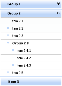
The <rich:panelMenu> component does not need any extra attributes declared for basic usage. However, it does require child <rich:panelMenuGroup> and <rich:panelMenuItem> components. Refer to Section 12.4.9, “<rich:panelMenuGroup>” and Section 12.4.10, “<rich:panelMenuItem>” for details on these child components.
The activeItem attribute is used to point to the name of the currently selected menu item.
By default, the event to expand the menu is a mouse click. Set the expandEvent attribute to specify a different event to expand menus. Multiple levels of sub-menus can be expanded in one action. Set expandSingle="true" to only expand one sub-menu at a time.
Similarly, the default event to collapse the menu is a mouse click. Set the collapseEvent attribute to specify a different event to collapse menus.
As with other control components, set disabled="true" to disable the <rich:panelMenu> comonent. Child menu components can be disabled in the same way.
Icons for the panel menu can be chosen from a set of standard icons. Icons can be set for the top panel menu, child panel menus, and child item. There are three different menu states that the icon represents, as well as icons for both the left and right side of the item title.
topGroupExpandedLeftIcon,topGroupExpandedRightIcon- These attributes determine the icons for the top level menu when it is expanded.
topGroupCollapsedLeftIcon,topGroupCollapsedRightIcon- These attributes determine the icons for the top level menu when it is collapsed.
topGroupDisabledLeftIcon,topGroupDisabledRightIcon- These attributes determine the icons for the top level menu when it is disabled.
topItemLeftIcon,topItemRightIcon- These attributes determine the icons for a top level menu item.
topItemDisabledLeftIcon,topItemDisabledRightIcon- These attributes determine the icons for a top level menu item when it is disabled.
groupExpandedLeftIcon,groupExpandedRightIcon- These attributes determine the icons for sub-menus that are not the top-level menu when they are expanded.
groupCollapsedLeftIcon,groupCollapsedRightIcon- These attributes determine the icons for sub-menus that are not the top-level menu when they are collapsed.
groupDisabledLeftIcon,groupDisabledRightIcon- These attributes determine the icons for sub-menus that are not the top-level menu when they are disabled.
itemLeftIcon,itemRightIcon- These attributes determine the icons for items in the menus.
itemDisabledLeftIcon,itemDisabledRightIcon- These attributes determine the icons for items in the menus when they are disabled.
Example 12.2, “panelMenu” demonstrates the use of icon declaration at the panel menu level. The standard icons are shown in Figure 9.4, “<Standard icons>”. Alternatively, point the icon attributes to the paths of image files. The image files are then used as icons.
Any icons specified by child <rich:panelMenuGroup> and <rich:panelMenuItem> components overwrite the relevant icons declared with the parent <rich:panelMenu> component.
The itemMode attribute defines the submission mode for normal menu items that link to content, and the groupMode attribute defines the submission mode for menu items that expand and collapse. The settings for these attributes apply to the entire menu unless a menu item defines its own individual itemMode or groupMode. The possible values for itemMode and groupMode are as follows:
-
server, the default setting, which submits the form normally and completely refreshes the page. -
ajax, which performs an Ajax form submission, and re-renders elements specified with therenderattribute. -
client, which causes theactionandactionListeneritems to be ignored, and the behavior is fully defined by the nested components instead of responses from submissions.
The <rich:panelMenu> component fires the ItemChangeEvent event on the server side when the menu is changed. The event only fires in the server and ajax submission modes. The event provides the itemChangeListener attribute to reference the event listener. Refer to Section 9.6.6, “<rich:itemChangeListener>” for details on the <rich:itemChangeListener> tag.
The <rich:panelMenu> component can be controlled through the JavaScript API. The JavaScript API provides the following functions:
expandAll()- Expand all the panel menu groups in the component.
collapseAll()- Collapse all the panel menu groups in the component.
selectItem(id)-
Select the menu item with the
ididentifier (either component id or name). expandGroup(id)-
Expand a panel menu group with the
ididentifier (either component id or name). collapseGroup(id)-
Expand a panel menu group with the
ididentifier (either component id or name).
-
component-type:org.richfaces.PanelMenu -
component-class:org.richfaces.component.UIPanelMenu -
component-family:org.richfaces.PanelMenu -
renderer-type:org.richfaces.PanelMenuRenderer -
handler-class:org.richfaces.view.facelets.html.PanelMenuTagHandler
Table 12.3. Style classes (selectors) and corresponding skin parameters
| Class (selector) | Skin Parameters | Mapped CSS properties |
|---|---|---|
| No skin parameters. | |
|
|
|
| No skin parameters. | |
| No skin parameters. | |
| No skin parameters. | |
| No skin parameters. | |
|
|
|
|
| |
| No skin parameters. | |
|
|
|
| No skin parameters. | |
|
|
|
| No skin parameters. | |
| No skin parameters. | |
|
|
|
|
| |
|
|
|
| No skin parameters. | |
| No skin parameters. | |
|
|
|
|
|
|
|
|
|
| No skin parameters. | |
| No skin parameters. | |
|
|
|
|
| |
| No skin parameters. | |
|
|
|
|
| |
| No skin parameters. | |
|
|
|
| No skin parameters. | |
|
|
|
| No skin parameters. | |
| No skin parameters. | |
|
|
|
|
| |
|
|
|
| No skin parameters. | |
| No skin parameters. | |
|
|
|
|
| |
|
|
|
|
| |
| No skin parameters. | |
| No skin parameters. | |
|
|
|
|
| |
| No skin parameters. | |
The <rich:panelMenuGroup> component defines a group of <rich:panelMenuItem> components inside a <rich:panelMenu>.
The <rich:panelMenuGroup> component needs the label attribute declared, which specifies the text to show for the menu entry. Alternatively, the label facet can be used to specify the menu text.
In addition, the <rich:panelMenuGroup> component at least one <rich:panelMenuGroup> or <rich:panelMenuItem> components as child elements.
Icons for the menu group are inherited from the parent <rich:panelMenu> component. Refer to Section 12.4.3, “Appearance” for details on icon attributes and facets. Alternatively, the menu group’s icons can be re-defined at the <rich:panelMenuGroup> component level, and these settings will be used instead of the parent component’s settings.
If the mode attribute is unspecified, the submission behavior for the group is inherited from the parent <rich:panelMenu>. Otherwise, the groupMode setting of the panel menu is used instead of the parent’s behavior. Refer to Section 12.4.4, “Submission modes” for submission mode settings.
The <rich:panelMenuGroup> component fires the ActionEvent event on the server side when the menu group receives a user action. The event only fires in the server and ajax submission modes. The event provides the action attribute to specify the user action method, and the actionListener attribute to reference the event listener.
The <rich:panelMenuGroup> component can be controlled through the JavaScript API. The JavaScript API provides the following functions:
expand()- Expand this panel menu group.
collapse()- Collapse this panel menu group.
select()- Select this panel menu group.
The <rich:panelMenuItem> component represents a single item inside a <rich:panelMenuGroup> component, which is in turn part of a <rich:panelMenu> component.
The <rich:panelMenuItem> component needs the label attribute declared, which specifies the text to show for the menu entry. Alternatively, the label facet can be used to specify the menu text.
Icons for the menu item are inherited from the parent <rich:panelMenu> or <rich:panelMenuGroup> component. Refer to Section 12.4.3, “Appearance” for details on icon attributes and facets. Alternatively, the menu item’s icons can be re-defined at the <rich:panelMenuItem> component level, and these settings will be used instead of the parent component’s settings.
If the mode is unspecified, the submission behavior for the item is inherited from the parent <rich:panelMenu>. Otherwise, the itemMode setting from the panel menu is used instead of the parent’s behavior.
The <rich:panelMenuItem> component fires the ActionEvent event on the server side when the menu item receives a user action. The event only fires in the server and ajax submission modes. The event provides the action attribute to specify the user action performed, and the actionListener attribute to reference the event listener.
The <rich:panelMenuItem> component can be controlled through the JavaScript API. The JavaScript API provides the following functions:
select()- Select this menu item.
The <rich:toolbar> component is a horizontal toolbar. Any JavaServer Faces ( JSF) component can be added to the toolbar.

The <rich:toolbar> component does not require any attributes to be defined for basic usage. Add child components to the <rich:toolbar> component to have them appear on the toolbar when rendered.
Example 12.3. Basic usage
<rich:toolbar>

   <h:commandLink value="News" />

   <h:commandLink value="Reviews" />

   <h:commandLink value="Galleries" />

</rich:toolbar>
Set the width and height of the toolbar using the common width and height attributes.
Items on the toolbar can be separated by a graphical item separator. Use the itemSeparator attribute to specify one of the standard separator styles:
-
none, the default appearance, does not show any item separators. -
discshows a small circular disc to separate items:
-
gridshows a grid pattern to separate items:
-
lineshows a vertical line to separate items:
-
squareshows a small square to separate items:
Alternatively, use the itemSeparator attribute to specify a URL to an image. The image is then used as an item separator. The appearance of the item separator can be additionally customized by using the itemSeparator facet.
Group together multiple items on the toolbar by using the <rich:toolbarGroup> child component. Refer to Section 12.5.6, “<rich:toolbarGroup>” for full details on the <rich:toolbarGroup> component.
-
component-type:org.richfaces.Toolbar -
component-class:org.richfaces.component.UIToolbar -
component-family:org.richfaces.Toolbar -
renderer-type:org.richfaces.ToolbarRenderer
Table 12.4. Style classes (selectors) and corresponding skin parameters
| Class (selector) | Skin Parameters | Mapped CSS properties |
|---|---|---|
|
|
|
|
| |
|
| |
|
| |
|
| |
|
| |
| No skin parameters. | |
| No skin parameters. | |
| No skin parameters. | |
| No skin parameters. | |
The <rich:toolbarGroup> component is a child component of the <rich:toolbar> component. The <rich:toolbarGroup> component is used to group a number of items together on a toolbar.
Like the <rich:toolbar> parent component, the <rich:toolbarGroup> component does not require any extra attributes for basic functionality. Add child components to the <rich:toolbarGroup> component to have them appear grouped on the parent toolbar when rendered.
Similar to the <rich:toolbar> component, items within a <rich:toolbarGroup> can be separated by specifying the itemSeparator attribute. Refer to Section 12.5.2, “Appearance” for details on using the itemSeparator attribute.
Groups of toolbar items can be located on either the left-hand side or the right-hand side of the parent toolbar. By default, they appear to the left. To locate the toolbar group to the right of the parent toolbar, set location="right".
Example 12.4. <rich:toolbarGroup>
<rich:toolBar height="26" itemSeparator="grid">

   <rich:toolBarGroup>

      <h:graphicImage value="/images/icons/create_doc.gif"/>

      <h:graphicImage value="/images/icons/create_folder.gif"/>

      <h:graphicImage value="/images/icons/copy.gif"/>

   </rich:toolBarGroup>

   <rich:toolBarGroup>

      <h:graphicImage value="/images/icons/save.gif"/>

      <h:graphicImage value="/images/icons/save_as.gif"/>

      <h:graphicImage value="/images/icons/save_all.gif"/>

   </rich:toolBarGroup>

   <rich:toolBarGroup location="right">

      <h:graphicImage value="/images/icons/find.gif"/>

      <h:graphicImage value="/images/icons/filter.gif"/>

   </rich:toolBarGroup>

</rich:toolBar>
The example shows how to locate a toolbar group to the right-hand side of the parent toolbar. It also demonstrates how item separators on the parent toolbar work with toolbar groups.

Read this chapter for details on components that display messages and other feedback to the user.
The <rich:chart> component allows the user to plot data and to create line, bar or pie charts. It uses up to five children tags <rich:chartSeries>, <rich:chartLegend>, <rich:chartXAxis>, <rich:chartYAxis> and <rich:chartPoint>. Each child tag customizes a particular aspect of the chart. All are optional except at least one <rich:chartSeries> tag is required.
Additionally the <rich:chart> component allows one to handle events using either a client-side JavaScript or using server-side listeners.
The <rich:chart> tag and its optional children tags generate and customize the chart. The chart type is selected by a <rich:chartSeries> attribute. The only requirements for use of the <rich:chart> are selection of the chart type and to pass at least one series of data - explained below.
The <rich:chart> component accepts data by two means - by facelet iteration or by creating data model object.
Use <a4j:repeat> and a collection of objects inside the <rich:chartSeries> tag and specify what you want to be plotted on the x and y axis using <rich:chartPoint> tag. The <a4j:repeat> approach can also be used at the <rich:chartSeries> level.
Example 13.1. rich:chart facelet iteration example
<rich:chart id="barChart" title="Countries by vehicles per capita">

    <rich:chartSeries type="bar">

        <a4j:repeat value="#{bean.records}" var="record">

            <rich:chartPoint x="#{record.country}" y="#{record.count}"/>

        </a4j:repeat>

    </rich:chartSeries>

    <rich:chartYAxis label="Motor vehicles per 1000 people"/>

</rich:chart>
When facelet iteration is used the ChartDataModel object is created by the ChartRenderer. An alternative to this is to create a ChartDataModel yourself and pass it using <rich:chartSeries> data attribute. To do this, create an instance of one of the child classes of ChartDataModel - NumberChartDataModel, StringChartDataModel or DateChartDataModel (not yet fully supported). Select the class according to the data type used on the x-axis. Add values to the model using the put method and pass it to the <rich:chartSeries> tag using the data attribute.
Example 13.2. rich:chart DataModel object example
<rich:chart id="barChart" title="Countries by vehicles per capita">

   <rich:chartSeries type="bar" data="#{bean.cars}"/>

   <rich:chartYAxis label="Motor vehicles per 1000 people"/>

</rich:chart>
cars = new StringChartDataModel(ChartDataModel.ChartType.bar);

cars.put("San Marino", 1263);

cars.put("United States", 797);

...
If there is a model passed using the <rich:chartSeries> data attribute, any nested <rich:chartPoint> tags are ignored. If the data attribute is not used, then nested <rich:chartPoint> tags are expected.
The chart configuration is split into multiple tags providing a clearer facelet API. To configure axes, their min/max values, and label use <rich:chartXAxis> or <rich:chartYAxis> tag. The <rich:chartLegend> allows one to set up the position of the legend and the order of the labels within it.
To adjust the chart component size you can use CSS class .richfaces-chart-container, to customize title use .richfaces-chart-title the placeholder. The chart itself is placed in the div with the CSS class .richfaces-chart.
The <rich:chart> can also be customized directly through JavaScript to allow the use of plugins or objects that are not directly supported by the component.
There are two ways to define the customization: the hooks attribute or a facet named hooks. The facet takes precedence over attribute when both are defined.
<h:outputScript>

    var hooks = {

        processOptions: [function(plot,options) {

                options.xaxes[0].tickFormatter = function (value, axis) {

                    return value.toLocaleString('en-US', {minimumFractionDigits: 2});

                };

        }]

    };

</h:outputScript>

<rich:chart hooks="hooks" />


<rich:chart>

    <f:facet name="hooks">

        {

            processOptions: [function(plot,options) {

                    options.xaxes[0].tickFormatter = function (value, axis) {

                        return value.toLocaleString('en-US', {minimumFractionDigits: 2});

                    };

            }]

        }

    </f:facet>

</rich:chart>
In the above samples, the <rich:chart> is configured to display the label on x-axis according to US locale (e.g. 45,324.23).
Note
For further configuration options, refer to Flot API - Hooks and Flot API - Plugins.
The <rich:chart> component does not only create static charts.
-
It allows the user to zoom line charts when the
<rich:chart>attribute zoom is set true. To reset zoom you can use the JavaScript API. -
You can also add functions to handle events fired by components. Event handlers are set up using proper
<rich:chart>attributes. They handle events fired by any series. If you want to handle an event only fired by a particular series, set up handlers using the<rich:chartSeries>attributes.
-
The
PlotClickEventis fired when the user clicks a point in the chart. To set a listener use theClickListenerattribute.
-
The
plothoverevent points to the client-side function to execute when the mouse cursor is over the chart point. -
The
plotclickevent points to the client-side function to execute when the user clicks the chart point. -
The
mouseoutevent points to the cient-side function to execute when the mouse cursor leaves the chart grid.
The plothover and plotclick handlers are given an event-object that contains the deatils of which point fired the event.
function log(e){
           	console.log("Series index: "+
                 	e.data.seriesIndex +" DataIndex: "+
                 	e.data.dataIndex+' ['+e.data.x+','+e.data.y+']');
}
To access the jQuery widget of the component, use the componentID + chart
resetZoom()- display chart without scaling
getPlotObject()- returns JavaScript object containing chart data and options
Example
<rich:chart id="priceChart">
$(document.getElementById("priceChart")).chart("resetZoom")
The <rich:message> component renders a single FacesMessage message instance added for the component. The appearance of the message can be customized, and tool-tips can be used for further information about the message.
The <rich:message> component is rendered in the same way as the standard <h:message> component, but allows separate styling of the message summary and detail. It allows unified icons to be set using background images in predefined classes.
The <rich:message> component needs the for attribute to point to the id identifier of the related component. The message is displayed after the FacesMessage message instance is created and added for the client identifier of the related component.
The <rich:message> component is automatically rendered after an Ajax request. This occurs without the use of an <a4j:outputPanel> component or a specific reference through the render attribute of the Ajax request source.
Example 13.3. rich:message example
<h:outputText value="Zip:" />

<h:inputText label="Zip" id="zip" required="true"

             value="#{userBean.zip}">

   <f:validateLength minimum="4" maximum="9" />

</h:inputText>

<rich:message for="zip" ajaxRendered="true"/>
The example contains a text input for zip codes. The simple validation requires the entered zip code to be between 4 and 9 characters long. The <rich:message> component references the input box, and reports any messages relating to the input validation.
The showSummary attribute specifies whether to display only a summary of the full message. The full message can be displayed in a tool-tip when hovering the mouse over the summary.
Use CSS (Cascading Style Sheets) to customize the appearance and icon for the <rich:message> component. To use a custom icon, set the background-image property to the icon graphic, as shown in Example 13.4, “Message icons”. Refer to Section 13.2.4, “Style classes and skin parameters” for a complete list of style classes for the <rich:message> component.
Example 13.4. Message icons
.rf-msg-err{
   background-image: url('#{facesContext.externalContext.requestContextPath}/images/icons/error.gif');
}
The example demonstrates how an icon for an error message could be added using CSS.
-
component-type:org.richfaces.Message -
component-class:org.richfaces.component.html.HtmlMessage -
component-family:javax.faces.Message -
renderer-type:org.richfaces.MessageRenderer
Table 13.1. Style classes (selectors) and corresponding skin parameters
| Class (selector) | Skin Parameters | Mapped CSS properties |
|---|---|---|
|
|
|
|
| |
|
|
|
|
|
|
|
|
|
|
|
|
|
|
|
| No skin parameters. | |
The <rich:messages> components works similarly to the <rich:message> component, but can display all the validation messages added for the current view instead of just a single message. Refer to Section 13.1, “<rich:chart>” for details on the <rich:message> component.
The <rich:messages> component doesn’t require any extra attributes for basic usage. It displays all messages relating to requests from components.
To limit the messages to a specific component, use the for attribute to reference the component’s identifier.
To show only those messages that are not attached to specific components, set globalOnly="true".
The <rich:messages> component is automatically rendered after an Ajax request. This occurs without the use of an <a4j:outputPanel> component or a specific reference through the render attribute of the Ajax request source.
The <rich:messages> component displays error messages for each validating component in the same container.
The <rich:messages> component can be further styled through CSS, the same as for the <rich:message> component. Refer to Section 13.2.2, “Appearance” for an example of message styling, and refer to Section 13.3.4, “Style classes and skin parameters” for a complete list of style classes for the <rich:message> component.
The layout of the messages can also be customized through CSS. By default, the messages are arranged in a block as shown in Figure 13.4, “Messages in a block”.
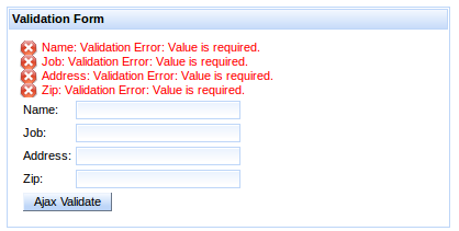
Override the display property for all CSS message classes to customize the layout as follows:
- Display messages in a list with no icons
- To display the messages in a list format without the default icons, override the message styles as follows:
.rf-msg-err, .rf-msgs-err, .rf-msg-ftl, .rf-msgs-ftl, .rf-msg-inf,
.rf-msgs-inf, .rf-msg-wrn, .rf-msgs-wrn, .rf-msg-ok, .rf-msgs-ok {
   display: list-item;
   margin-left: 20px;
   padding-left: 0px; }

.rf-msg-err, .rf-msgs-err{ background-image:none; }
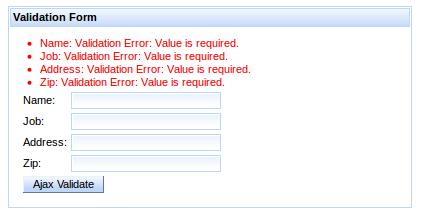
- Display in-line messages
- To display the messages in line with text, override the message styles as follows:
.rf-msg-err, .rf-msgs-err, .rf-msg-ftl, .rf-msgs-ftl, .rf-msg-inf,
.rf-msgs-inf, .rf-msg-wrn, .rf-msgs-wrn, .rf-msg-ok, .rf-msgs-ok { display:inline; }
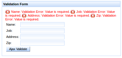
-
component-type:org.richfaces.Messages -
component-class:org.richfaces.component.html.HtmlMessages -
component-family:javax.faces.Messages -
renderer-type:org.richfaces.MessagesRenderer
Table 13.2. Style classes (selectors) and corresponding skin parameters
| Class (selector) | Skin Parameters | Mapped CSS properties |
|---|---|---|
|
|
|
|
| |
|
|
|
|
|
|
|
|
|
|
|
|
|
|
|
| No skin parameters. | |
The <rich:notify> component serves for advanced user interaction, using notification boxes to give the user instant feedback on what’s happening within the application. Each time this component is rendered, a floating notification box is displayed in the selected corner of the browser screen.
The <rich:notify> has two message customization attributes: summary is short text summarizing the message, while detail configures the detailed body of the message. Both attributes have their counterparts in form of facets with the same names as the corresponding attributes.
A notification appears on the page each time it is rendered, either on full-page or ajax requests. The notification remains on the screen for 8 seconds and then disappears. Users can close the notification with the close button in the top-right corner of the notification.
Notification stacks can be used to create sequences. For customization of stacking see the <rich:notifyStack> component.
There are several attributes that can change default behavior:
-
sticky: notifications does not disappear automatically, they needs to be closed explicitly with close button (this attribute can’t be used together withnonblockingandstayTime) -
stayTime: configures how long notification stays on the screen before it disappears (in miliseconds) -
styleClass: defines the class customizing the notification -
nonblocking: defines notifications which becomes partially transparent and user can click through. Non-blocking notifications don’t have close button. -
nonblockingOpacity: defines opacity of nonblocking notifications when mouse hovers over notification (decimal number between 0 and 1) -
showShadow: defines whether shadow will be displayed under the notification
Note
Nonblocking notifications can be clicked through, but because they are using jQuery mechanism to bypass events, only jQuery event handlers are triggered. IThis means that standard links won’t be triggered.
-
component-type:org.richfaces.Notify -
component-class:org.richfaces.component.UINotify -
component-family:org.richfaces.Notify -
renderer-type:org.richfaces.NotifyRenderer
Note that skinning is common for <rich:notify>, <rich:notifyMessage> and <rich:notifyMessages>
Table 13.3. Style classes (selectors) and corresponding skin parameters
| Class (selector) | Skin Parameters | Mapped CSS properties |
|---|---|---|
| No skin parameters. | |
|
|
|
|
| |
|
|
|
|
| |
|
| |
| No skin parameters. | |
| No skin parameters. | |
| No skin parameters. | |
| No skin parameters. | |
| No skin parameters. | |
The <rich:notifyMessage> component is built on top of <rich:notify>, the difference is in usage. The <rich:notifyMessage> component displays FacesMessage s associated with a given component, similar to <rich:message>: one notification is displayed for first FacesMessage in the stack that is risen either programatically or during conversion/validation of the component. The severity of the message determines the color and icon of the resulting notification.
For customization of notification behavior, please refer to Customizing notifications of <rich:notify>.
-
component-type:org.richfaces.NotifyMessage -
component-class:org.richfaces.component.html.HtmlNotifyMessage -
component-family:javax.faces.Message -
renderer-type:org.richfaces.NotifyMessageRenderer
Note that <rich:notifyMessage> shares common classes with <rich:notify>, since there is exactly one notification rendered for each JSF message.
The <rich:notifyMessage> specific classes are redefining the look for various message severity levels.
Table 13.4. Style classes (selectors) and corresponding skin parameters
| Class (selector) | Skin Parameters | Mapped CSS properties |
|---|---|---|
|
|
|
| No skin parameters. | |
| No skin parameters. | |
| No skin parameters. | |
| No skin parameters. | |
The <rich:notifyMessages> component is the same as the <rich:notifyMessage> component, but each of the available messages generates one notification.
<rich:notifyMessages> shares the same set of attributes with <rich:notifyMessage>
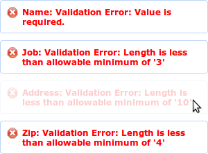
-
component-type:org.richfaces.NotifyMessages -
component-class:org.richfaces.component.html.HtmlNotifyMessages -
component-family:javax.faces.Messages -
renderer-type:org.richfaces.NotifyMessagesRenderer
Notifications emited by <rich:notify>, <rich:notifyMessage> and <rich:notifyMessages> are displayed in top-right corner of the screen by default.
It is <rich:notifyStack> which defines where messages will appear and handles their stacking.
Stack also provides way how to remove messages from screen - when stack is re-rendered, current notifications are destroyed, freeing place for new notifications.
They are three alternative ways to bind notifications with a stack:
-
wrapping: nesting
<rich:notify>,<rich:notifyMessage>or<rich:notifyMessages>binds notifications with the stack in which they are wrapped -
binding by id: notification can be bound directly to a stack using it’s
componentIdin thestackattribute - using default stack: a default stack is used when no other binding is defined for a given notification
<rich:notifyStack position="bottomRight">

    <rich:notifyMessages />

</rich:notifyStack>
The sample above defines the stack explicitly, where notifications use the stack in which they are wrapped.
The sample bellow uses a notification rendered into the top-left corner of the screen. The notification is bound to a stack using it’s id.
<rich:notifyStack id="leftStack" position="topLeft" />


<rich:notify stack="leftStack" />
To redefine the position of a notification, one needs to define a stack and bind it with the given notification.
<rich:notifyStack> uses the position attribute to place the stack and it’s notifications into one of four corners: topRight (default), bottomRight, bottomLeft, topLeft.
There are two attributes which influences how notifications are placed into a stack:
-
method: defines where new notifications are placed and how they are removed. Options:first(default),last.direction: defines in which direction will be messages stacked. Options:vertical(default),horizontal
The following sample shows a stack which will place new notifications up front - the incoming message will appear first, causing all notifications currently in stack to shift. Subsequently, messages at the end of stack will be then removed.
<rich:notifyStack method="first" />
On the other hand, stacking method last provides a method to place messages on the end of the stack, and when removing a notification, it is removed from the start, causing all other notifications to shift.
-
component-type:org.richfaces.NotifyStack -
component-class:org.richfaces.component.UINotifyStack -
component-family:org.richfaces.NotifyStack -
renderer-type:org.richfaces.NotifyStackRenderer
Table 13.5. Style classes (selectors) and corresponding skin parameters
| Class (selector) | Skin Parameters | Mapped CSS properties |
|---|---|---|
| No skin parameters. | |
| No skin parameters. | |
| No skin parameters. | |
| No skin parameters. | |
The <rich:progressBar> component displays a progress bar to indicate the status of a process to the user. It can update either through Ajax or on the client side, and the look and feel can be fully customized.

Basic usage of the <rich:progressBar> component requires the value attribute, which points to the property that holds the current progress value. When the value is greater than or equal to the minimum value ( 0 by default), the progress bar becomes active, and starts sending Ajax requests if in ajax mode.
By default, the minimum value of the progress bar is 0 and the maximum value of the progress bar is 100. These values can be customized using the minValue and maxValue attributes respectively.
The progress bar can be labeled in one of two ways:
- Using the
labelattribute -
The content of the
labelattribute is displayed over the progress bar.
Example 13.6. Using the label attribute
<rich:progressBar value="#{bean.incValue}" id="progrs" label="#{bean.incValue} % complete"/>
- Using nested child components
-
Child components, such as the JSF
<h:outputText>component, can be nested in the<rich:progressBar>component to display over the progress bar.
Example 13.7. Using nested child components
<rich:progressBar value="#{bean.incValue}">

    <h:outputText value="#{bean.incValue} % complete"/>

</rich:progressBar>
Define the initial and finish facets to customize the progress bar’s appearance before progress has started and after progress has finished. When the current progress bar value is less than the minimum value, the initial facet is displayed. When the current progress bar is greater than the maximum value, the finish facet is displayed.
Example 13.8. Initial and finished states
<rich:progressBar value="#{bean.incValue1}">

    <f:facet name="initial">

        <h:outputText value="Process has not started"/>

    </f:facet>

    <f:facet name="finish">

        <h:outputText value="Process has completed"/>

    </f:facet>

</rich:progressBar>
The mode for updating the progress bar is determined by the mode attribute, which can have one of the following values:
ajax-
The progress bar updates in the same way as the
<a4j:poll>component. The<rich:progressBar>component repeatedly polls the server for the current progress value. client- The progress bar must be explicitly updated on the client side through the JavaScript API.
The <rich:progressBar> component can be set to constantly poll for updates at a constant interval. Use the interval component to set the interval in milliseconds. The progress bar is updated whenever the polled value changes. Polling is only active when the enabled attribute is set to true.
Example 13.9. Using set intervals
<rich:progressBar value="#{bean.incValue1}" id="progress" interval="900" enabled="#{bean.enabled1}"/>
The <rich:progressBar> component can be controlled through the JavaScript API. The JavaScript API provides the following functions:
getValue()- Return the current value displayed on the progress bar.
setValue()- Set the current value to display on the progress bar.
getMinValue()- Return the minimum value for the progress bar.
getMaxValue()- Return the maximum value for the progress bar.
disable()- Disables the progress bar.
enable()- Enables the progress bar.
isEnabled()- Returns a boolean value indicating whether the progress bar is enabled.
-
component-type:org.richfaces.ProgressBar -
component-class:org.richfaces.component.UIProgressBar -
component-family:org.richfaces.ProgressBar -
renderer-type:org.richfaces.ProgressBarRenderer
Table 13.6. Style classes (selectors) and corresponding skin parameters
| Class (selector) | Skin Parameters | Mapped CSS properties |
|---|---|---|
| No skin parameters. | |
|
|
|
|
| |
|
|
|
|
| |
|
| |
The <rich:tooltip> component provides an informational tool-tip. The tool-tip can be attached to any control and is displayed when hovering the mouse cursor over the control.
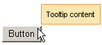
For basic usage, define the tool-tip text using the value attribute. The <rich:tooltip> component is then automatically attached to the parent element, and is usually shown when the mouse cursor hovers.
Alternatively, the content of the tool-tip can be defined inside the <rich:tooltip> tags, and the value attribute is not used. This allows HTML tags to be used to define the content, and provides for rich content such as images, links, buttons, and other RichFaces components.
Example 13.10. Defining tool-tip content
- Basic content
<rich:panel>

    <rich:tooltip value="This is a tool-tip."/>

</rich:panel>
- Rich content
<rich:panel>

    <rich:tooltip>

        This is a <b>tool-tip</b>.

    </rich:tooltip>

</rich:panel>
If not otherwise specified, the tool-tip is attached to the parent element in which it is defined. The target attribute is used to attach the tool-tip to another component, pointing to the target component’s id identifier. This allows the <rich:tooltip> component to be specified outside the target element. This approach is demonstrated in Example 13.11, “Attaching the tool-tip”.
Example 13.11. Attaching the tool-tip
<rich:panel id="panelId">

...

</rich:panel>


<rich:tooltip value="This is a tool-tip." target="panelId"/>
The <rich:tooltip> component can alternatively be left unattached, and is instead invoked through an event handler on the target component. To leave the <rich:tooltip> component unattached, set attached="false", and define the event handler to trigger the tool-tip on the target component. This approach is demonstrated in Example 13.12, “Unattached tool-tips”. When leaving the <rich:tooltip> component unattached, ensure it has an id identifier defined. If it is defined outside the target element, it must be nested in an <h:form> component.
Example 13.12. Unattached tool-tips
<rich:panel id="panelId" onclick="#{rich:component('tooltipId')}.show(event);" />


<h:form>

    <rich:tooltip id="toolTipId" attached="false" value="This is a tool-tip."/>

</h:form>
By default, the <rich:tooltip> component is positioned intelligently based on the position of the mouse cursor. Use the jointPoint attribute to specify a corner of the target component at which to display the tool-tip instead, and use the direction attribute to specify the direction the tool-tip will appear relative to that corner. Possible values for both attributes are: auto, autoLeft, autoRight, bottomAuto, bottomLeft, bottomRight, topAuto, topLeft, topRight. Use the horizontalOffset and verticalOffset attributes to specify the horizontal offset and vertical offset at which to display the tool-tip.
Use the showEvent attribute to specify when the tool-tip is shown. By default it appears when the attached component is hovered-over with the mouse. Use the hideEvent attribute to specify when the tool-tip is hidden. The default value is none, so the tool-tip remains shown. However, it can be linked to an event on the target component, such as the mouseout event.
Set followMouse="true" to cause the tool-tip to follow the user’s mouse movements.
Advanced appearance features are demonstrated in Example 13.13, “Advanced tool-tip usage”.
The mode for updating the tool-tip is determined by the mode attribute, which can have one of the following values:
ajax- The tool-tip content is requested from the server with every activation.
client- The tool-tip content is rendered once on the server. An external submit causes the content to re-render.
When using mode="ajax", define the loading facet. The tool-tip displays the content of the loading facet while loading the actual content from the server.
Example 13.13. Advanced tool-tip usage
<h:commandLink value="Simple Link" id="link">

    <rich:tooltip followMouse="true" direction="topRight" mode="ajax" value="#{bean.toolTipContent}"

                  horizontalOffset="5" verticalOffset="5" layout="block">

        <f:facet name="loading">

            <f:verbatim>Loading...</f:verbatim>

        </f:facet>

    </rich:tooltip>

</h:commandLink>
The <rich:tooltip> component supports the following client-side events:
click- This event is activated when the tool-tip is clicked with the mouse.
dblclick- This event is activated when the tool-tip is double-clicked with the mouse.
mouseout- This event is activated when the mouse cursor leaves the tool-tip.
mousemove- This event is activated when the mouse cursor moves over the tool-tip.
mouseover- This event is activated when the mouse cursor hovers over the tool-tip.
show- This event is activated when the tool-tip is shown.
complete- This event is activated when the tool-tip is completed.
hide- This event is activated when the tool-tip is hidden.
The <rich:tooltip> component can be controlled through the JavaScript API. The JavaScript API provides the following functions:
show(event)- Show the tool-tip.
hide()- Hide the tool-tip.
-
component-type:org.richfaces.Tooltip -
component-class:org.richfaces.component.UITooltip -
component-family:org.richfaces.Tooltip -
renderer-type:org.richfaces.TooltipRenderer
Table 13.7. Style classes (selectors) and corresponding skin parameters
| Class (selector) | Skin Parameters | Mapped CSS properties |
|---|---|---|
| No skin parameters. | |
| No skin parameters. | |
| No skin parameters. | |
|
|
|
|
| |
|
| |
Read this chapter for details on adding drag and drop support to controls.
The <rich:dragSource> component can be added to a component to indicate it is capable of being dragged by the user. The dragged item can then be dropped into a compatible drop area, designated using the <rich:dropTarget> component.
To add drag support to a component, attach the <rich:dragSource> component as a child element.
The type attribute must be specified, and can be any identifying string. Dragged items can only be dropped in drop zones where the type attribute of the <rich:dragSource> component is listed in the acceptedTypes attribute of the <rich:dropTarget> component.
Use the dragIndicator parameter to customize the appearance of a dragged object while it is being dragged. The dragIndicator parameter must point to the id identifier of a <rich:dragIndicator> component. If the dragIndicator attribute is not defined, the drag indicator appears as a clone of the <rich:dragSource> component’s parent control.
To bind data to the dragged object, use the dragValue attribute. The dragValue attribute specifies a server-side object, which is then bound to the parent component when it is dragged. This facilitates handling event data during a drop event.
Use the dragOptions parameter to further customize the appearance and behavior of the dragIndicator.
<h:outputScript>

    opts = {

        helper: function () {

            return $("#indicator").clone();

        },

        cursorAt: {

            left: 5,

            top: 5

        }

    }

</h:outputScript>


<rich:dragSource dragOptions="opts" />
For full list of options see the jQuery.draggable documentation.
The <rich:dropTarget> component can be added to a component so that the component can accept dragged items. The dragged items must be defined with a compatible drop type for the <rich:dragSource> component.
To allow dragged items to be dropped on a component, attach the <rich:dropTarget> component as a child element to the component.
The acceptedTypes attribute must be specified. The acceptedTypes attribute is a comma-separated list of strings that match the types of dragged items. Dragged items can only be dropped in drop zones where the type attribute of the <rich:dragSource> component is listed in the acceptedTypes attribute of the <rich:dropTarget> component.
The acceptedTypes attribute can optionally be set to either @none or @all. If set to @none, the component will not accept any type of dropped object. If set to @all, the component accepts all dropped objects. If the acceptedTypes attribute is not specified, the default value is null, which is the same as a @none setting.
To provide additional parameters for the server-side drop event, use the dropValue attribute.
The <rich:dropTarget> component raises the DropEvent server-side event when an object is dropped. The event uses the following parameters:
-
The
dragSourceidentifies the component being dragged (the parent of the<rich:dragSource>component). -
The
dragValueparameter is the content of the<rich:dragSource>component’sdragValueattribute. -
The
dropValueparameter is the content of the<rich:dropTarget>component’sdropValueattribute.
-
component-type:org.richfaces.DropTarget -
component-class:org.richfaces.component.UIDropTarget -
component-family:org.richfaces.DropTarget -
renderer-type:org.richfaces.DropTargetRenderer -
handler-class:org.richfaces.view.facelets.DropHandler
The <rich:dragIndicator> component defines a graphical element to display under the mouse cursor during a drag-and-drop operation.
To use a drag indicator, define the inner content that appears during a drag event. No additional attributes are required. If a drag indicator is not used, a clone of the drag source is used instead.
The drag indicator can be styled depending on the current state of the dragged element. There are three attributes for different states. The attributes reference the CSS class to use for styling the drag indicator when the dragged element is in the relevant state.
acceptClass-
The
acceptClassattribute specifies the style when the dragged element is over an acceptable drop target. It indicates that thetypeattribute of the element’s<rich:dragSource>component matchesacceptedTypesattribute of the drop target’s<rich:dropTarget>component. rejectClass-
The
rejectClassattribute specifies the style when the dragged element is over a drop target that is not acceptable. It indicates that thetypeattribute of the element’s<rich:dragSource>component is not found in theacceptedTypesattribute of the drop target’s<rich:dropTarget>component. draggingClass-
The
draggingClassattribute specifies the style when the dragged element is being dragged. It indicates that the dragged element is not over a drop target.
-
component-type:org.richfaces.DragIndicator -
component-class:org.richfaces.component.UIDragIndicator -
component-family:org.richfaces.DragIndicator -
renderer-type:org.richfaces.DragIndicatorRenderer
Style classes (selectors)
.rf-ind- This class defines styles for the drag indicator.
.rf-ind-drag.accept- This class defines styles for the indicator when it is over an acceptable drop target.
.rf-ind-drag.reject- This class defines styles for the indicator when it is over an unacceptable drop target.
.rf-ind-drag.default- This class defines styles for the indicator when it is being dragged, and is not over any drop targets.
Read this chapter to alter the layout and appearance of web applications using special components.
The <rich:jQuery> component applies styles and custom behavior to both JSF (JavaServer Faces) objects and regular DOM (Document Object Model) objects. It uses the jQueryJavaScript framework to add functionality to web applications.
The query triggered by the <rich:jQuery> component is specified using the query attribute.
With the query defined, the component is used to trigger the query as either a timed queryor a named query. The query can be bound to an event to act as an event handler. These different approaches are covered in the following sections.
Any objects or lists of objects used in the query are specified using the selector attribute. The selector attribute references objects using the following method:
-
The
selectorattribute can refer to the elements by using syntax of the jQuery Selectors (a superset of CSS selectors defined by W3C consortium) and additionally it expands JSF component IDs to client-side IDs (see the VDL documentation for theselectorattribute). -
If the
selectorattribute does not match theididentifier attribute of any JSF components or clients on the page, it instead uses syntax defined by the World Wide Web Consortium (W3C)for the CSS rule selector. Refer to the syntax specification at http://api.jquery.com/category/selectors/ for full details.
Because the selector attribute can be either an id identifier attribute or CSS selector syntax, conflicting values could arise. Example 15.1, “Avoiding syntax confusion” demonstrates how to use double backslashes to escape colon characters in id identifier values.
Example 15.1. Avoiding syntax confusion
<h:form id="form">

    <h:panelGrid id="menu">

        <h:graphicImage value="pic1.jpg" />

        <h:graphicImage value="pic2.jpg" />

    </h:panelGrid>

</h:form>
The id identifier for the <h:panelGrid> element is form:menu, which can conflict with CSS selector syntax. Double backslashes can be used to escape the colon character such that the identifier is read correctly instead of being interpreted as CSS selector syntax.
<rich:jQuery selector="#form\\:menu img" query="..." />
Queries set as event handlers are triggered when the component specified in the selector attribute raises an event. The query is bound to the event defined using the event attribute.
Use the attachType attribute to specify how the event-handling queries are attached to the events:
bind-
This is the default for attaching queries to events. The event handler is bound to all elements currently defined by the
selectorattribute. live-
The event handler is bound to all current and future elements defined by the
selectorattribute. one-
The event handler is bound to all elements currently defined by the
selectorattribute. After the first invocation of the event, the event handler is unbound such that it no longer fires when the event is raised.
Timed queries are triggered at specified times. This can be useful for calling simple methods when a page is rendered, or for adding specific functionality to an element. Use the timing attribute to specify the point at which the timed query is triggered:
domready-
This is the default behavior. The query is triggered when the document is loaded and the DOM is ready. The query is called as a
jQuery()function. immediate- The query is triggered immediately. The query is called as an in-line script.
Example 15.2. <rich:jQuery> example
<rich:dataTable id="customList" ... >

   ...

</rich:dataTable>


<rich:jQuery selector="#customList tr:odd" timing="domready" query="addClass(odd)" />
In the example, the selector picks out the odd <tr> elements that are children of the element with an id="customlist" attribute. The query addClass(odd) is then performed on the selection during page loading ( load) such that the odd CSS class is added to the selected elements.
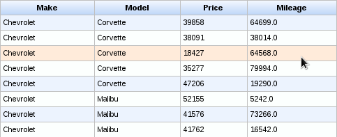
Named queries are given a name such that they can be triggered by other functions or handlers. Use the name attribute to name the query. The query can then be accessed as though it were a JavaScript function using the specified name attribute as the function name.
Calls to the function must pass a direct reference ( this) to the calling object as a parameter. This is treated the same as an item defined through the selector attribute.
If the function requires extra parameters itself, these are provided in JavaScript Object Notation (JSON) syntax as a second parameter in the JavaScript call. The options namespace is then used in the <rich:jQuery> query to access the passed function parameters. Example 15.3, “Calling a <rich:jQuery> component as a function” demonstrates the use of the name attribute and how to pass function parameters through the JavaScript calls.
Example 15.3. Calling a <rich:jQuery> component as a function
<h:graphicImage width="50" value="/images/price.png" onmouseover="enlargePic(this, {pwidth:'60px'})" onmouseout="releasePic(this)"  />

<h:graphicImage width="50" value="/images/discount.png" onmouseover="enlargePic(this, {pwidth:'100px'})" onmouseout="releasePic(this)"  />

...

<rich:jQuery name="enlargePic" query="animate({width:options.pwidth})" />

<rich:jQuery name="releasePic" query="animate({width:'50px'})"/>
The example enlarges the images when the mouse moves over them. The enlargePic and releasePic components are called like ordinary JavaScript functions from the image elements.
The <rich:jQuery> component applies style and behavioral changes to DOM objects dynamically. As such, changes applied during an Ajax response are overwritten, and will need to be re-applied once the Ajax response is complete.
Any timed queries with the timing attribute set to domready may not update during an Ajax response, as the DOM document is not completely reloaded. To ensure the query is re-applied after an Ajax response, include the name attribute in the <rich:jQuery> component and invoke it using JavaScript from the complete event attribute of the component that triggered the Ajax interaction.
Read this chapter for details on special functions for use with particular components. Using JavaServer Faces Expression Language ( JSF EL), these functions can be accessed through the data attribute of components. Refer to Section 2.4.4.1, “data” for details on the data attribute.
The rich:clientId('id')'id'null is returned instead.
The rich:component('id')RichFaces.component('clientId')'id'null is returned instead. The function can be used to get an object from a component to call a JavaScript API function without using the <rich:componentControl> component.
The rich:element('id')document.getElementById(#{rich:clientId('id')})null is returned instead.
The rich:jQuery('id')jQuery('##{rich:clientId('id')})null is returned instead.
The rich:findComponent('id')null is returned instead.
Example 16.1. rich:findComponent example
<h:inputText id="myInput">

   <rich:support event="keyup" render="outtext"/>

</h:inputText>

<h:outputText id="outtext" value="#{rich:findComponent('myInput').value}" />
The rich:isUserInRole(Object) function checks whether the logged-in user belongs to a certain user role, such as being an administrator. User roles are defined in the web.xml settings file.
Example 16.2. rich:isUserInRole example
The rich:isUserInRole(Object) function can be used in conjunction with the rendered attribute of a component to only display certain controls to authorized users.
<rich:editor value="#{bean.text}" rendered="#{rich:isUserInRole('admin')}"/>
Read this chapter for details on miscellaneous components that provide extended functionality to web applications.
The <rich:componentControl> behavior allows JavaScript API functions to be called on target components. The functions are called after defined events are triggered on the component to with the <rich:componentControl> behavior is attached. Initialization variants and activation events can be customized, and parameters can be passed to the target component.
The operation attribute is required to attach JavaScript functions to the parent component, along with either the target or selector attributes. Use the operation attribute to specify the JavaScript API function to perform. Use the target attribute to define the id identifier of the target component, or use the selector attribute to define a number of target components through the use of valid jQuery selectors.
Use the event attribute to specify the event that triggers the JavaScript API function call if it is different from the default triggering event for the parent component.
Example 17.1. <rich:componentControl> basic usage
<h:commandButton value="Show Modal Panel">

    <!--componentControl is attached to the commandButton-->

    <rich:componentControl target="ccModalPanelID" event="click" operation="show"/>

</h:commandButton>
The example contains a single command button, which when clicked shows the modal panel with the identifier ccModalPanelID.
The operation can receive parameters through nested <f:param> elements.
Example 17.2. Using parameters
<rich:componentControl event="click" target="modalPanel" operation="show">

   <f:param value="width" name="500"/>

</rich:componentControl>
To group multiple parameters for a function, use the <rich:hashParam> component to create a hash map. Refer to Section 17.4, “<rich:hashParam>” for details.
-
client-behavior-renderer-type:org.richfaces.behavior.ComponentControlBehavior -
behavior-id:org.richfaces.behavior.ComponentControlBehavior -
handler-class:org.richfaces.taglib.ComponentControlHandler -
behavior-class:org.richfaces.component.behavior.ComponentControlBehavior -
client-behavior-renderer-class:org.richfaces.renderkit.html.ToggleControlRenderer
The <rich:focus> component allows one to manipulate the focus of components on a page. It is intended to be used with any input field.
The component will behave differently when placed:
- in a form - defines behavior for components in the given form
- in a view (outside of forms) - defines behavior for components in all forms in the view
There can be only one focus per form.
If both, form- and view-based focuses are defined, the form one takes a priority.
The focus is applied each time it is rendered - either on form submission or after an AJAX request. Only focuses inside the form which is submitted are applied.
You can turn focusing-after-AJAX-requests off by setting the ajaxRendered attribute to false.
The <rich:focus> component reflects the results of validation of components in a view. Focus is given to the first input component in the page which is invalid.
If all components are valid, then first component in the form is focused.
The order of input components is determined on the client-side and reflects the tabindex and position in the page. You can prioritize the focusing of a specific component by increasing its tabindex.
You can turn validation awareness off by setting the validationAware attribute to false.
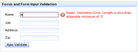
Focus can be configured to keep focus on the input component which had focus before sending the JSF request (using either AJAX or form submission).
Example 17.3. <rich:focus> preserving focus
<h:form>

    <rich:focus preserve="true" />


    <h:inputText id="query" value="#{query}" />

    <a4j:commandButton value="Search" render="output" />


    <h:outputText value="Searched query:" />

    <h:outputText id="output" value="#{query}" />

</h:form>
In the example above, everytime the user hits Search (or hits enter), the focus is given back to the query input after the request.
This configuration will take priority over any other focus setup.
In certain situations, focus needs to be applied with a delay - once suitable conditions are met.
By configuring a focus with the attribute delayed to true, the focus won’t be applied on initial page request.
Then it is possible to call the applyFocus() JavaScript API method in order to let the focus be applied.
For a situation when none of the options above help one to achieve the desired focus behavior, one can use the server-side component FocusManager.
A component focus chosen by the FocusManager will take priority over any focus configuration.
Example 17.4. <rich:focus> preserving focus
FocusManager focusManager = ServiceTracker.getService(FocusManager.class);

focusManager.focus("input2");
If the target component is inside an iteration component such as <rich:dataTable> or <ui:repeat>
the string passed to the focus method has to include a part of the full id containing the row number, starting with a separator (by default ":")
focusManager.focus(":2:input");
The <rich:hotKey> component allows one to register hot keys for the page or particular elements and to define client-side processing functions for these keys.
There are two ways to register <rich:hotKey>:
-
place it anywhere on the page. In this case the
<rich:hotKey>component is attached to the whole page. This is the default scenario. -
attach it to specific elements by defining the
selectorattribute. This attribute uses the syntax of the jQuery Selectors (a superset of CSS selectors defined by W3C consortium) and additionally it expands JSF component IDs to client-side IDs (see the VDL documentation for theselectorattribute).
The key attribute defines the hot key itself, which is processed by the component.
The key sequences can be defined using a " +" key separator. The key sequence modifiers needs to be defined in alphabetical order, e.g. alt+ctrl+shift.
Hot key processing can be disabled by setting rendered to false.
Example 17.5. <rich:hotKey> basic usage
<rich:hotKey key="ctrl+z">

    <rich:componentControl target="popup" operation="show" />

</rich:hotKey>


<rich:popupPanel id="popup">

    ...

</rich:popupPanel>
The example contains <rich:hotKey> which handles the Ctrl+Z key sequence on the whole page. When the key sequence is pressed, the <rich:popupPanel> is displayed.
The enabledInInput attribute enables the hot key event processing when form inputs are focused. This attribute is false by default.
The preventDefault attribute specifies whether the hot key binding should prevent default browser-specific actions to be taken (e.g. Ctrl+A hot key selecting all available text, Ctrl+B opening bookmarks bar, etc.). This attribute has a default value of true.
Cross-browser support for preventing default actions
Even though RichFaces instructs the browser to prevent the default action, browser implementations do not support preventing browser’s native actions for selected key combinations.
Although the inability to prevent default action is not usual, you may experience that both the programatically-defined action and the browser’s native action are triggered (e.g. native popup appears).
To keep an application accessible, it is convenient to not depend on hot keys or hot key combinations heavily. Best practice is using a hot key only as shortcut for a given action.
The following event handlers could be used to trigger client-side behaviors or to invoke javascript directly:
-
keydown(default event) is fired when the hot key sequence is initiated (the keys are down) -
keyupis fired when the hot key sequence is finished (the keys are up)
Example 17.6. <rich:hotKey> event handlers
<rich:hotKey key="ctrl+a" onkeyup="alert('Ctrl+A was pressed')" />
Hot Key in Editor
The <rich:editor> uses <iframe> for the editable area.
The <iframe> doesn’t allow one to propagate events outside of the <rich:editor>, making <rich:hotKey> unusable for handling events from <rich:editor>.
The CKEditor specific event handling mechanism should be used instead.
The <rich:hashParam> component allows client-side parameters to be grouped into a hash map. The hash map can then be passed to the client JavaScript API functions of any RichFaces component.
Nest parameter tags in the <rich:hashParam> component to group them in the hash map. The hash map itself can then be passed as a function parameter.
Example 17.7. <rich:hashParam>
<h:commandButton value="Show popup">

   <rich:componentControl target="popupPanel" operation="show">

      <a4j:param noEscape="true" value="event" />

      <rich:hashParam>

         <f:param name="width" value="500" />

         <f:param name="height" value="300" />

         <f:param name="minWidth" value="300" />

         <f:param name="minHeight" value="150" />

         <a4j:param noEscape="true" name="left" value="(jQuery(window).width()/2)-250" />

         <a4j:param noEscape="true" name="top" value="(jQuery(window).height()/2)-150" />

      </rich:hashParam>

   </rich:componentControl>

</h:commandButton>
The example illustrates the use of the <rich:hashParam> component to group multiple parameters into a hash map. The parameters are passed through to the show function pop-up panel with the popupPanel identifier.
The <rich:placeholder> component allows one to use functionality similar to the HTML5 placeholder attribute for input components.
This component brings a backward compatibility for HTML5 non-compliant browsers and some additional features:
-
per-component styling using
styleClassattribute -
application to multiple components at once using
selectorattribute
Example 17.8. <rich:placeholder> with input components
<h:outputLabel value="Input text:" />

<h:inputText id="input">

    <rich:placeholder value="Type text here..." />

</h:inputText>


<h:outputLabel value="Textarea:" />

<h:inputTextarea id="textarea">

    <rich:placeholder value="A space for long content..." />

</h:inputTextarea>


<h:outputLabel value="Date:" />

<rich:calendar datePattern="dd/M/yyyy" enableManualInput="true">

    <rich:placeholder value="dd/mm/yyyy" />

</rich:calendar>
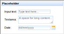
-
component-type:org.richfaces.Placeholder -
component-class:org.richfaces.component.UIPlaceholder -
component-family:org.richfaces.Placeholder -
renderer-type:org.richfaces.PlaceholderRenderer
Table 17.1. Style classes (selectors) and corresponding skin parameters
| Class (selector) | Skin Parameters | Mapped CSS properties |
|---|---|---|
|